A Single Push is the most basic form of push notifications. You can create standard or rich ad-hoc campaigns to notify your users about promos, offers, and discounts.
Requirements
To start using the single push, you need to complete the following requirements.
Integrate the basic SDK version
The mobile push opt-in must be true for the user to receive app push notifications.
Your account must have at least one certificate uploaded.
Use Cases
To get a better understanding of how and when to use single app pushes, refer to Use Cases for Single App Push.
You should complete the following steps to launch a campaign with a Single App Push:
1. Create a campaign
You can follow the steps listed below to start creating your campaign.
1.1. Navigate to Experience > Message > App Push..png)
1.2. Click the Create button to start creating your campaign.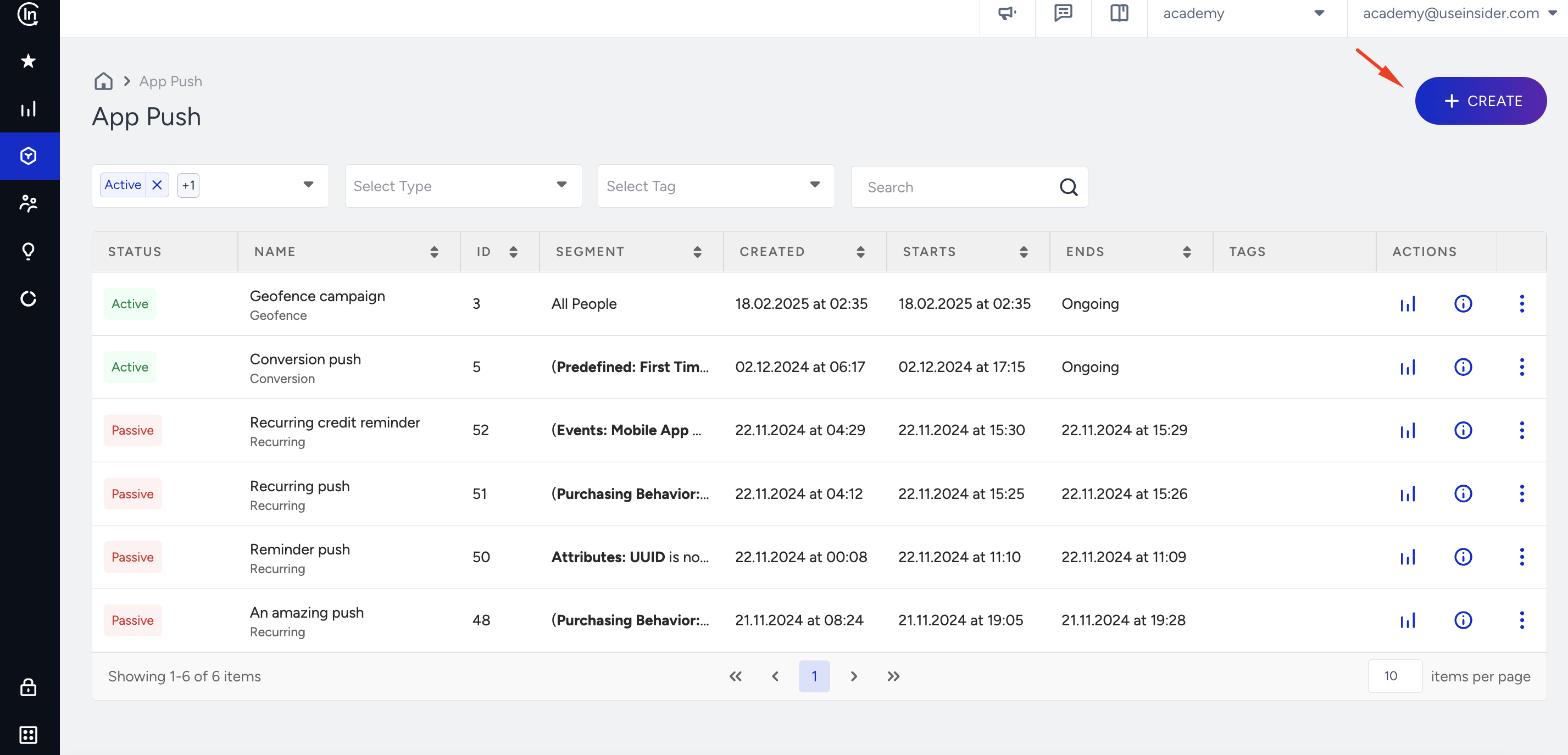
1.3. Select Single push and click the Create button..png)
2. Select a segment
To select the group of users to send your push notification to, refer to Segments to see the steps that you should complete.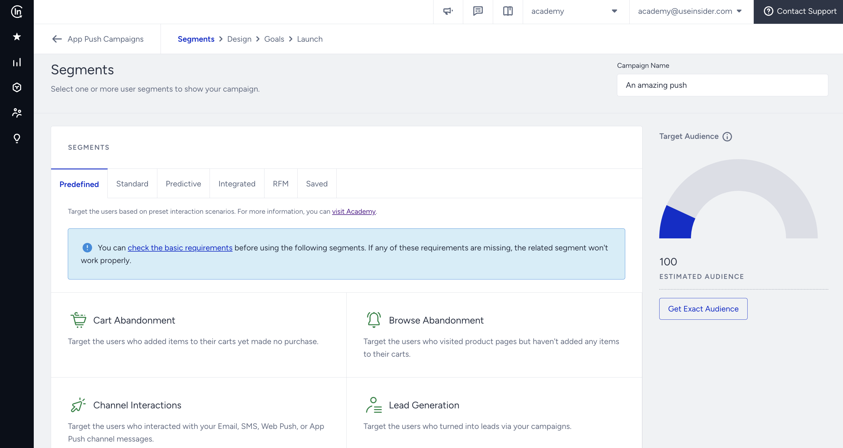
You can select from Predefined Segments, Standard Segments, Predictive Segments, Integrated Segments, RFM Segments, and Saved Segments.
3. Design your message
Message layout
3.1. Select Icon or Single Image for your push notification. An icon push is a push with no uploaded image, but the app icon, while a single image push is a push with an image.
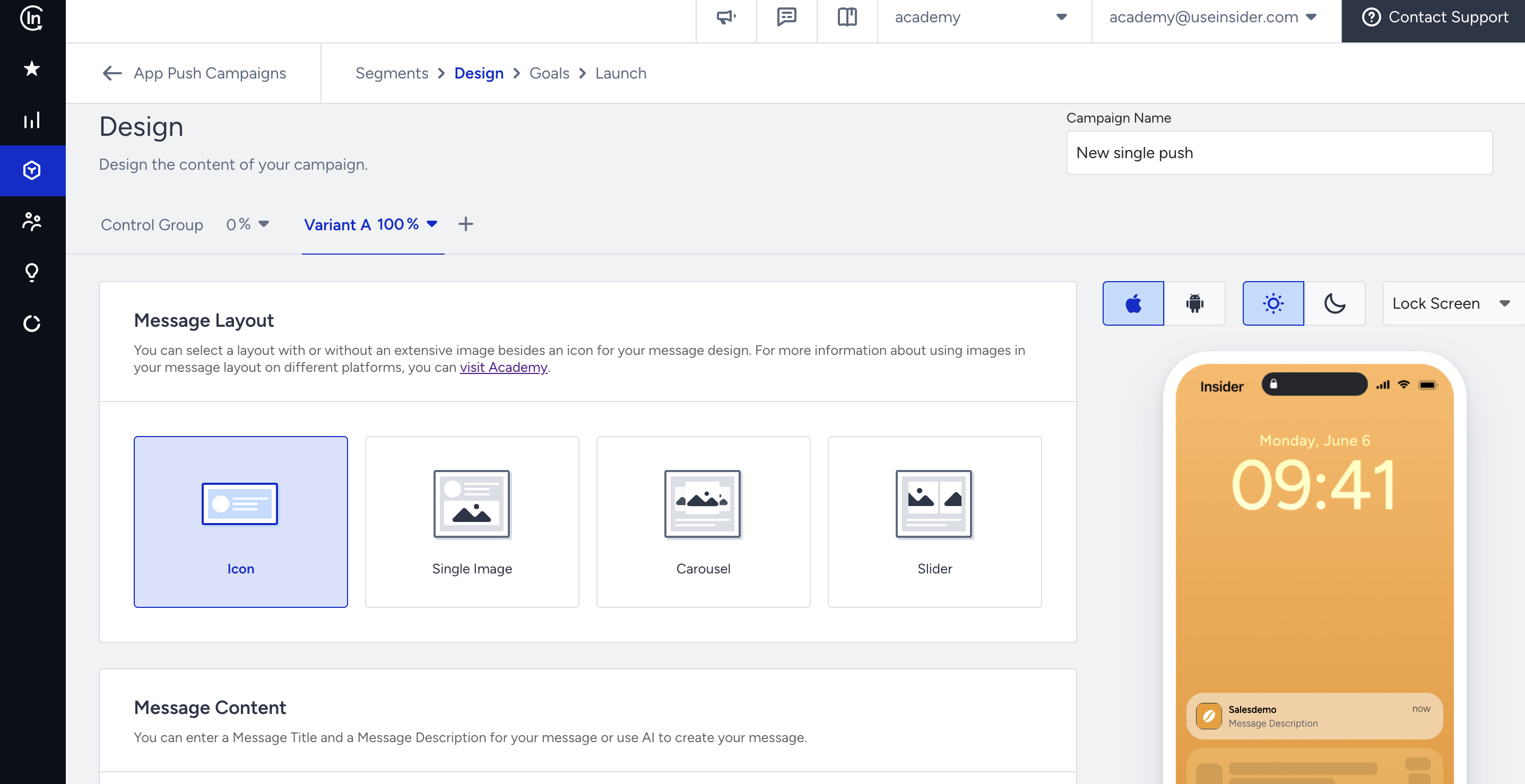
For the icon push, add your Message Title and Description.
Message image
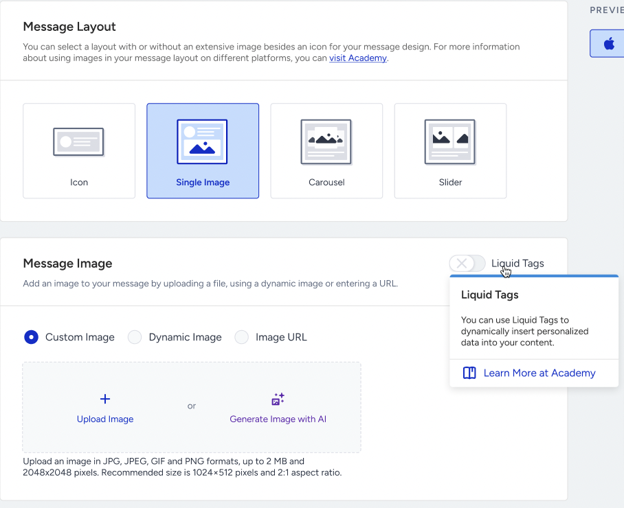
For the single image, the image source has three options: Custom Image (file upload), Dynamic Image (image URL from a user attribute), and Image URL (direct URL input).
You can upload an image in JPG, JPEG, GIF, and PNG formats, up to 2MB and 2048x2048 pixels. The recommended size is 1024x512 pixels and a 2:1 aspect ratio.
Dynamic Image lists only string attributes whose names contain img, image, or _url, grouping them into Default Attributes and Custom Attributes. An optional Fallback Image can be set for users who have no value for that attribute.
Liquid in images
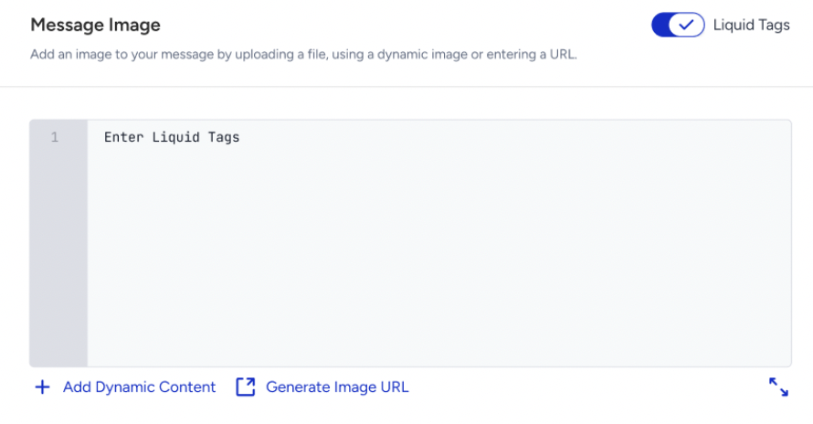
The Message Image section has its own Liquid Tags toggle. When it is on, the source options are replaced by a Liquid editor. When it is turned off, the last selected source and its value come back, so switching between modes does not clear what was entered.
The Image URL Generator lets you upload an image and use the generated URL inside the Liquid syntax.
The "Enter a valid Message Image to continue." message will be displayed if the Liquid tag or the attribute is not valid.
Every image also has an Image Title and an Image Description, each up to 40 characters, with an emoji picker, dynamic content, and an image deep link subsection.
Liquid is available only on the Single Image layout. Carousel and Slider slides retain the three image sources (Custom Image, Dynamic Image, Image URL) with the no Liquid Tags toggle, and their per-slide deep links remain unchanged.
Cart Reminder pushes have no support for Liquid.
Message content
Fill out the Message Title and Message Description fields. Click Add Dynamic Content to personalize your message and add a fallback value.
Attributes also need a fallback value in case some users in the segment do not have a value for the respective attribute. For example, a user may not be logged in to the app, and the user's name attribute may not be available at that time.
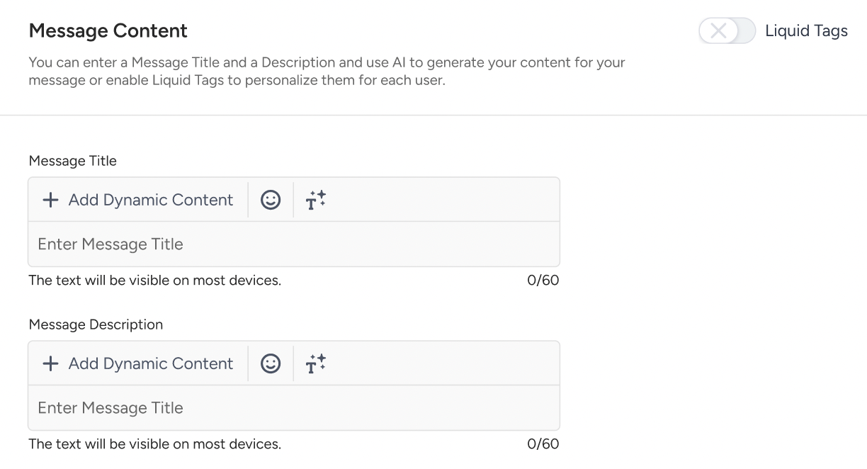
Refer to Liquid in App Push to use Liquid Tags in your push content.
Click the emoji button next to the Title and Message input fields to add emojis.
To use AI-generated text:
1. Click the Generate Text button to see the side modal.
2. Enter a prompt you want to generate the text about.
3. The language option will be the default selected language of your panel.
4. Select your industry and use case to define the context for the text to be generated.
5. Click the Generate Copy button.
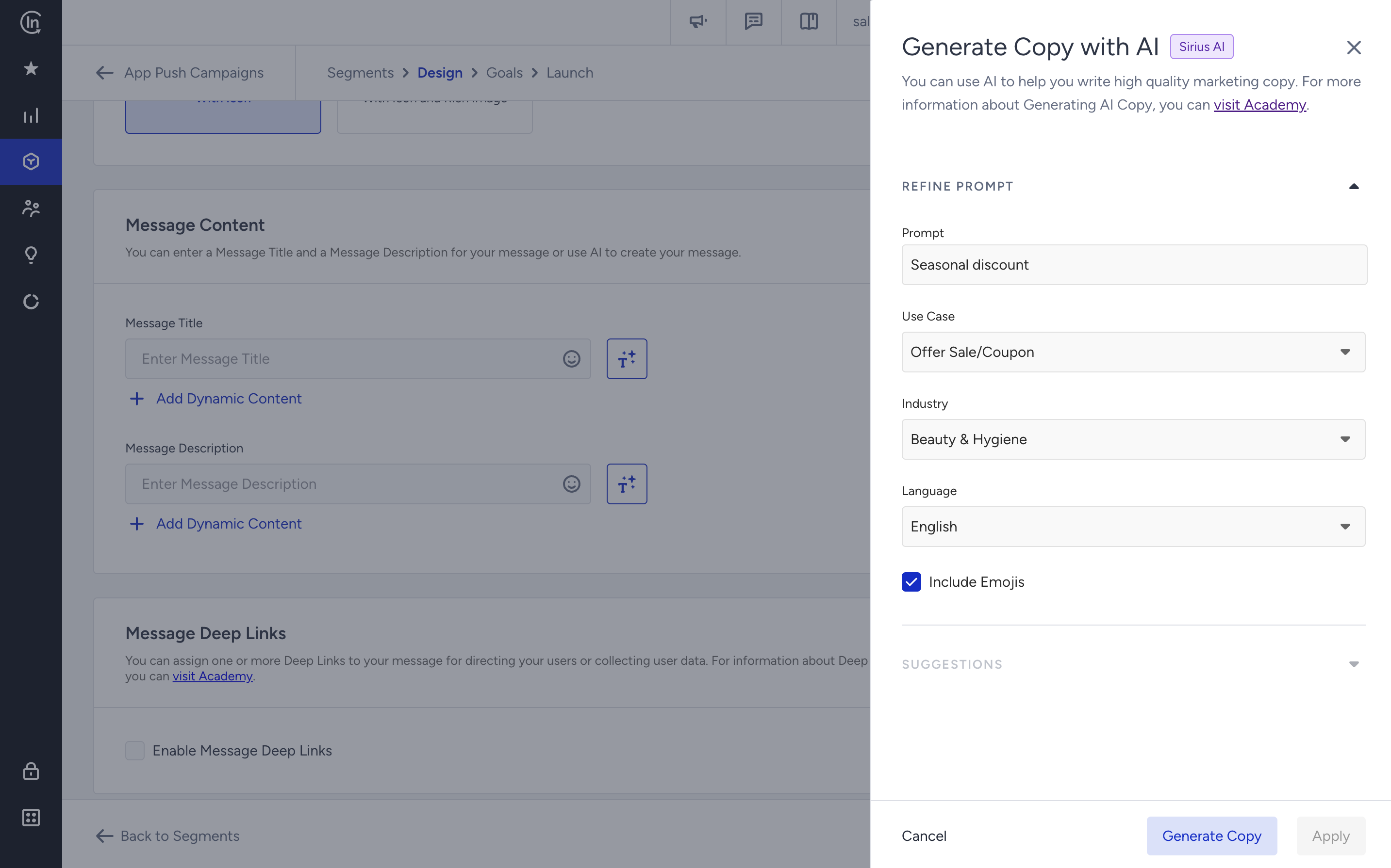
If you want to include emojis in your copy, you can check the "Include Emojis" box.
This option indicates that the AI can generate copies with emojis. However, not all options might include emojis.
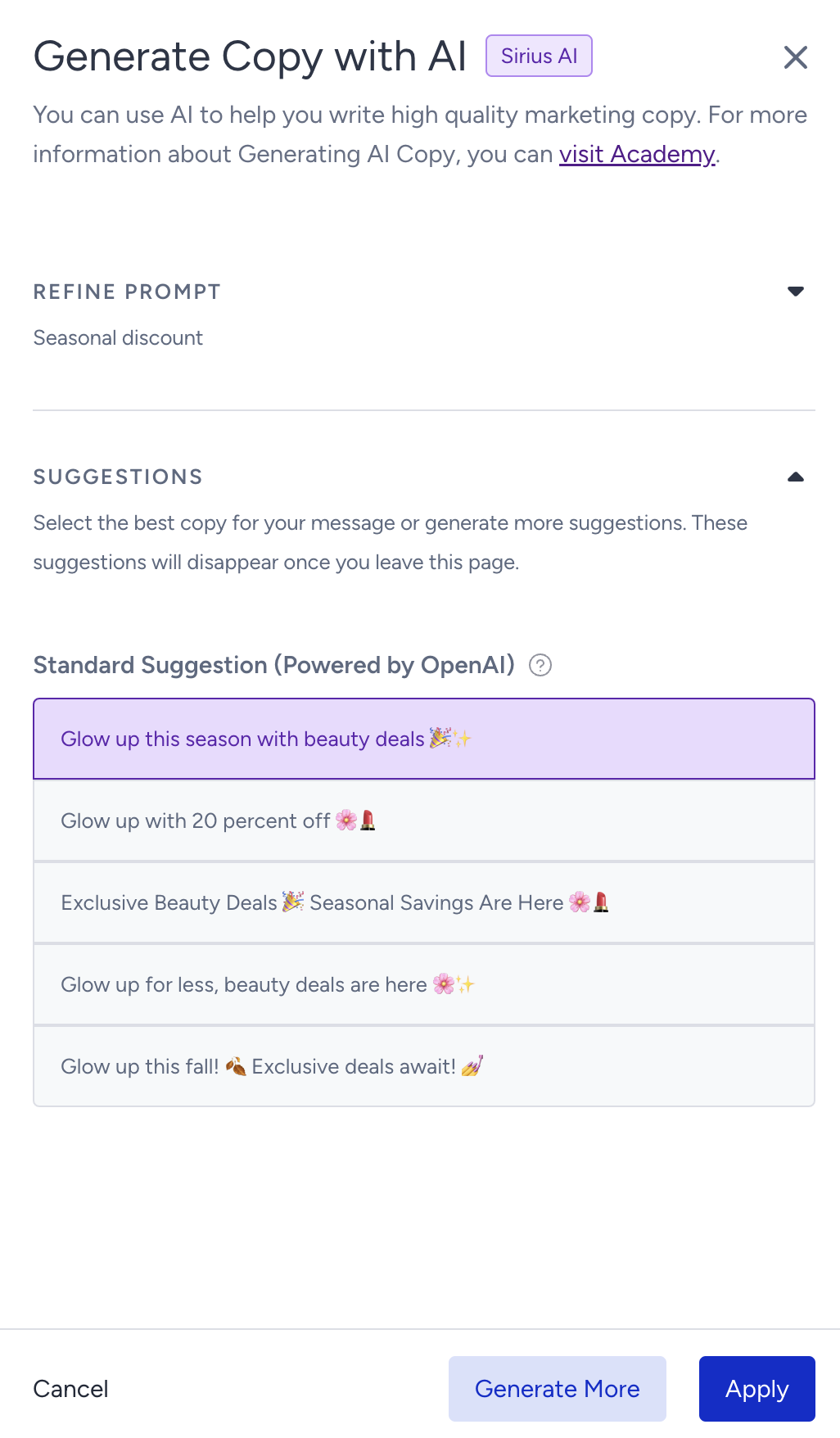
The modal displays 5 suggestions. To see more, you can click the Generate More button. To use a suggestion, select it and click Apply. Once you click the Apply button, the copy will be added to the respective field.
Deep links
3.2. To add a deep link to the push message, check the Enable Message Deep Links box.
(1).png)
Select one of the deep link types to enter your key and value or add an existing deep link. Read more on deep links.
%20(1).png)
You can also use attributes as the deep link value. This means that the deep link value will change for all users who have that value, and each user will be redirected to a personalized page (e.g., last visited product).
Liquid in deep links
The Liquid Tags toggle stays disabled until deep links are enabled. With the toggle on, the value inputs turn into Liquid editors, the error messages become type-specific, such as "Enter an Internal URL to continue.", "Enter an External URL to continue.", "Enter a URL Scheme to continue.", "Enter a JSON code to continue.", and JSON rows show the banner "Make sure you check and validate your JSON Code to avoid any issues”
In Liquid mode, the URL rows are not prefilled with https://, and the strict http(s) prefix and JSON parsing checks are not applied, because the value is resolved at send time. A value like exampledomain {{ na }} is accepted. Broken Liquid syntax is still blocked with a validation message.
Plain rows and Liquid rows are stored separately within a session, so turning the toggle on and off does not lose either set. After a page reload, only the saved mode is restored.
Deep links on CTA (action) buttons are not supported in Liquid. Liquid applies to Message Deep Links and to the Image Deep Linkonly.
Deep link types cannot all be combined. Key-Value Pair can be added many times; only one of URL Scheme, Internal URL, and External URL can be used at a time, and JSON can be added only once.
Push CTA buttons
3.3. You can configure CTA buttons without requiring any development effort to:
Seamlessly switch push notification types to include actionable buttons.
Define multiple button actions within a single notification, expanding redirection options.
Customize button texts and deep links to align with your campaign goals.
Manage all configurations directly within the panel, eliminating the need for developer involvement or app updates.
Segment CTA buttons based on user attributes, behaviors, or other targeting criteria, ensuring more personalized and relevant interactions.
Create richer and more interactive app push experiences that drive engagement and conversion.
You can add the Message Action Buttons to campaigns that use Icon and Single Image message layouts. By default, Message Action Buttons are disabled.
The action buttons will be visible depending on your SDK version. To ensure clarity, the minimum required SDK versions are:
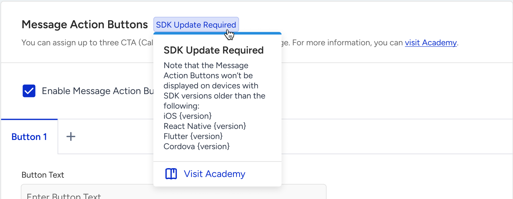
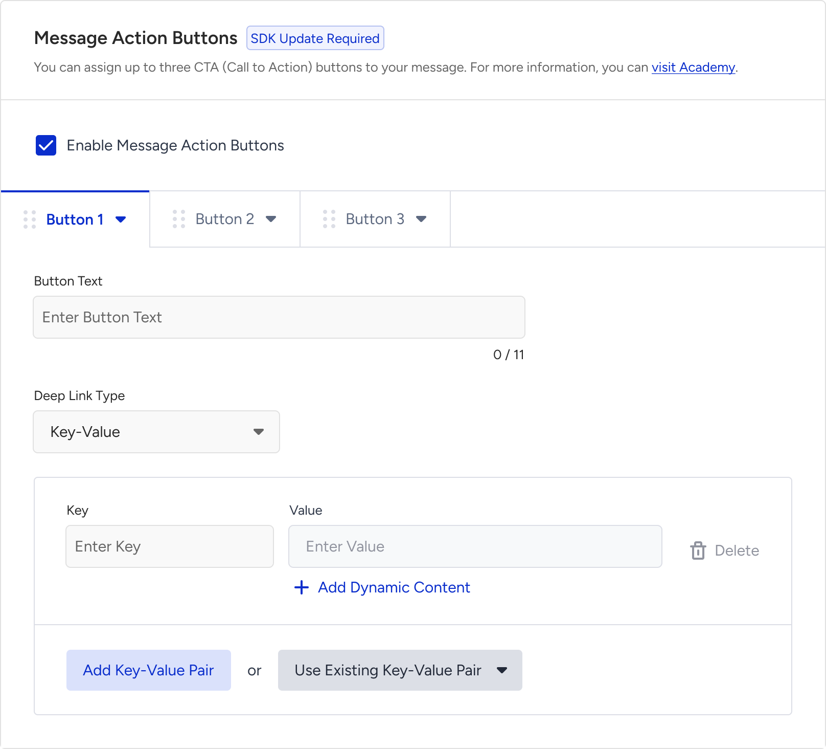
Once the action buttons are enabled, you can click the + (plus) sign to add up to three buttons. You can define a Button Text that determines how the button appears on end users' devices.
The maximum Button Text length varies depending on the number of buttons added:
1 button: Up to 48 characters
2 buttons: Up to 20 characters each
3 buttons: Up to 11 characters each
After adding the button text, you can assign a deep link to redirect those clicking the specific button. You can either add a new deep link of any type or select from the existing deep links you previously created.
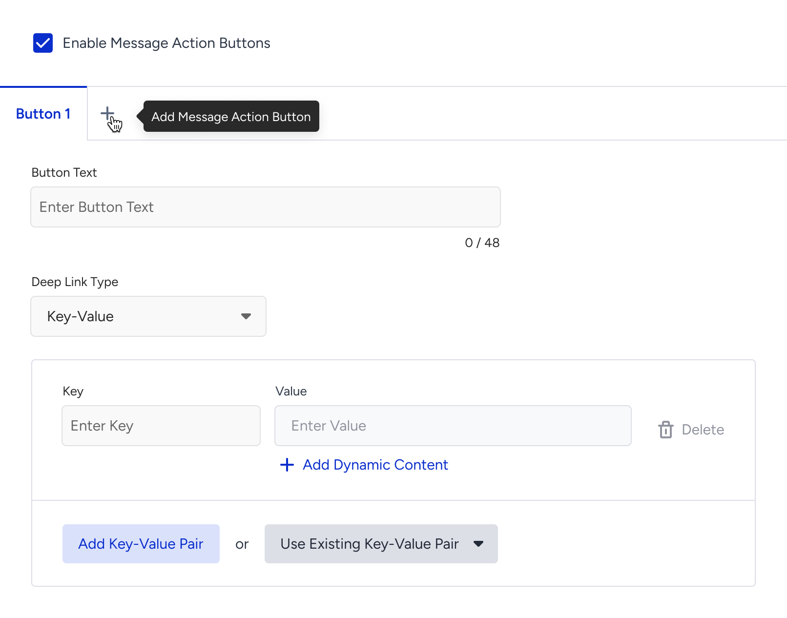
Once you add the maximum number of buttons (three), the "+" icon will disappear. You can drag the buttons to rearrange them.
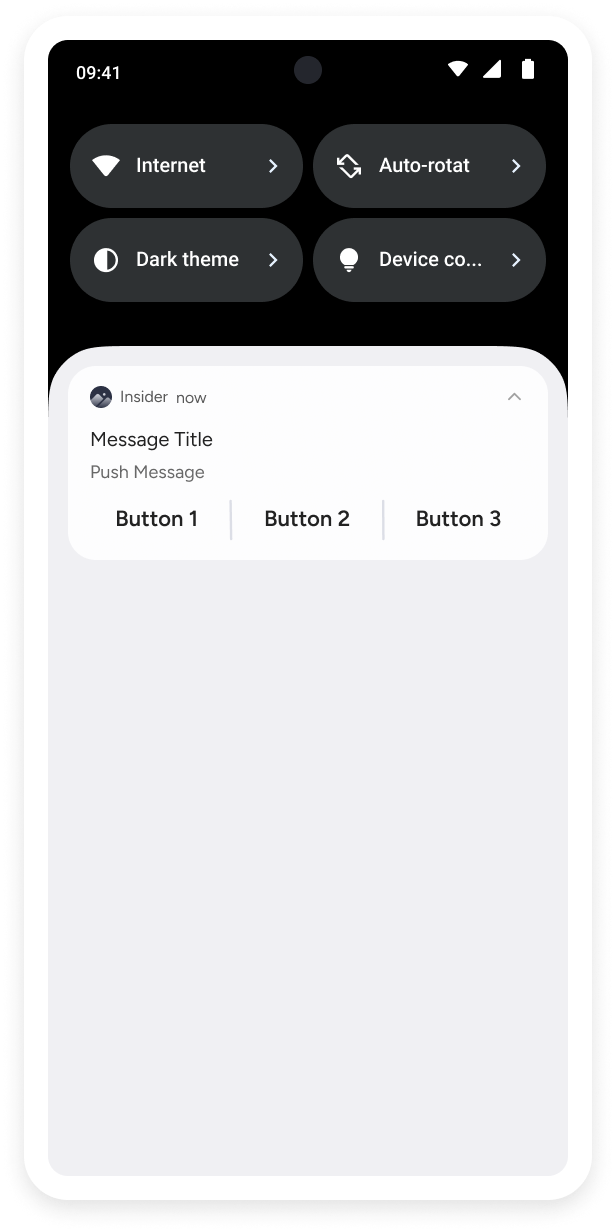
Additionally, previews will update dynamically based on the number of buttons and their content. This allows you to see a realistic preview of your campaign for both iOS and Android platforms.
Below you can see some example previews:
|
|
.png)
Later, you can segment your users based on their clicks on the action buttons in the app push campaigns.
3.4. To run A/B/C tests, click the + (plus) button next to your variant. Then click the variant to change their percentage, duplicate it, or delete it.
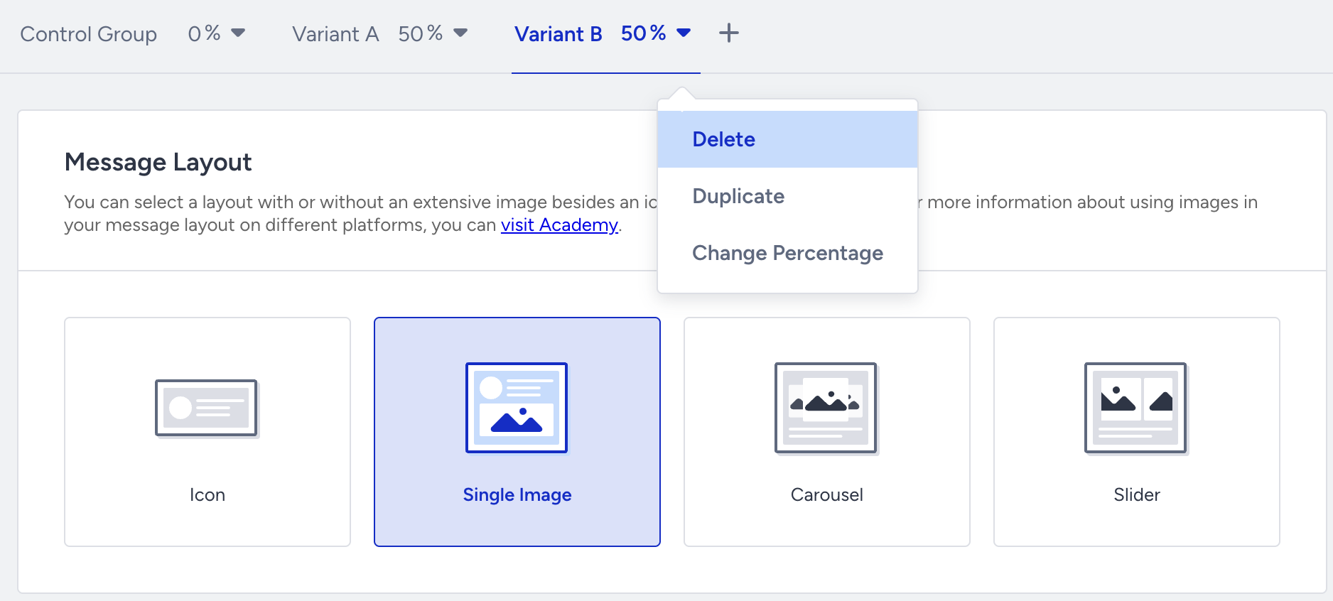
Control Group and Variant A are created by default when you create your push notification.
4. Test your campaign
You can preview your app pushes on the Design step while designing your message. The Test Message button helps you see the campaign preview on your device. You can select a test group and/or any individual user to test your message.
Refer to the Test page to see how to test your campaign.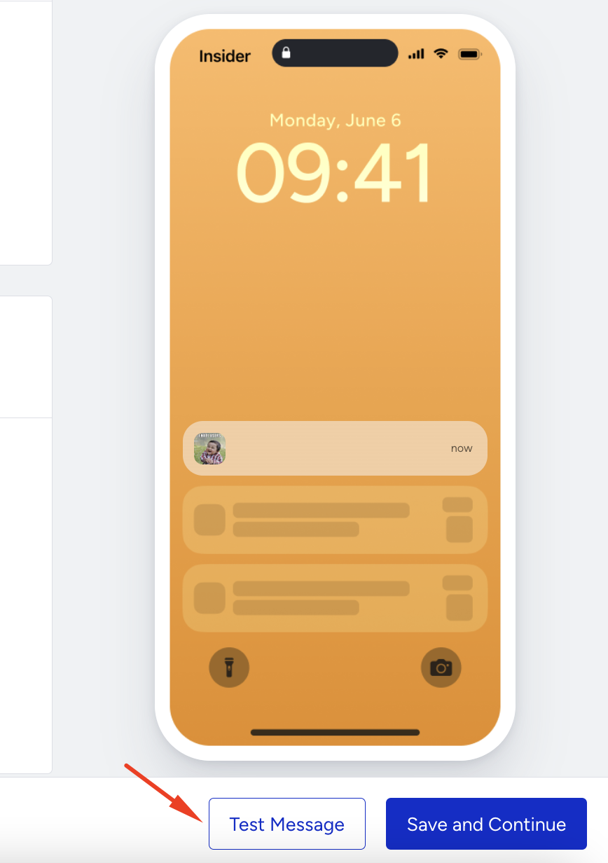
5. Select goals
The Goals step helps you create goals and configure conversion durations for your campaign.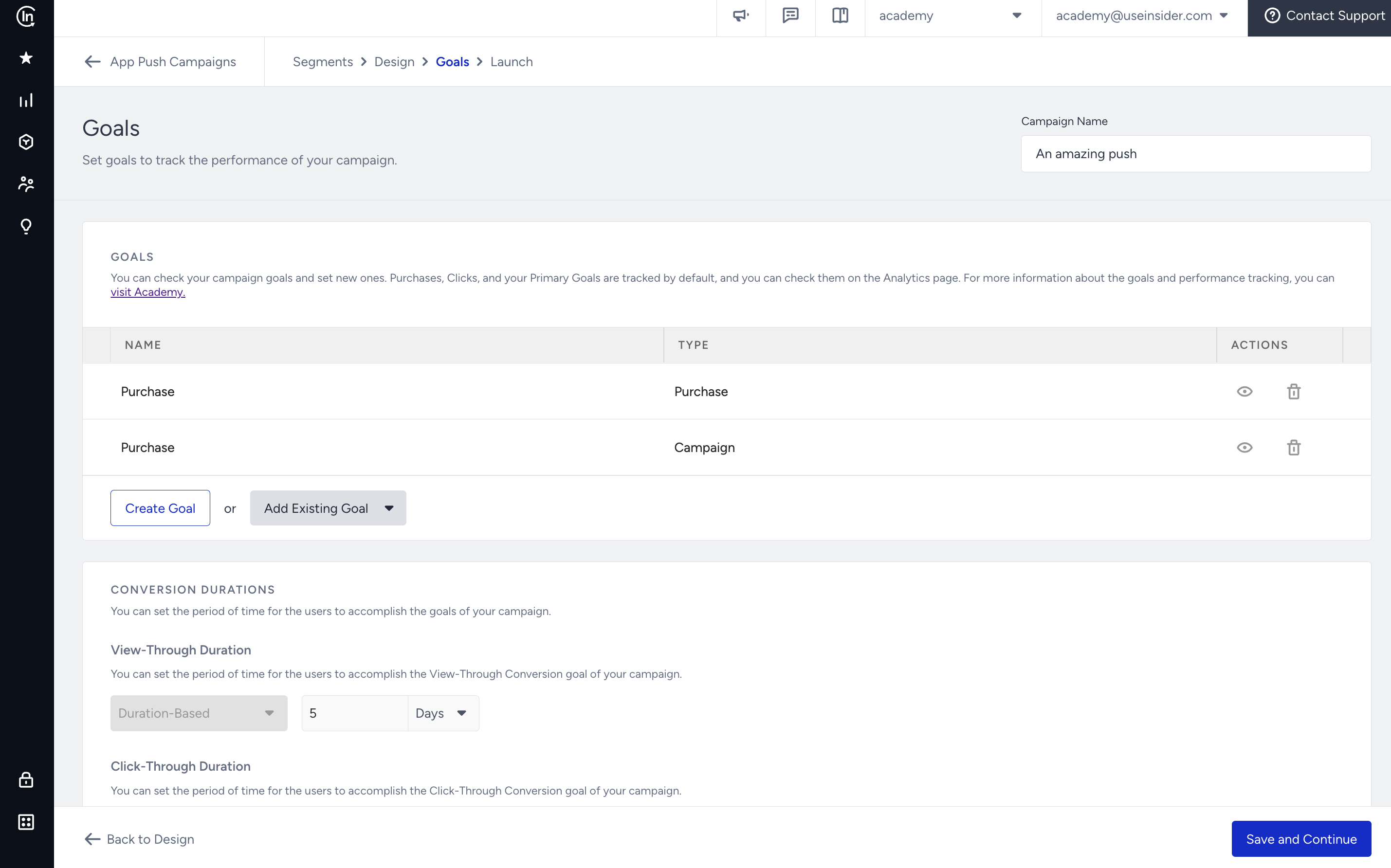
6. Configure the launch
Refer to the Launch page to configure Silent Hours, Send Time Optimization, Time to Live, Campaign Group Access, App Template Campaign Integration, Frequency Capping, Message Throttling, Notification Sounds, iOS Thread and Android Channels, and Campaign Tags.
7. Check analytics
Go to the Analytics page to
View the summary metrics
Analyze the pie chart & graphs
View the variant list
Export your results
