In this step, you define the visual and textual layout of the app card content.
(2).png)
Message Layout
You can choose from three design types when creating a campaign.
.png)
Single Message: Displays only a text-based message. This is the simplest format, suitable for short announcements or plain notifications without visuals.
Single Image: Displays one image. A text field is also available but optional, allowing the image to stand alone or be supported with a caption/description.
Multiple Images: Displays a carousel or sequence of images. Similar to the single image option, text can be added optionally to accompany the visuals. This format is useful for showcasing multiple products, promotions, or content pieces within one campaign.
Message Content
For text elements, two fields will be available: a title and a description.
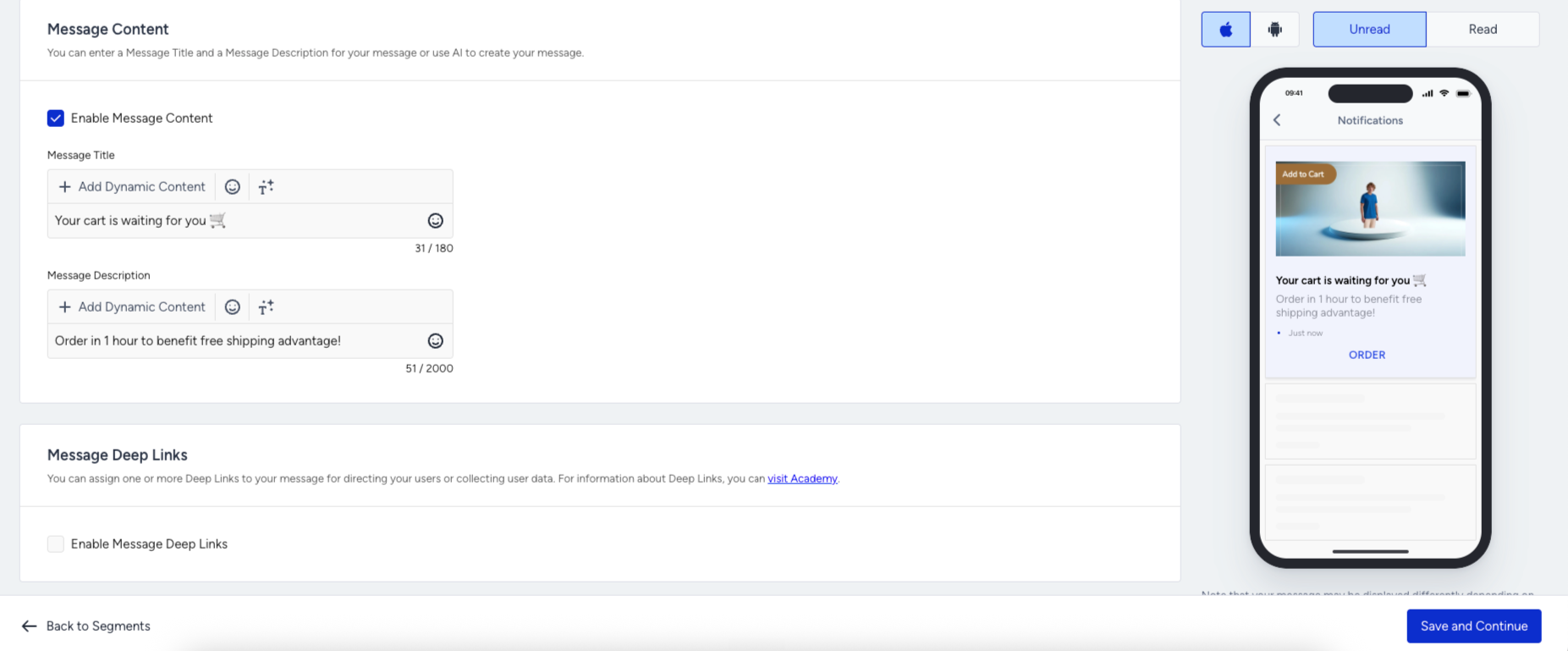
You can click the Add Dynamic Content button to personalize your message with default attributes, custom attributes, and expressions.
Message Image
If you create a message with images, the following section will be available.
The image source has three options: Custom Image (file upload), Dynamic Image (image URL from a user attribute), and Image URL (direct URL input).
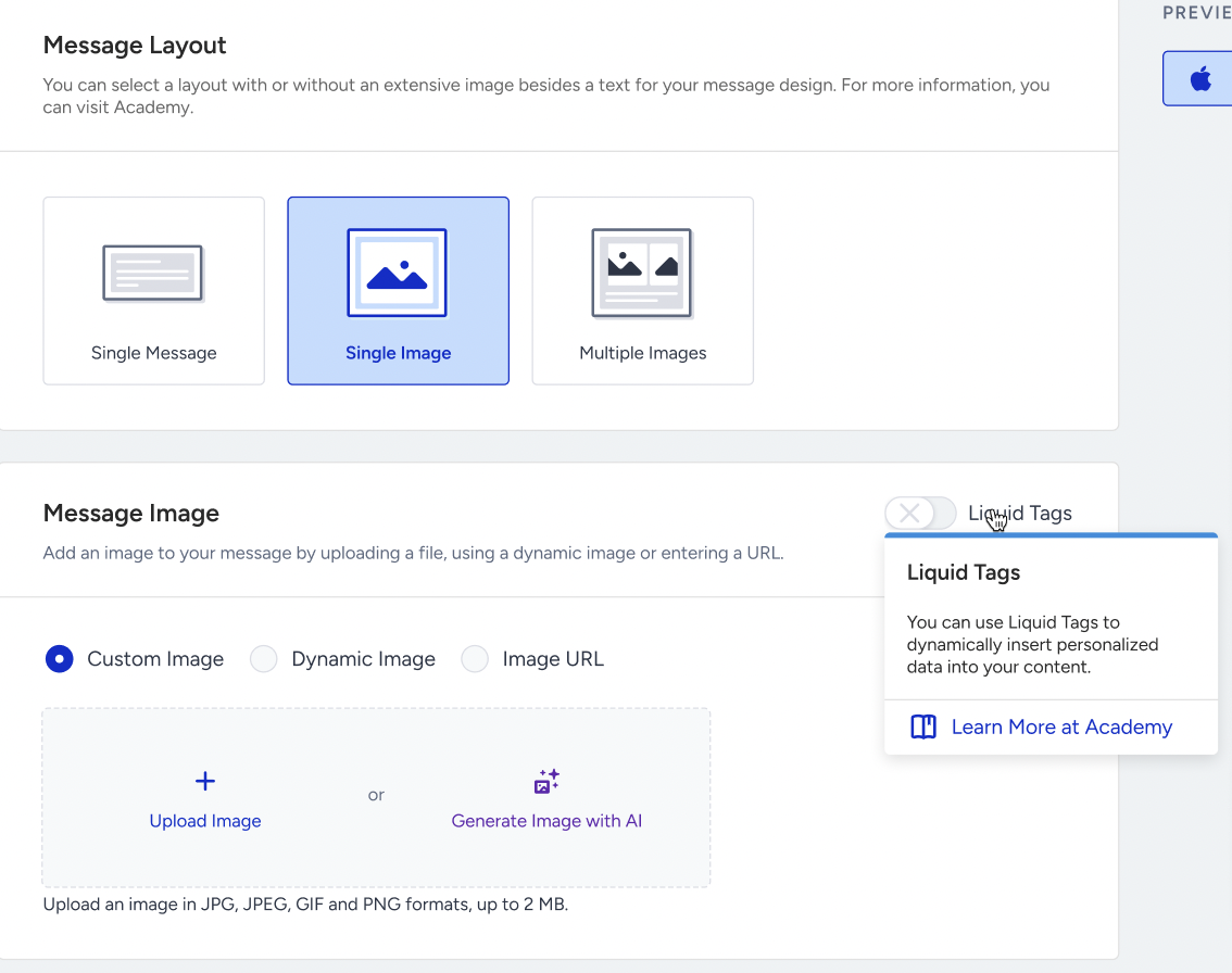
Dynamic Image lists only string attributes whose names contain img, image, or _url, grouping them into Default Attributes and Custom Attributes. An optional Fallback Image can be set for users who have no value for that attribute.
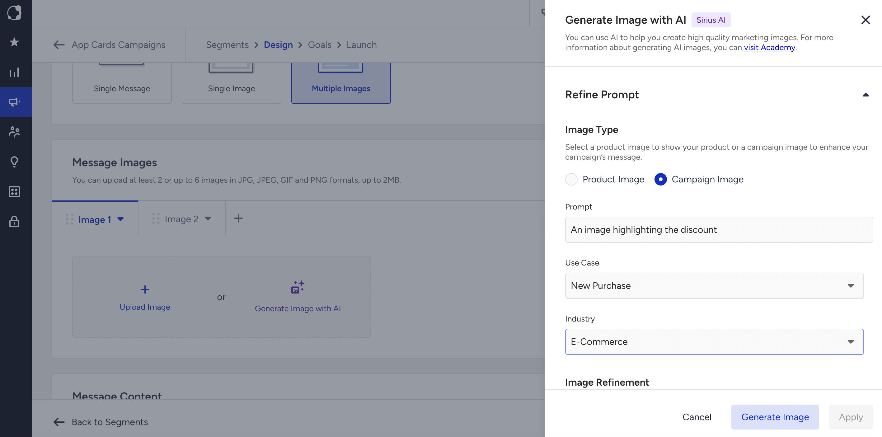
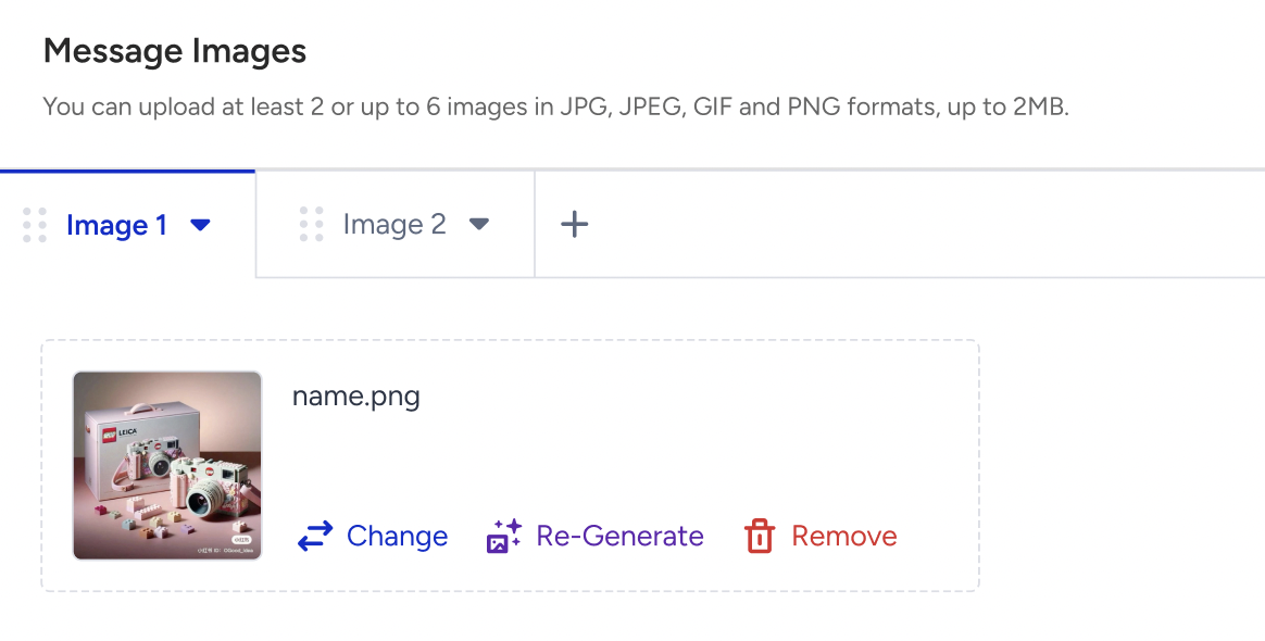
You can upload an image or generate an image with AI.
Multiple Images
You can upload at least 2 or up to 6 images. You can also use the AI image generator in this message type.
Liquid in message images
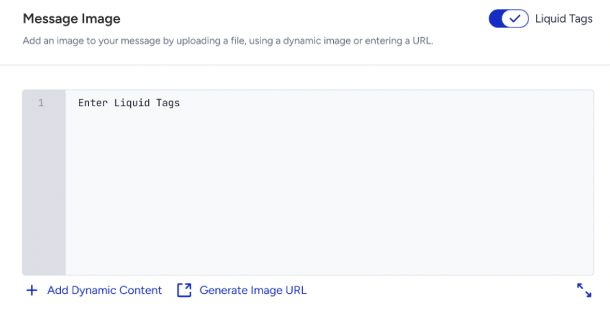
The Message Image section has its own Liquid Tags toggle. When it is on, the source options are replaced by a Liquid editor. When it is turned off, the last selected source and its value come back, so switching between modes does not clear what was entered.
Liquid is available only on the Single Image layout.
The Image URL Generator lets you upload an image and use the generated URL inside the Liquid syntax.
The "Enter a valid Message Image to continue." message will be displayed if the Liquid tag or the attribute is not valid.
Every image also has an Image Title and an Image Description, each up to 40 characters, with an emoji picker, dynamic content, and an image deep link subsection.
Message Deep Links
You can attach a deep link directly to the message itself. Messages will support deep linking, allowing users to be redirected to a specific page or section within the app.
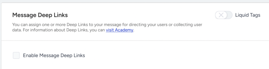
Liquid in deep links
The Liquid Tags toggle stays disabled until deep links are enabled. With the toggle on, the value inputs turn into Liquid editors, the error messages become type-specific, such as "Enter an Internal URL to continue.", "Enter an External URL to continue.", "Enter a URL Scheme to continue.", "Enter a JSON code to continue.", and JSON rows show the banner "Make sure you check and validate your JSON Code to avoid any issues”
In Liquid mode, the URL rows are not prefilled with https:// and the strict http(s) prefix and JSON parsing checks are not applied, because the value is resolved at send time. A value like exampledomain {{ na }} is accepted. Broken Liquid syntax is still blocked with a validation message.
Plain rows and Liquid rows are stored separately within a session, so turning the toggle on and off does not lose either set. After a page reload, only the saved mode is restored.
If a Liquid image cannot be resolved, the push is still delivered, without an image. If a deep link cannot be resolved, its current value is kept. The user is never dropped from the campaign. Message Title and Message Description keep their existing behavior.
Deep links on CTA (action) buttons are not supported in Liquid. Liquid applies to Message Deep Links and to the Image Deep Link only.
Deep link types cannot all be combined. Key-Value Pair can be added many times, only one of URL Scheme, Internal URL and External URL can be used at a time, and JSON can be added only once.
Message Action Buttons
You can enable action buttons in your message.
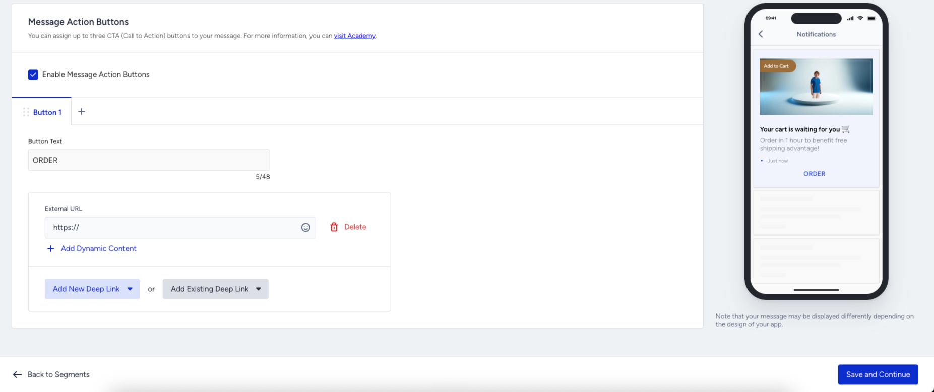
You can add up to 3 buttons. Button types include:
Key-Value Pair
External URL
Internal URL
URL Scheme
JSON
Message Preview
You can use the preview area to have a general idea of how the message will appear. However, this will not be a 100% accurate representation, as the final UI rendering will be handled natively by the customer’s app. Your message may be displayed differently depending on the design of your app.
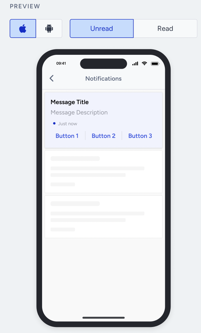
The preview area will display both the read and unread states of the message.
Once you complete designing your message, click the Save and Continue button to configure your goals.