Suggested reading: How can we format our email for mobile view?
The preferences in the General Settings apply to only desktop devices. You must also set the mobile preferences.
Let's say your font size is set to 14px for desktop. On mobile devices, it will be too small, so you will need to change it to another value, like 16px.
You need to adjust preferences for all texts, info areas/footers, buttons, and related elements.
Set preferences for mobile view
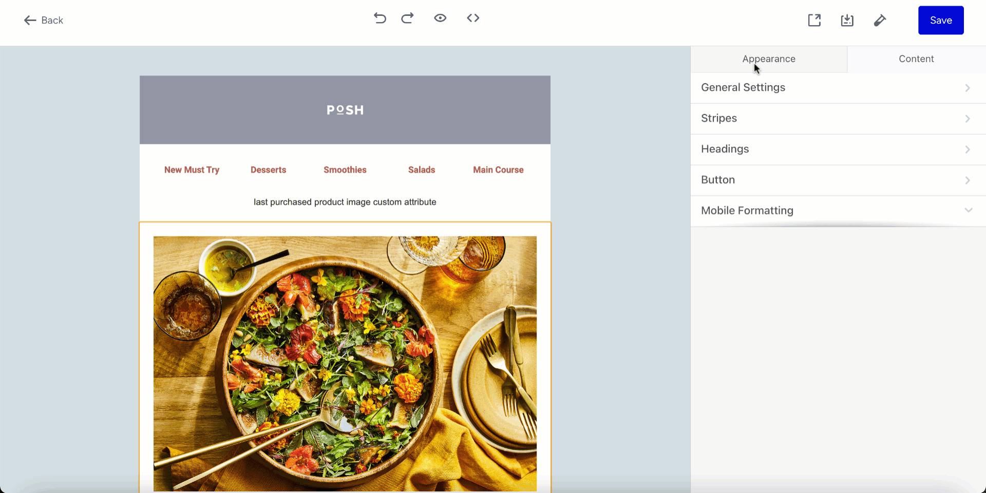
1. In the settings panel, click the Appearance tab.
2. Click the Mobile Formatting tab.
3. Set your preferences for heading size, text size in different content areas, and text size in buttons.
Use the responsiveness toggle for mobile view
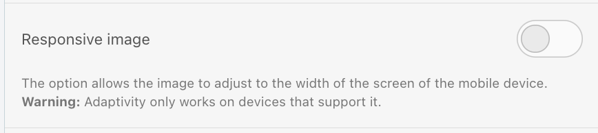
The responsive toggle lets the size of your image or element adapt to different screens, such as mobile or tablet. If the toggle is off, the design will be displayed as it is in the editor for all screen types. Below, you can see how it works for responsive images and structures.
Responsive image
For images like your brand logo, it is recommended that you toggle the Responsive image off to prevent the logo from unexpectedly scaling up on different screens.
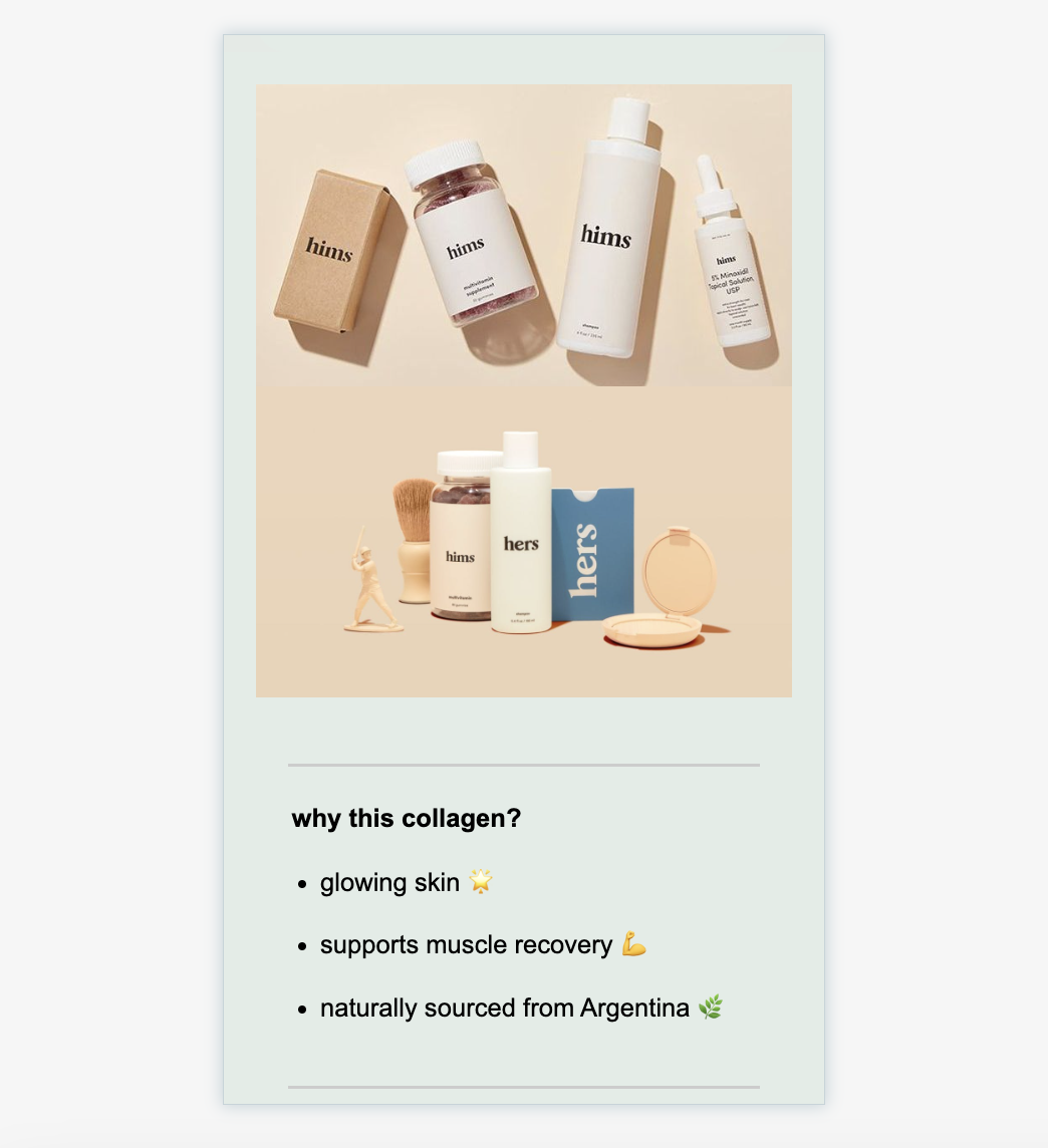
The following is an example email design.
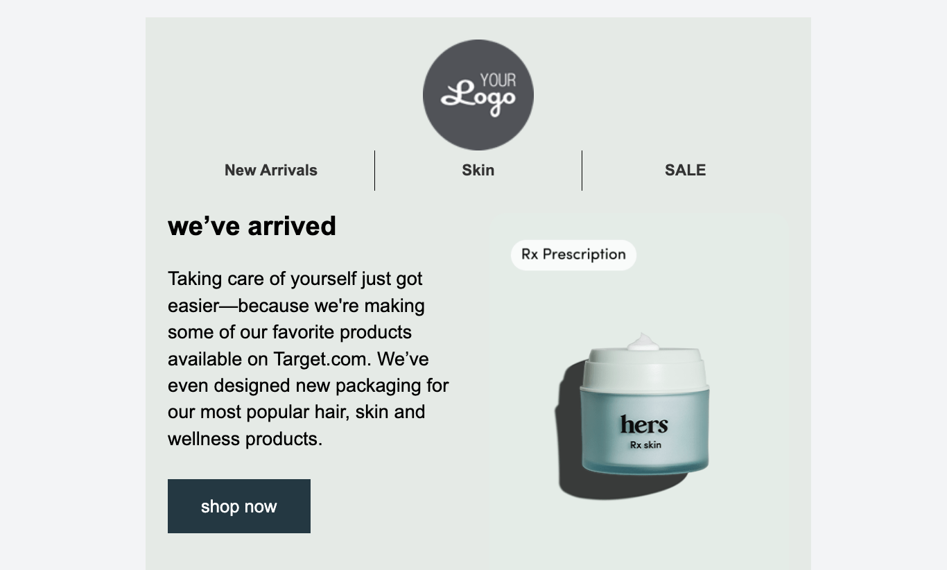
If you toggle on the Responsive image, your logo might look like this on mobile devices.
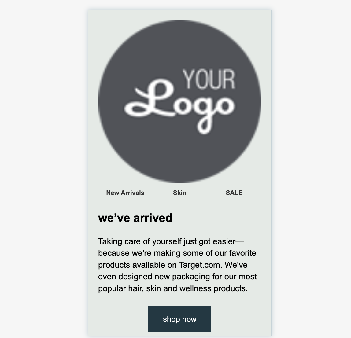
If you toggle off the Responsive image, your logo can look like this on mobile devices.

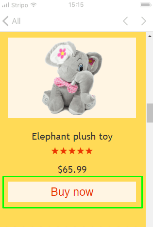
Responsive structure
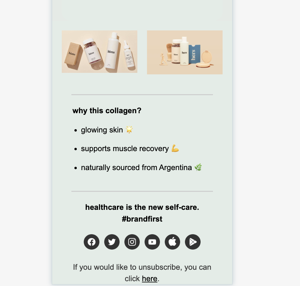
If you have several campaign images or product recommendations in a single row, you can use the Responsive structure toggle to adjust their display. If you toggle this option, the number of products displayed per row will change based on screen size. For example, if you have four products in a row, they will be displayed as a single product in the mobile display. On the other hand, if you toggle this option off, the number of images or the product in a row will not be changed according to the screen, their sizes will be adjusted.
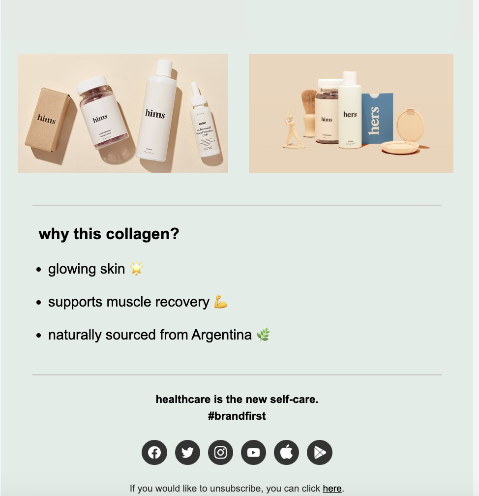
The following is an example email design.
If you toggle on the Responsive structure, your design will render as follows on mobile devices.
If you toggle off the Responsive structure, your design will render as follows on mobile devices.