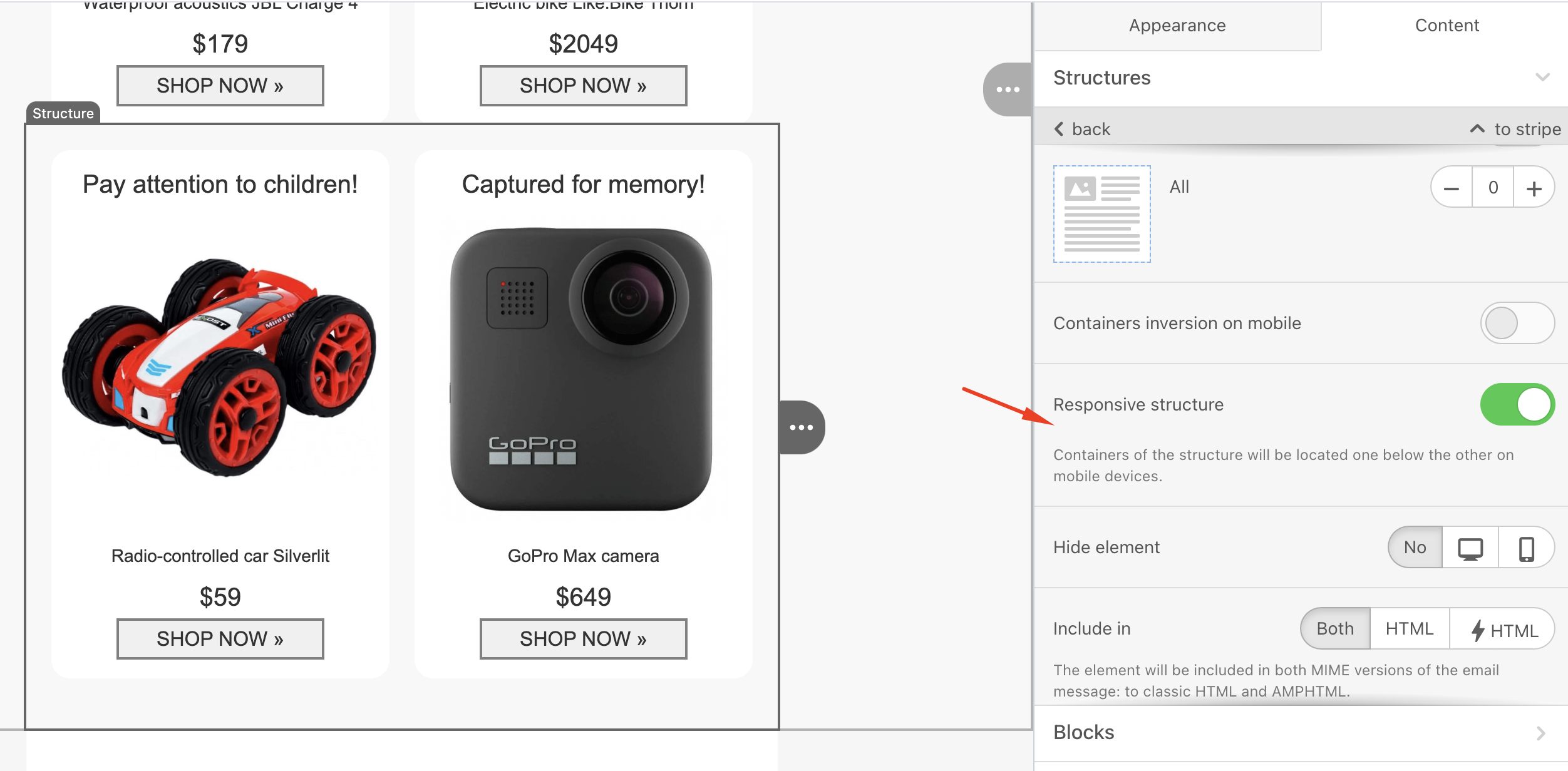
If you design an email and want the same preview on mobile, the responsive structure toggle for the block should be off. When this toggle is on, images, text, or any block you add will be placed under each other for mobile.
In some cases, the sizes of elements within the same block can differ even when the equalize option is selected. This happens when the "Responsive design" toggle is on. Since every device's screen resolution is different, the design will adapt each element to each device's resolution when the toggle is on.
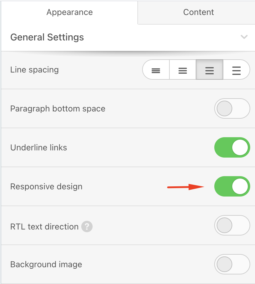
While the "Responsive design" affects the whole email structure, the "Responsive Structure" only affects the selected structure.
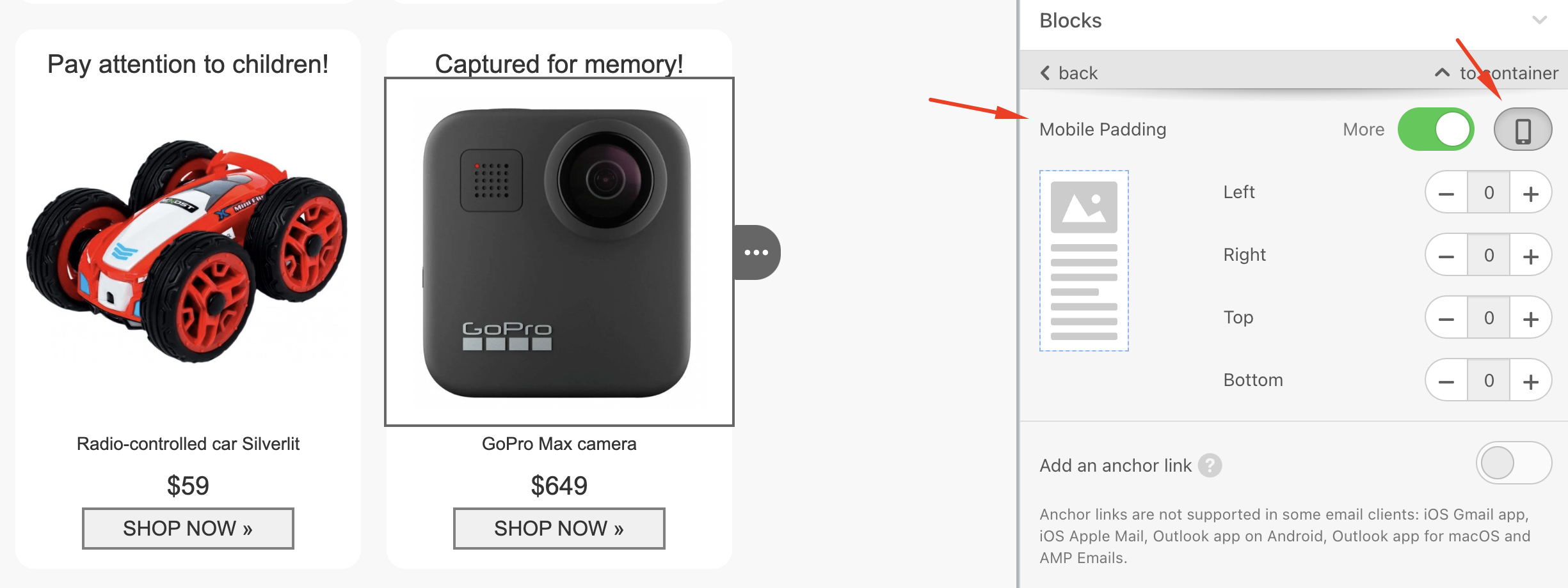
If you encounter an issue where images, such as logos, appear larger than they should on mobile devices, you can add additional mobile padding to those areas.
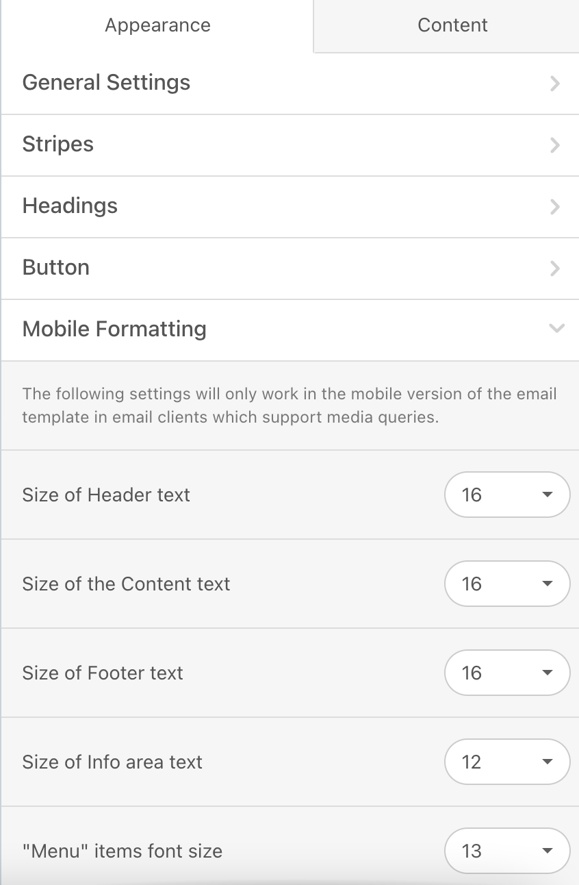
To specify different font sizes without adding different blocks and hiding one another in different platforms, you can select the area and change the font size of that area in the Mobile Formatting section.
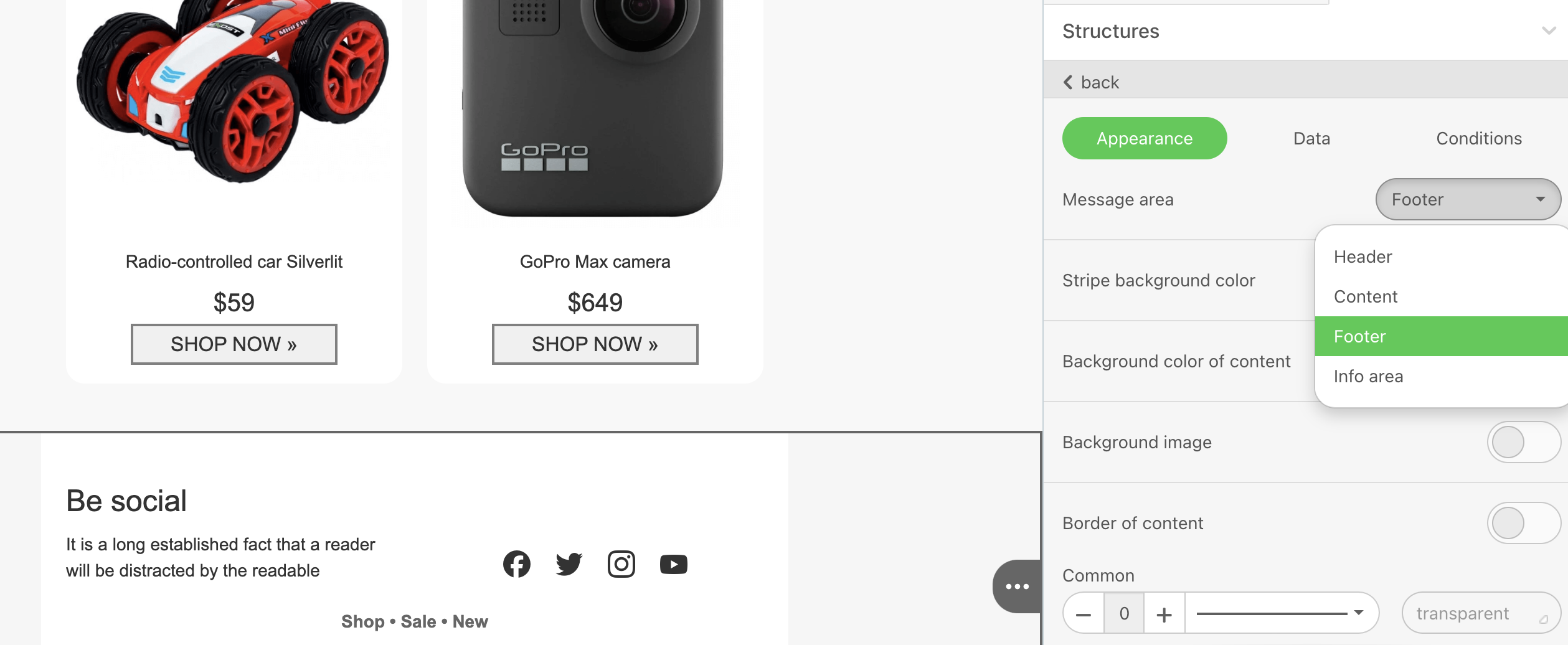
To specify an area, go to the Appearance > Message area.
To change the sizes of elements for mobile view, go to Appearance > Mobile Formatting and adjust the sizes as needed.