The Web Smart Recommender Widget Design Editor allows you to design product cards and full recommendation widgets without writing any code. You can select layouts, add elements such as product images, prices, and call-to-action buttons, and instantly preview how your widget will appear in live campaigns.
The editor serves as a centralized creative workspace where recommendation widgets can be styled to blend naturally with your website’s design.
The elements of the Web Smart Recommender Widget Design Editor are:
Top Bar
The Top Bar functions as the primary control area for managing global widget settings and previewing designs across platforms.

Preview and Design
Located on the left side of the Top Bar, these tabs let you switch between modes:
Preview: Displays how the widget will appear on your website in its final state.
Design: Opens the editor where all layout and styling changes are made.
All configuration and customization actions take place in Design mode.
Platforms
At the center of the Top Bar, platform controls allow you to manage responsiveness:
Sync All Platforms (default): Ensures a single responsive design across desktop, tablet, and mobile.
Platform-specific editing: Disable syncing to customize the widget individually for each platform.
Advanced Settings
Advanced Settings provide deeper control over widget behavior and formatting. From here, you can:
Apply custom HTML, CSS, or JavaScript
Configure currency formatting (symbols, decimal separators, thousand separators)
These settings are optional and intended for advanced customization.
Templates
The Templates section allows you to manage reusable designs:
Switch to an existing template
Save the current widget as a reusable template
Apply saved templates across multiple campaigns
Left Sidebar
The Left Sidebar manages the structural elements of the widget. It displays all widget layers and allows you to control visibility and hierarchy.
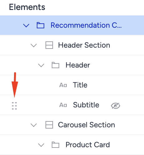
Reorder
Drag and drop elements to change their order within the widget.
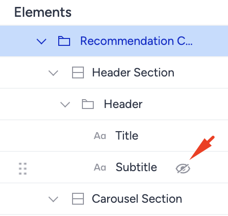
Hide
Use the eye icon to temporarily hide elements without deleting them.
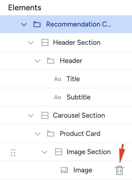
Delete
Use the trash icon to permanently remove an element from the design.
Right Sidebar
The Right Sidebar displays configurable properties for the selected element. Each element type has its own settings, such as:
Images: size, alignment
Buttons: text, color, interaction behavior
Text elements: typography and spacing
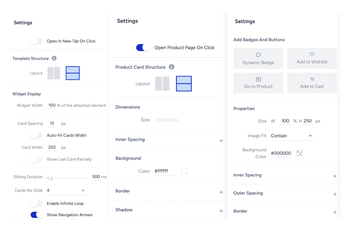
These settings enable precise control over both visual and functional properties.
Canvas
The Canvas is the live editing area where all design changes are reflected in real time.
Selecting the top-level element shows the full widget view
Switching to card view allows editing of individual product cards
Enables fine-tuning of both global layout and card-level details
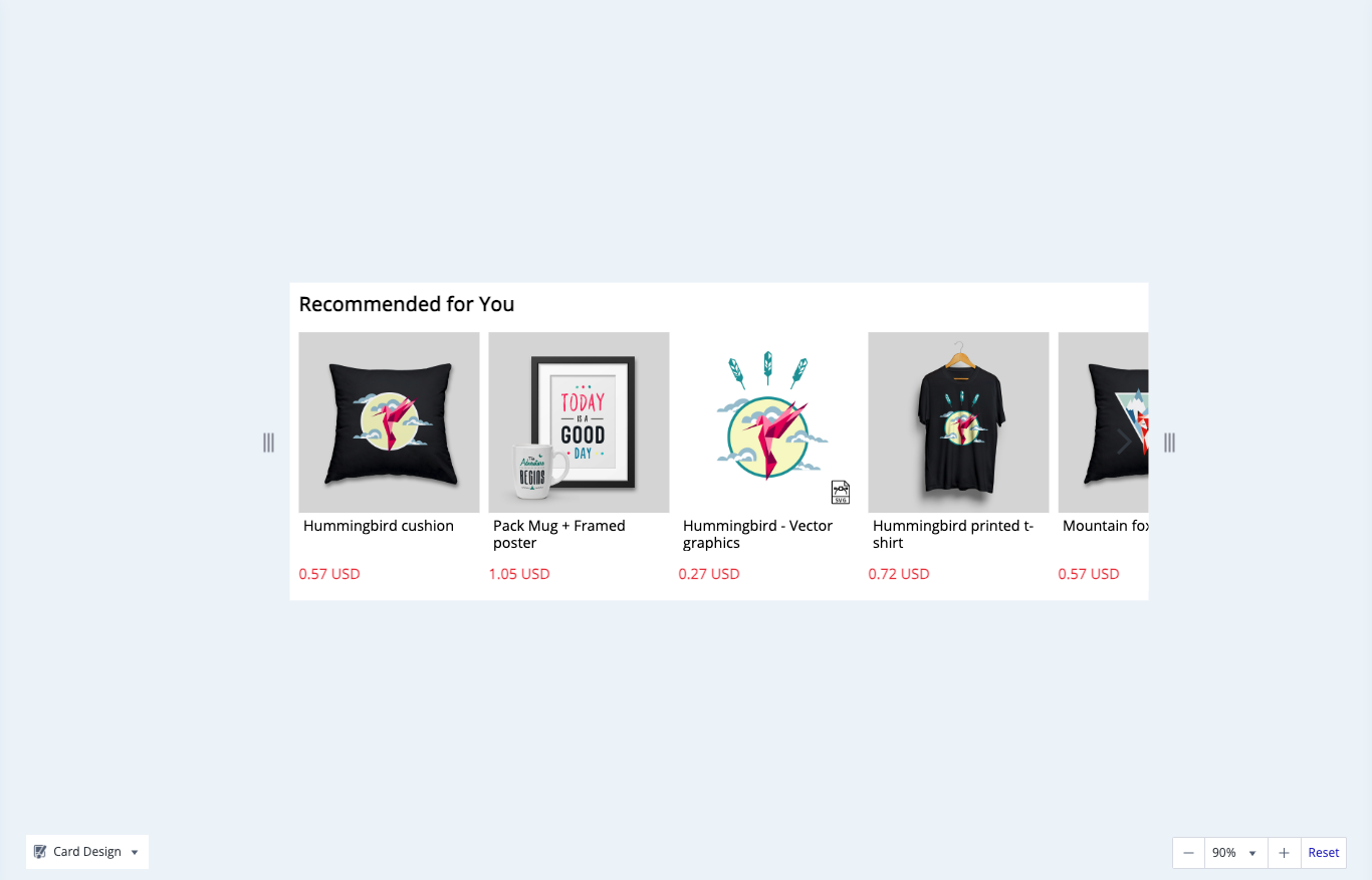
Product Card Templates
Individual product cards can be saved as reusable templates:
Open the dropdown menu in the bottom-left corner of the Canvas
Select Save as New
Access saved card templates from the template library
These templates can be reused across campaigns to ensure consistency.
Zoom
The zoom controls in the bottom-right corner of the Canvas allow you to zoom in or out, making it easier to focus on fine details or review the overall layout.