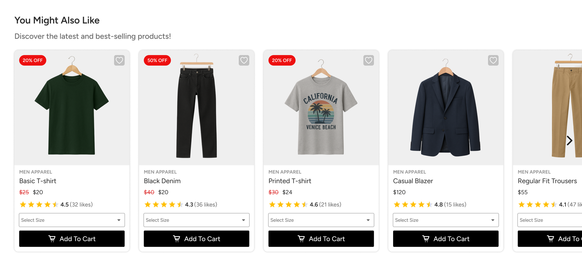
Widgets are the areas where visitors interact with recommended products. They typically appear in a carousel format, allowing users to browse multiple items, view key details such as images and prices, and take actions like adding products to the cart or saving them to a wishlist.

Smart Recommender offers ready-to-use widget templates that are designed to fit common use cases and page layouts.
Recommendation Widget Types
Smart Recommender provides two primary widget template types:
Inline Carousel
An Inline Carousel widget is embedded directly into your webpage. It displays recommended products as part of the existing page layout, creating a seamless and non-intrusive browsing experience.
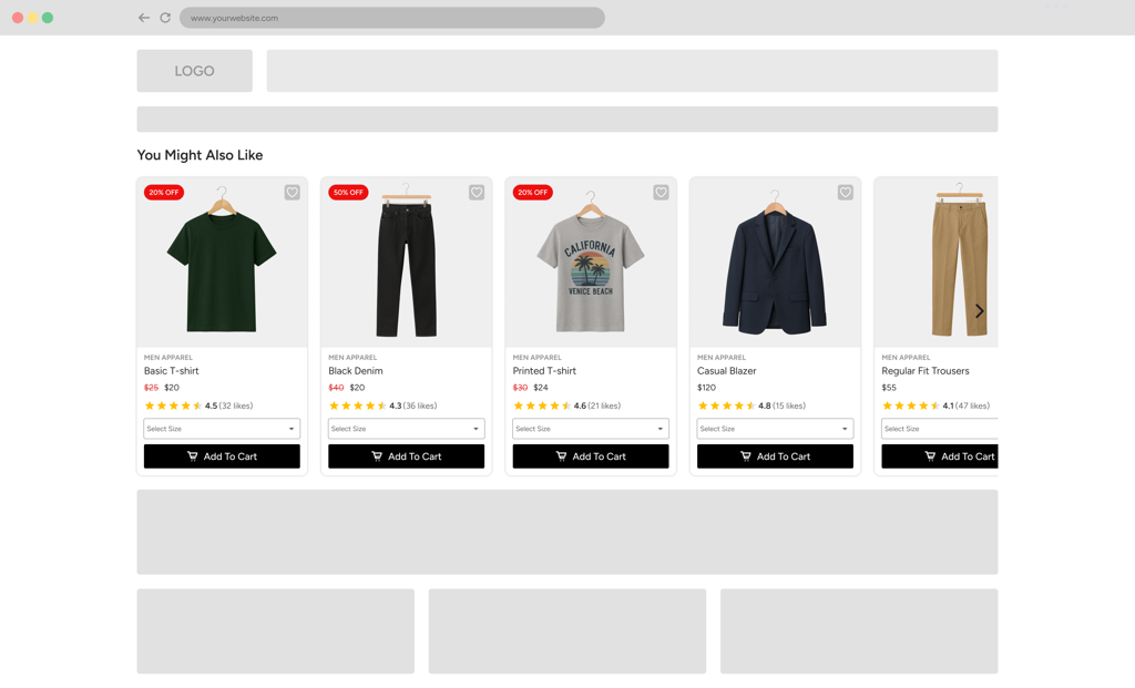
This format is ideal when you want recommendations to feel native and integrated within category pages, product pages, or content sections.
Overlay Carousel
An Overlay Carousel widget appears as a pop-up layer on top of the page content. It is designed to draw attention to recommended products and encourage immediate interaction.
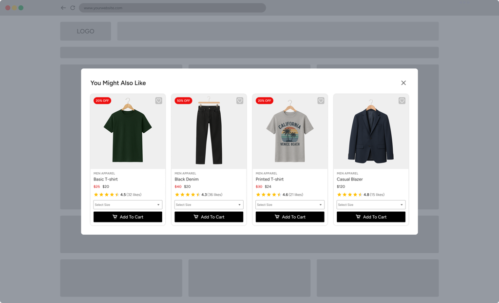
This format works well for highlighting promotions, cross-sell opportunities, or time-sensitive recommendations.
Custom Widget Templates
In addition to the predefined templates, you can also create and save custom widget templates using the Widget Design Editor. Custom templates allow you to:
Maintain consistent design across campaigns
Reuse layouts without redesigning from scratch
Apply brand-specific styling easily
All saved templates are available in the template selection panel, enabling quick access and efficient campaign setup across multiple use cases.
Product Card Elements
Product cards are the core building blocks of a recommendation widget. Each widget contains multiple product cards, and all cards share the same design to ensure visual consistency. Within a product card, you can configure multiple elements to highlight product information and guide users toward meaningful actions.
Below is an overview of the key elements that make up a product card and its surrounding structure.
Recommendation Carousel
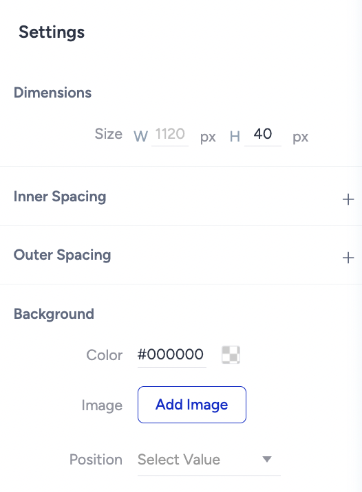
The Carousel is the main container of the recommendation widget. It consists of the header area and the scrolling carousel section, where product cards are displayed. At this level, you can control both the widget's visual appearance and its interaction behavior.
You can configure the following options:
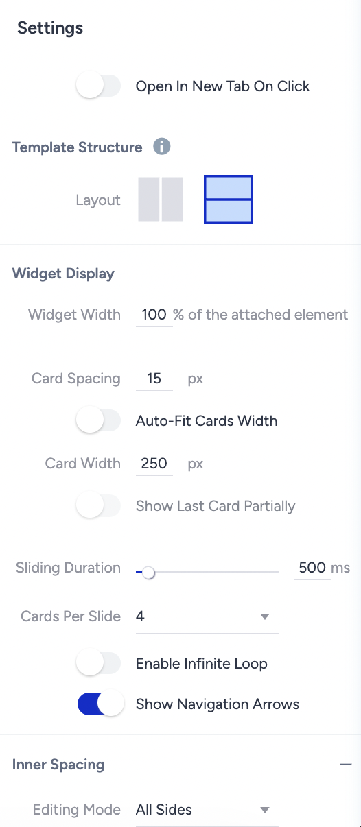
Open in New Tab on Click: Choose whether product clicks open in a new browser tab.
Template Structure: Define how the header and carousel sections are organized within the widget.
Widget Properties: Set overall widget padding, define spacing between product cards (in pixels), control the number of products displayed per view, and enable automatic fitting based on card size.
Sliding Settings: Adjust the sliding animation speed and the number of cards that move per slide.
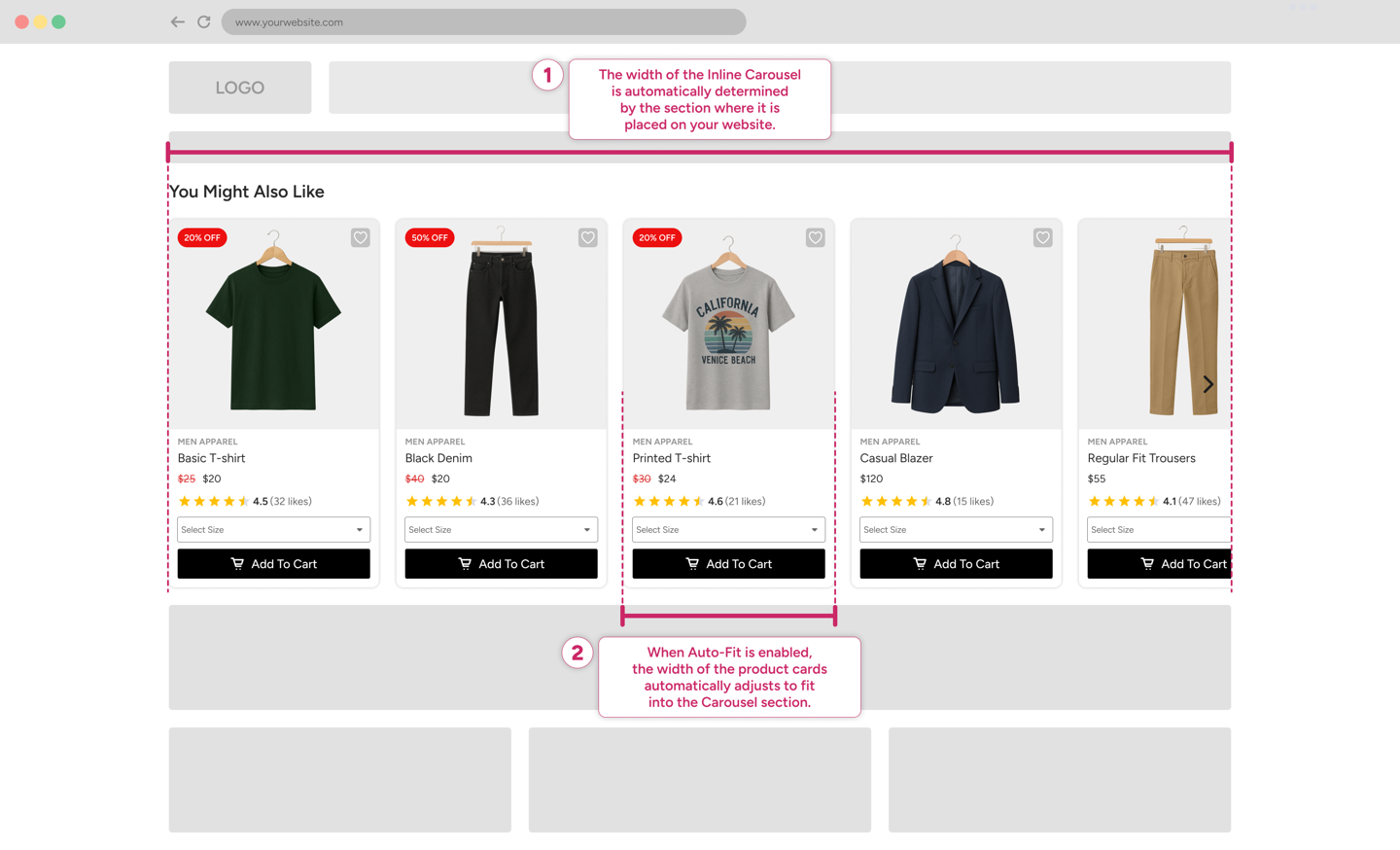
Size: The carousel size is automatically determined based on the reference element selected on your website.
Background: Add or modify the carousel background using a color or image.
Border: Customize border style, thickness, and color.
Animations: Select loading animations to enhance the widget’s visual experience.
These controls let you design a carousel that aligns with your brand while providing a smooth, engaging browsing experience.
Header Section
The Header appears at the top of the carousel and contains the widget’s title and subtitle. This section helps set context and guide users toward the recommended products.
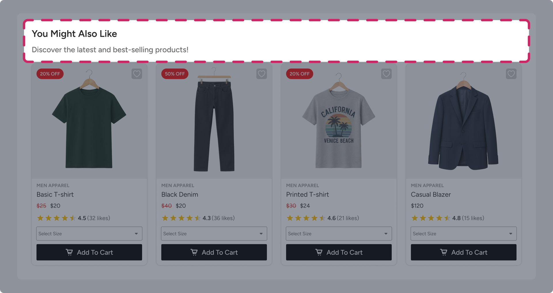
You can customize the Header Section by:
Adding a background color or image
Adjusting border styles
Editing the title and subtitle text
Both the title and subtitle can be selected from the Left Sidebar, where you can modify:
Font family and size
Text color
Alignment and spacing
This flexibility allows you to create clear, visually appealing headers that integrate seamlessly with your site design and improve widget discoverability.
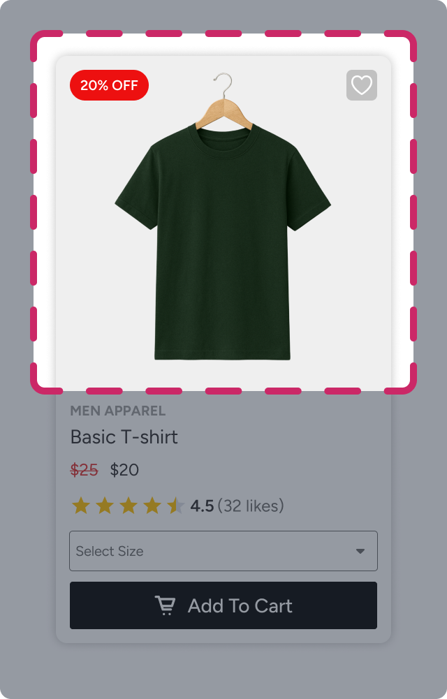
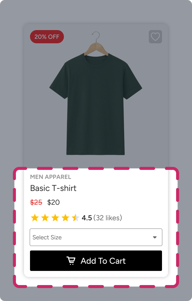
Product Card
Product cards are the foundation of recommendation carousels. Each carousel is composed of multiple product cards displayed in sequence. To maintain visual consistency, you only need to design one product card; this design is automatically applied to all products shown in the carousel.
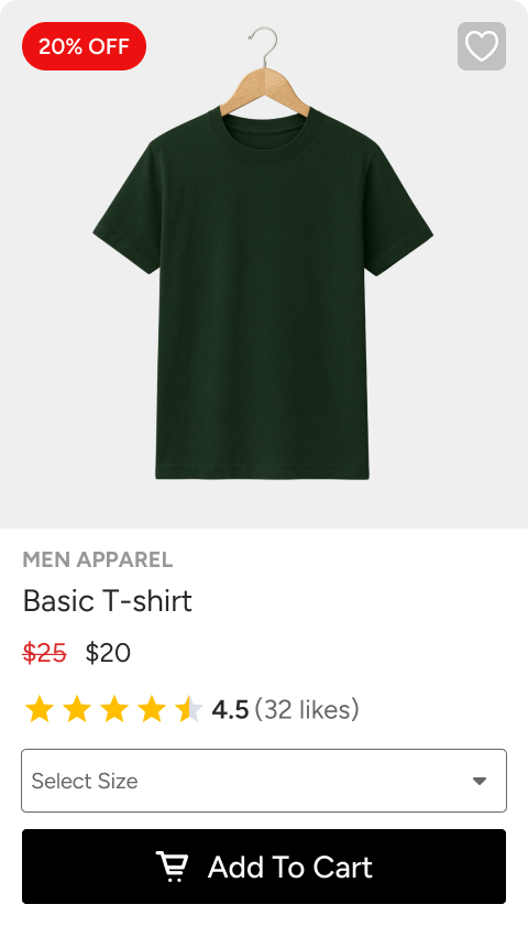
A product card is divided into two primary sections:
Image Section
The Image Section contains the product image and serves as the primary visual anchor of the product card.
You can customize the Image Section’s style properties, including:
Background color
Border style and thickness
Border radius
These settings help ensure that product images align with your brand’s visual guidelines and fit seamlessly within the card layout.
Details Section
The Details Section contains all remaining product-related elements, such as the product name and price, call-to-action buttons (for example, Add to Cart or Add to Wishlist), and interactive components, such as color or size selectors.
Similar to the Image Section, you can customize the Details Section’s appearance by adjusting:
Background color
Border style and radius
Background image and fit type
This section allows you to present both informational and interactive elements in a structured and visually appealing way.
Product Card Layouts
Within the Image and Details sections, you can add multiple elements using predefined layouts. Layouts act as ready-made containers that handle spacing and alignment automatically, allowing you to focus on content rather than manual positioning.
To add a layout to a product card:
Hover over the area of the card where you want to insert the layout.
Click the plus (+) button.
Select the number of elements you want in the layout.
Choose one of the available layout options.
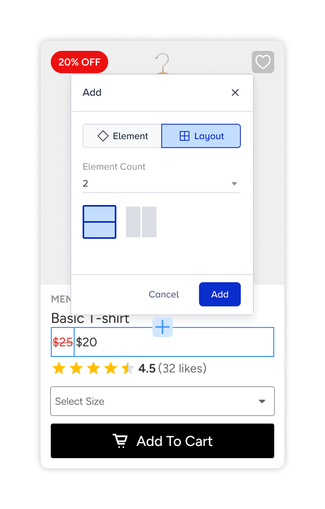
Once selected, the layout is added to the product card and is ready for further customization. Then, you can assign elements to each position by clicking on the Add Element buttons.
Product Card Elements
Product cards are the core building blocks of recommendation widgets. They present essential product information, such as images, prices, discounts, and actions, to attract user attention and encourage interaction.
In the Widget Design Editor, product information is added using configurable elements. Each element has its own set of properties. When you select an element from the Left Sidebar, its available settings appear in the Right Sidebar, where you can customize its appearance and behavior.
Below is an overview of the available product card elements.
Price Element
The Price element displays the product’s price information.
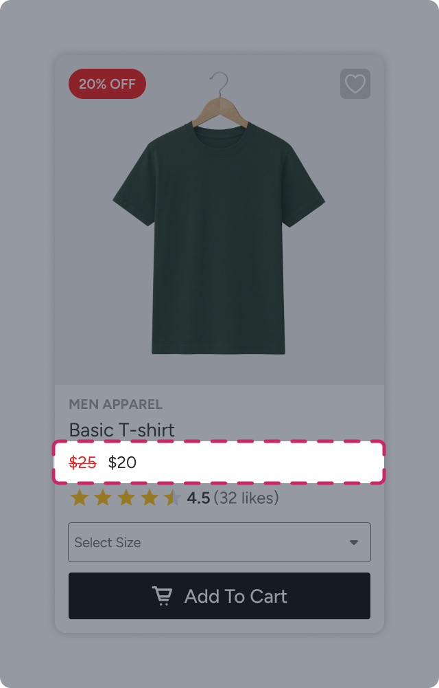
You can configure the element to:
Select which price attribute to display (for example, original price or sale price)
Adjust size and padding
Enable dynamic width to adapt automatically to the layout
Customize text properties such as font, color, and size
This element ensures pricing is clearly visible and aligned with your design standards.
Product Image Element
The Product Image element displays the recommended product’s image and acts as the primary visual anchor of the product card.
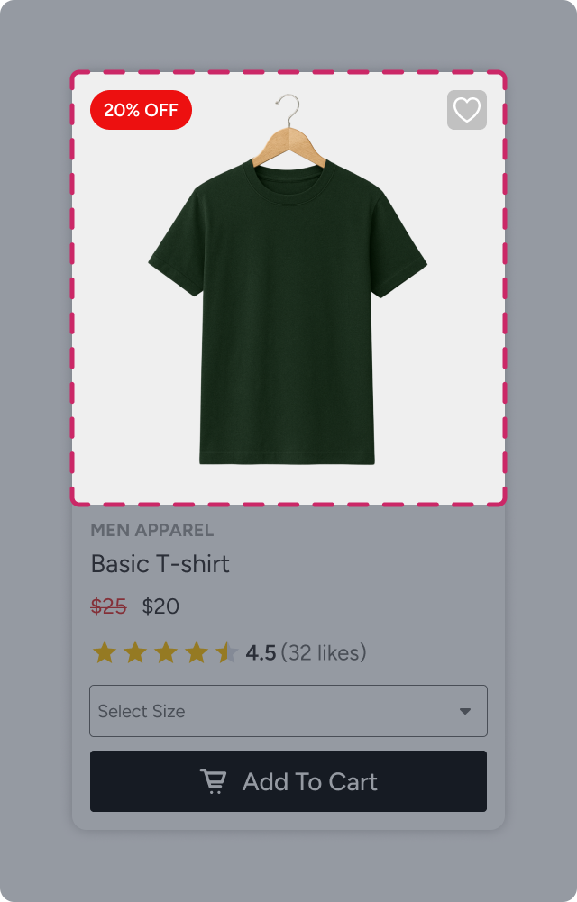
You can customize:
Image size and fit type
Margins and spacing
Borders and visual styling
Dynamic or CTA badges layered on top of the image
This element helps showcase products in a visually compelling way.
Dynamic Text Element
The Dynamic Text element allows you to display product attributes dynamically from the catalog, such as product name, discount rate, and category.
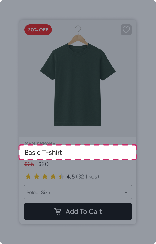
You can combine static text with dynamic attributes by inserting attributes via the Add Attribute option. Each product card then automatically renders the corresponding value.
Customization options include:
Size and padding
Font, color, and text size
Dynamic Badge Element
Dynamic Badges are styled text elements used to highlight key information, such as discounts or promotions.
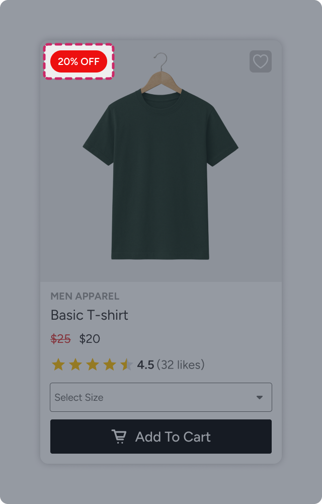
You can add Dynamic Badges to the product image (via Image element settings) and to the Details section (via the canvas plus icon).
Badges support:
Static or dynamic text
Positioning and padding
Background color or image
Text styling
Borders, shadows, and visual effects
Add to Cart Element
The Add to Cart element is a call-to-action that allows users to add products directly to their cart.
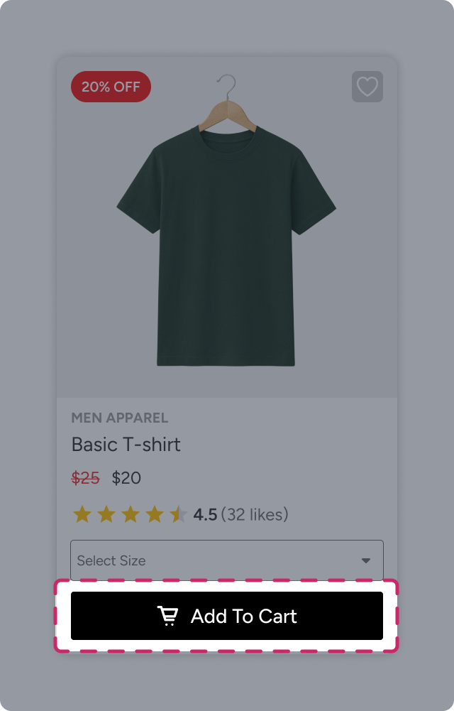
It can be displayed as an icon overlay on the product image or a button within the Details section.
Configuration options include:
Display mode and setup
Icon inclusion
Button text
Size, padding, background, text styling
Borders and shadows
Go to Product Element
The Go to Product element directs users to the product detail page.
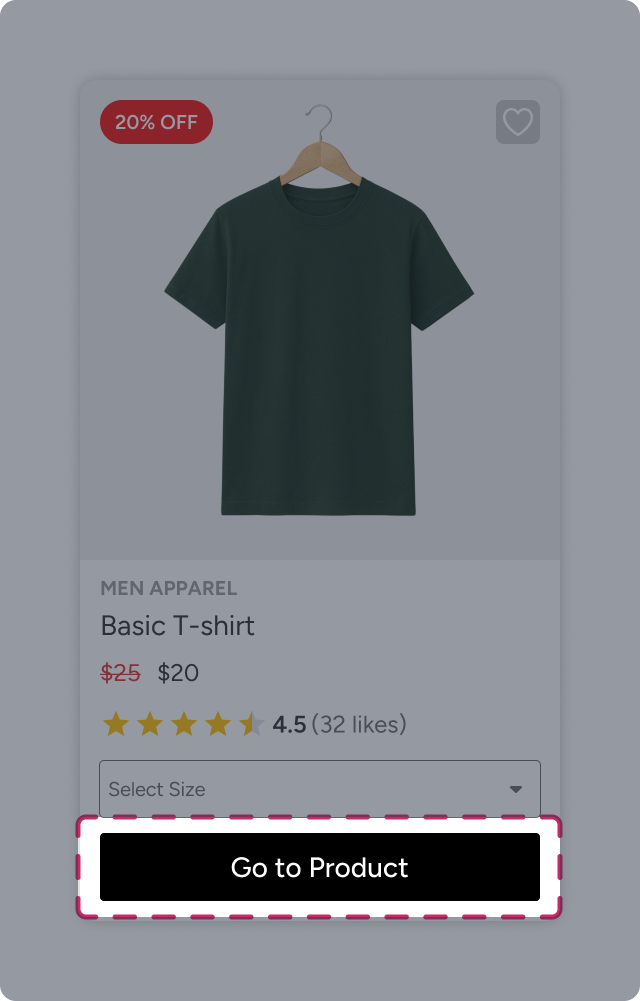
It can appear as an overlay icon on the product image or a button within the Details section.
You can configure:
Display behavior (Always or On Hover)
Icon or text-based presentation
Button text
Size, padding, background, borders, and shadows
Add to Wishlist Element
The Add to Wishlist element allows users to save products for later.
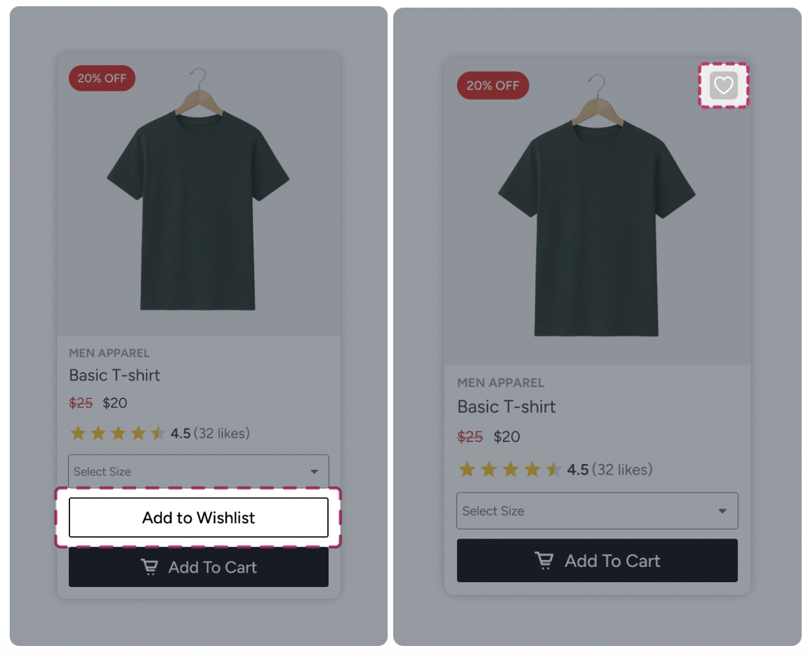
It supports:
Icon or button display
Always or On Hover visibility
Text-only, icon-only, or combined display
Full customization of size, padding, background, text, borders, and shadows
Rating Element
The Rating element displays product ratings using stars.
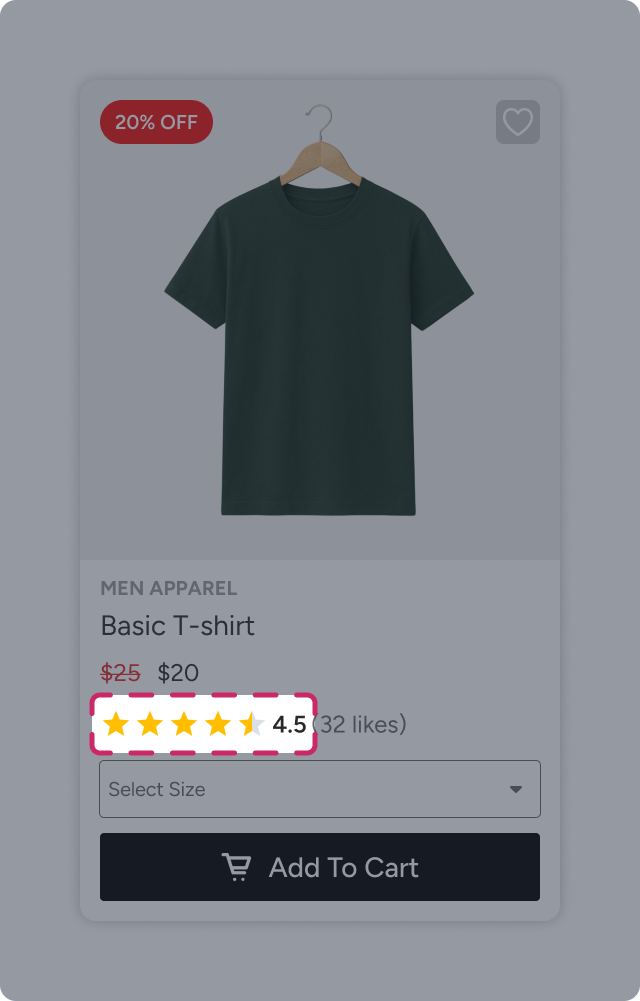
After adding the element, you can:
Select the catalog attribute representing ratings.
Define the maximum rating scale (5 or 10).
Choose rounding behavior (up or down).
Styling options include:
Size, padding, and alignment
Colors for filled and empty stars
Background, borders, and shadows
Dropdown Element
The Dropdown element allows users to select product variants directly from the product card, such as size, color, and package type.
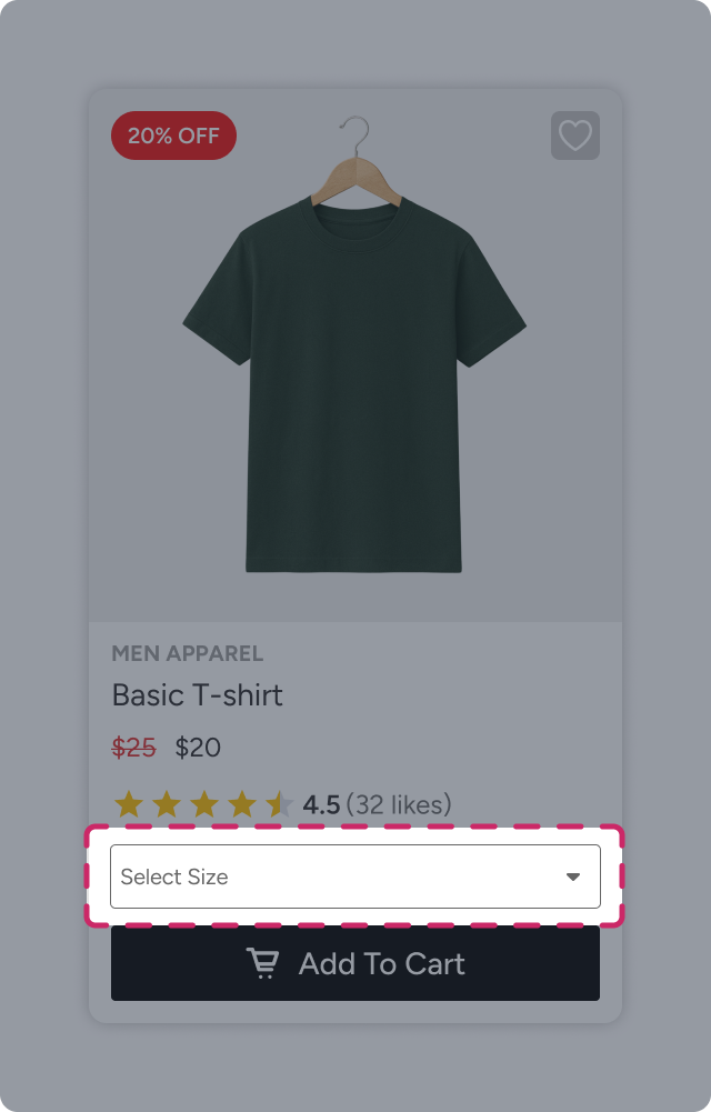
After selecting the related product attribute, you can customize:
Alignment, size, and padding
Background color
Text styling
Borders and shadows
How Product Card and Widget Size Work
Both the widget and the product cards within it have their own width and height behavior, which work together to define the final layout.
Widget Width
When you first add a widget to your website, its width is automatically inherited from the section or container where it is placed. This ensures the widget fits naturally within the page layout.
The product cards inside the widget automatically adapt to this available width, resizing themselves to fit evenly within the carousel.
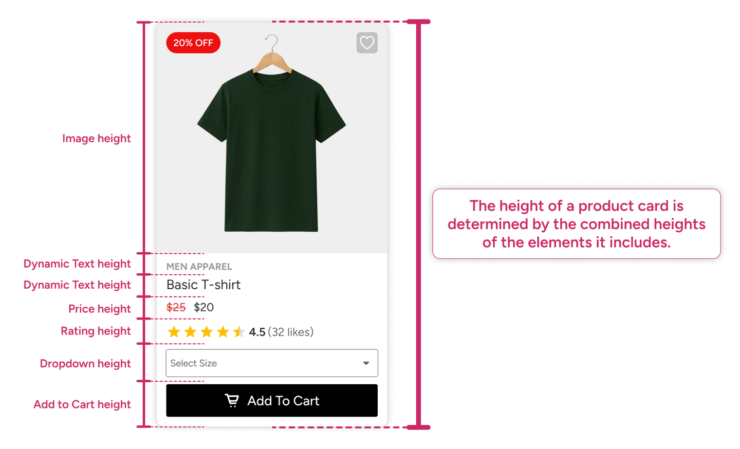
Product Card Height
The height of a product card is calculated dynamically based on the elements it contains. Each element, such as the product image, price, buttons, or badges, contributes to the card’s total height.
Once all elements are combined, their cumulative height defines the overall height of the product card. Because the widget displays a row of identical cards, this card height also determines the overall height of the widget.
This adaptive sizing ensures that widgets remain visually consistent while accommodating different content configurations.