The Mobile App Suite homepage provides general analytics metrics, such as Total Users and Opt-in Rate. 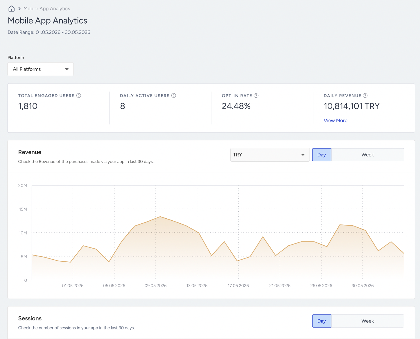
You can also see the same values in the Mobile App Card on InOne’s homepage, in line with the date range you selected.
Total Engaged Users
Total Engaged Users is the total number of your current App users who have your app on their devices and accessed it at least once in the last 365 days. Inactive users, including those who have uninstalled the app and/or haven't engaged in any sessions, are not included in this number.
Daily Active Users
Daily Active Users is the number of users who interacted with your Mobile App today. The data is presented according to your timezone and covers the period from 00:00 to 23:59.
Opt-in Rate
Opt-In Rate is the ratio of the Total Subscribers to the Total Engaged Users.
Revenue Today
Regardless of Mobile App campaigns, this number represents the revenue generated by the Mobile App in a day. The data is presented in your timezone, from 00:00 to 23:59. The initial revenue displayed is in the main currency. Hovering over the revenue also shows revenue in other currencies if applicable.
Revenue
This graph displays the revenue generated by the Mobile App over the last 30 days. When hovering over the revenue, users can view the revenue for specific days within the last 30 days.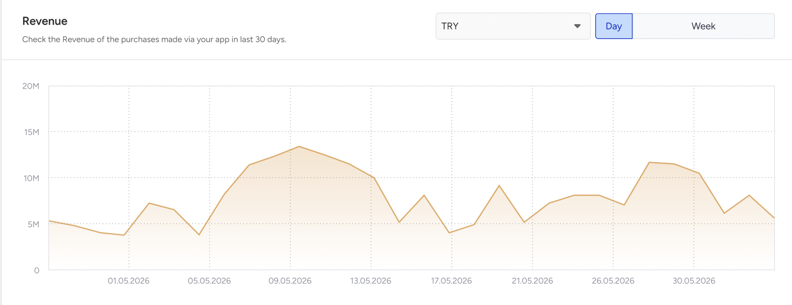
Sessions
This graph shows the number of sessions originating from the Mobile App over the days. When you hover over the revenue, you can view the session count for specific days in the last 30 days.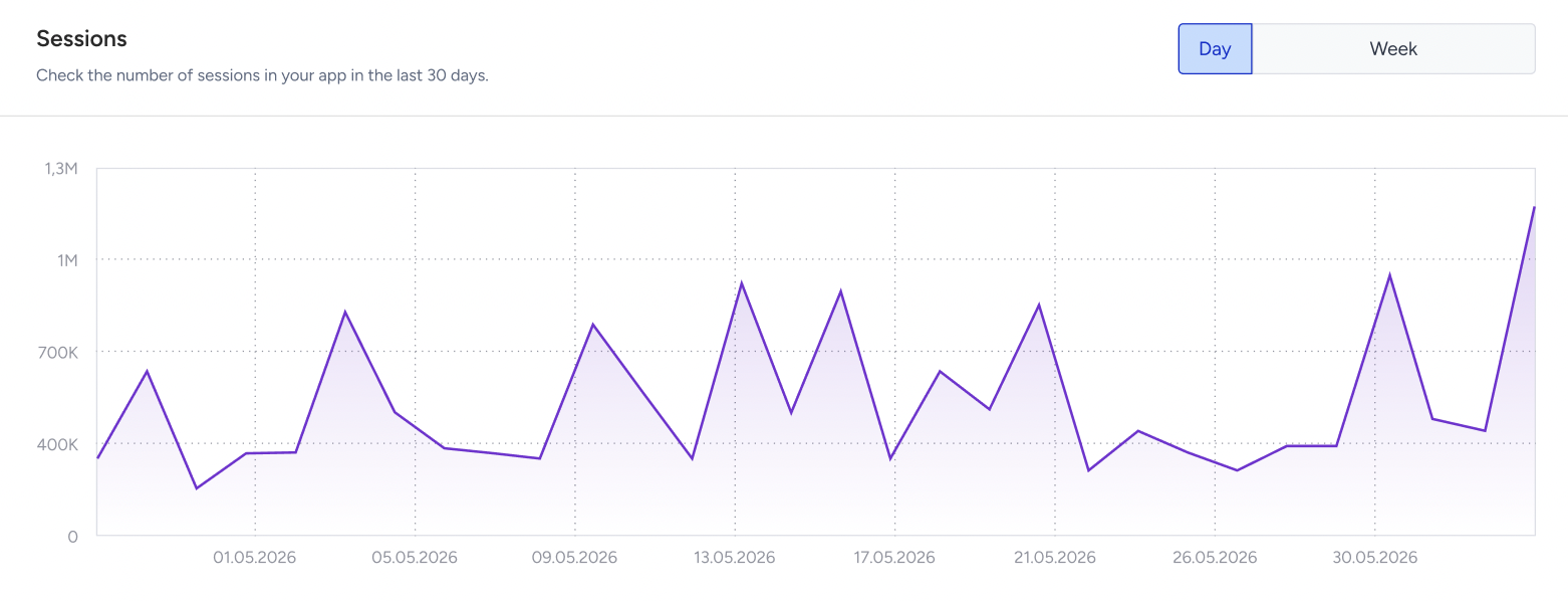
App Usage by Day and Hour
This heatmap shows the distribution of sessions across days and hours. The graph shows data from the past four weeks, with each segment shaded by session density. Darker squares indicate higher-density sessions, while lighter ones represent lower activity. The Legend on the right-hand side of the heatmap provides insights into session scales.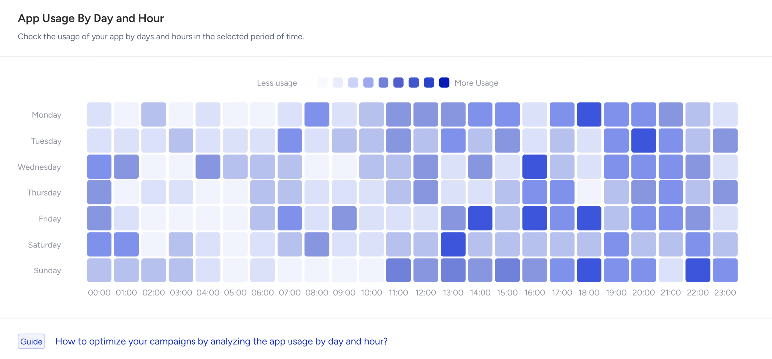
New User & Average Session Duration
These graphs show the number of new users and the average session duration over time.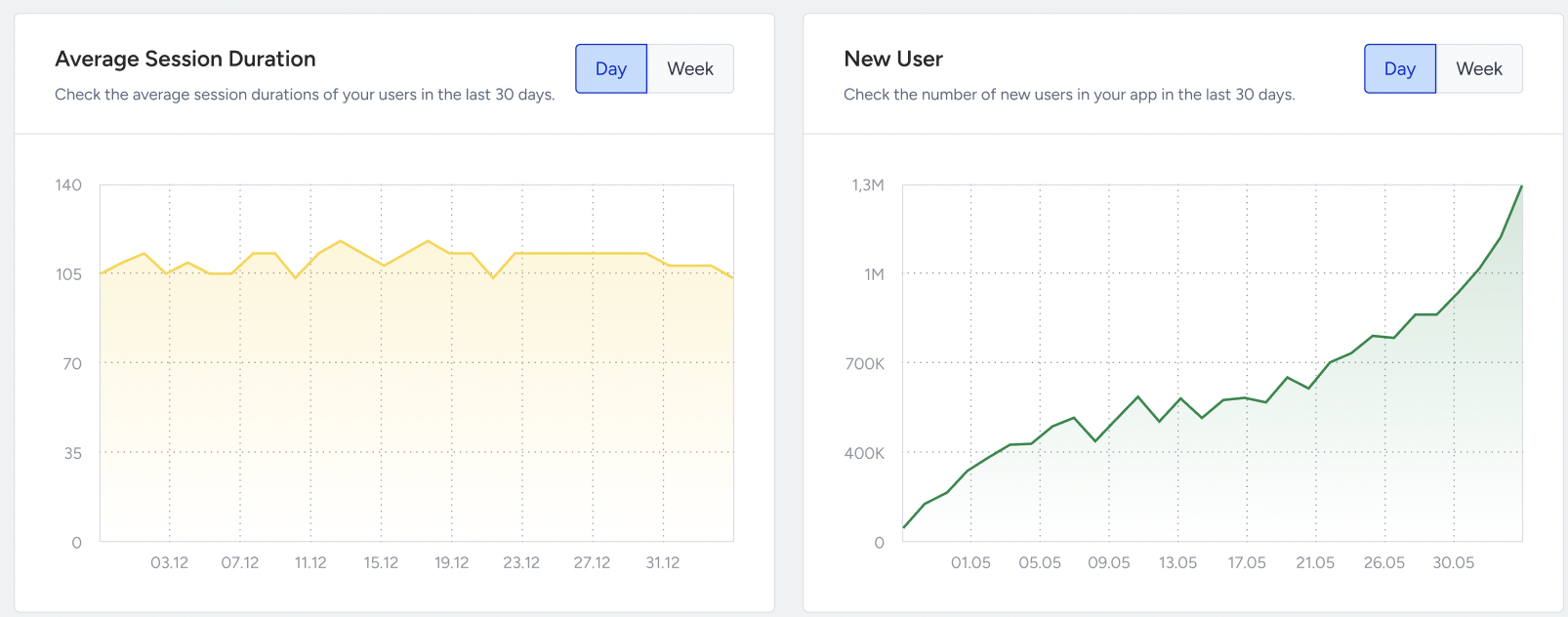
The count of new users represents users who initiate their first session within the app. These users had no previously recorded sessions on that specific day.
The average session duration is calculated by summing the total session durations throughout the day and dividing it by the total number of users who initiated a session on the same day. This value is displayed based on your time zone, which ranges from 00:00 to 23:59.
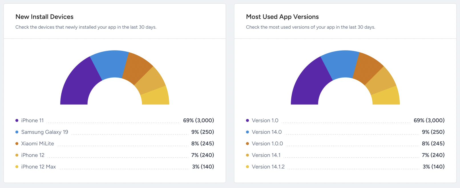
New Install Devices & Most Used App Versions
These two pie charts show the distribution of new install devices and most used mobile app versions over the last 30 days.
For instance, the charts show that the iPhone 11 was the most commonly used device during this 30-day period, showing that the majority of sessions in your Mobile App originate from it.