The Close Button is an important feature to maintain a seamless user experience during campaigns because it allows users to dismiss campaigns if they are not interested. As an essential component of the campaign content, you can customize it to achieve a more comprehensive design.
The Close Button settings are available only for Cross-platform and Enhanced templates.
To start customizing the Close Button, click on its element in the left menu.
Show after Delay
It determines when the Close Button becomes visible on the campaign, such as after a specified delay period, like 2 seconds.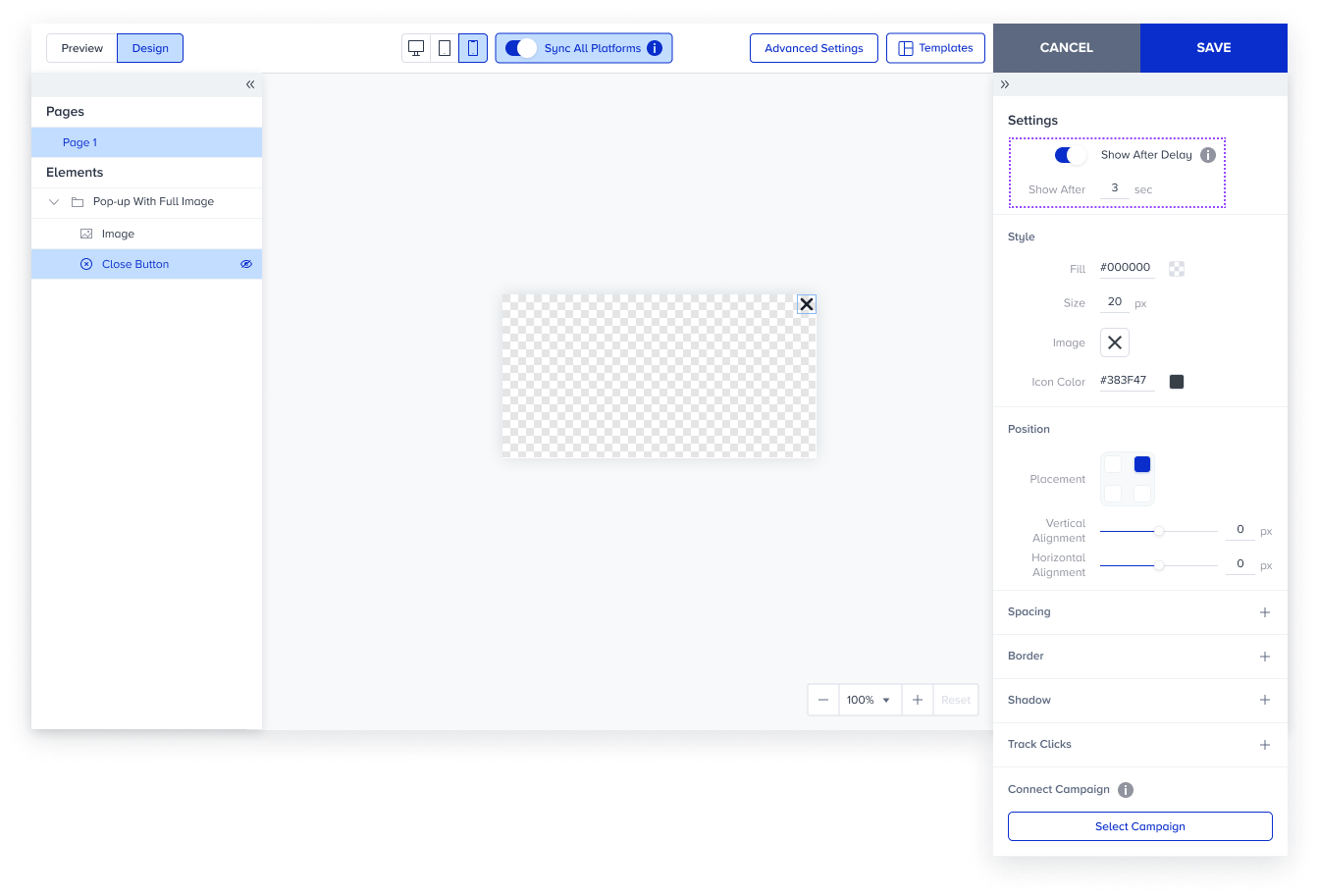
Style
You can customize the appearance of the Close Button, including its icon and background color. You can also upload a custom icon and adjust its size and icon color.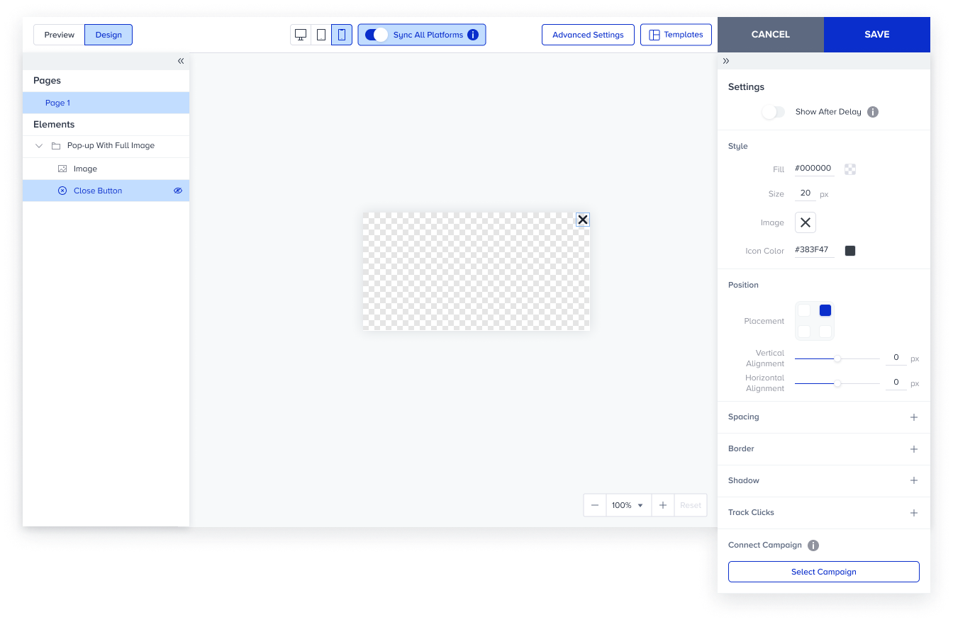
Fill: You can set a background color to the Close Button.
Size: You can change the size of the Close Button.
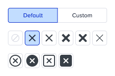
Image: You can select a default icon or upload your custom icon.
Icon Color: You can change the icon color for default icons.
Position
It provides flexibility in placing the Close Button within the campaign design.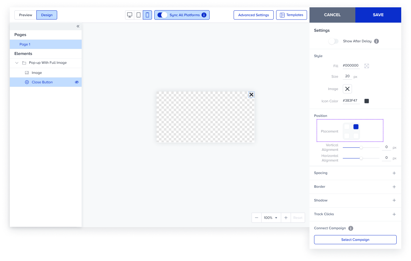
Placement: You can decide where you want to position the Close Button.
Vertical Alignment: You can move the Close Button up to ±50 px from the reference point.
Horizontal Alignment: You can move the Close Button up to ±50 px from the reference point.
For further configuration details, refer to Spacing Settings and Border Settings.