The important part of email design is the fonts. This article discusses the best options you can use in your emails to combine visual fidelity with eye-pleasing aesthetics.
While weight, height, width, color, shape, and spacing matter for the design, it is crucial to choose legible typography.
This article explains the following for you to choose the best professional font for your emails:
HTML email fonts: General rules to follow
You can consider three ground rules when choosing the best fonts for email:
Don’t use more than two email fonts at once
This is a fairly common practice not only in email design but also in web design and so on. If you use too many fonts, your email can seem very complicated in the best case and annoying in the worst. The best practice is to use only a font or two per email. In a perfect case, that’s enough to use only one perfect typography but different sizes: one to highlight the heading and another one for the rest of your content.
Use font styles carefully
As tempting as it may be to use font styles at every opportunity, your approach needs to be thoughtful. Each style should be used in moderation and in its own special cases, for example:
Bold style is best for highlighting Important phrases or keywords.
Italic style is used to emphasize quotes, foreign words, and titles (books, blogs, publications, etc.).
Underline is mainly used for links, as in the online space, it is difficult to distinguish a link from regular underlined text, which can cause confusion.
However, using Italics to highlight entire paragraphs of text will not only look unpresentable but also violate accessibility guidelines. The same applies to underlining. Therefore, we strongly recommend that you do not underline your copy, but use bold instead for email accessibility.
Stick to accessibility requirements when choosing fonts
Accessibility has its own requirements that must be adhered to. Read more about accessibility rules.
Pay close attention to the legibility of the chosen font
Legibility is the ability to distinguish one letter from another. Of course, legible body text is better and faster to read.
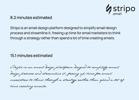
The experiment about font legibility was conducted by Norbert Schwarz and Hyunjin Song in 2010. The results were impressive. You spend almost twice as much time reading italic font styles and decorative fonts compared to regular ones.
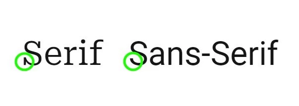
Which email font to choose: a Serif or a Sans Serif font?
Serif fonts are those with a small line at the end of each character. The most popular serif fonts are Times New Roman and Georgia.
Sans-serif fonts don’t have a decorative line at the end of every symbol. The most popular sans-serif safe fonts are Arial, Trebuchet MS, and Helvetica.
Assuming emails are viewed only online on desktop or mobile screens, the best fonts are sans serif. It’s easier to read sans-serif characters on the screen.
Email-safe fonts
The following 10 fonts can render in users’ inboxes as planned:
1. Arial email font
This font, designed back in 1982, is packaged with all versions of Microsoft, starting from Windows 3 and Apple Mac OS X. It is displayed by all email clients. Due to its terminal diagonal cuts, it looks less mechanical than other sans serifs.
2. Helvetica email font
A sans-serif typeface, one of the most widely used fonts, has rounded letters and wide capitals. Designed in 1957.
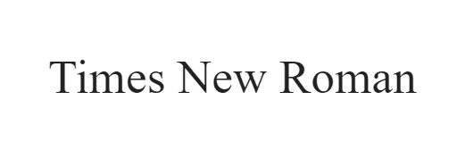
3. Times New Roman email font
This perfect font has tall, lowercase letters, slightly condensed, short descenders and ascenders. Commissioned by “The Times” in 1931. This is one of the favorite fonts from the sans-serif font families of many internet users and web designers.
4. Verdana email font
It was designed to be readable on low-resolution screens. Its main feature is tall and wide lowercase characters.

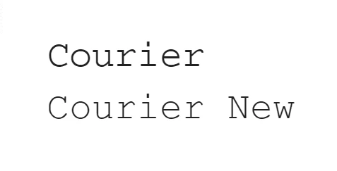
5. Courier/Courier New email font
Courier was designed in 1955 and adjusted to be a monospaced font. Courier New has heavier dots and commas than the original Courier. Courier is the standard modern font used for screenwriting in the film industry.
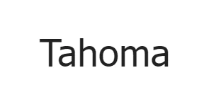
6. Tahoma email font
It is similar to Verdana yet has narrower letters, small counters, and tight letter spacing. Used as the default screen font for Windows 95, 2000, and XP versions.
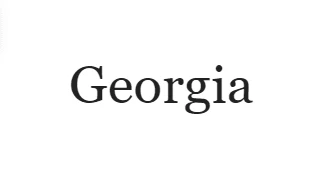
7. Georgia email font
It has tall lower-case strokers that are thicker than average ones; its numerals blend seamlessly with the text due to their similar size.
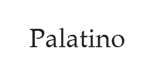
8. Palatino email font
This perfect font was originally designed for headings, advertisements, and printing. Wider than other old-style serif fonts and perfectly suits logo design.
9. Trebuchet MS email font
Has shortened tails for some letters; in bold, its letters are pointy rather than rounded, and rounded dots in uppercase and lowercase letters. Released in 1996.

10. Geneva email font
This is a redesigned version of Helvetica. Its main distinction is that it has a basic set of ligatures.

These email-friendly fonts are said to be among the most readable and among the best for email design.
Where to get email-safe fonts?
The great thing about the secure email-safe font style is that every subscriber's email client already supports them.
What is the best font to use for emails?
It depends on the language you're speaking. As a result, preferences vary from country to country due to language features.
Helvetica is one of the most popular fonts used by 25% of people for design purposes. Times New Roman takes 2nd place.
Another example is the German language. Verdana is not recommended for German texts because the final quotation marks are displayed upside down. This was fixed only in the Verdana Pro font.
To choose the most legible sans serif font, in your opinion, according to your alphabet features, you may test all the sans serif fonts as we did.

Use of custom fonts in emails
You might want or need to use a custom font for your emails, either to stay brand-consistent or to make your emails look more festive for a special occasion.
Given that some custom fonts, depending on the email client, may be rendered as is or replaced with the default font, we strongly recommend that you preview these emails across multiple environments. You can do it with our embedded testing tool.
Here are the default typefaces for email clients:
iCloud Mail uses Helvetica as a default font
Gmail adopts the Arial font
Microsoft Outlook, one of the oldest versions, often uses Calibri font.
Email font design practices
Below are different email font design practices you should consider when choosing fonts for your emails.
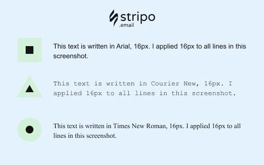
The size of the email fonts matters
Quite often, different fonts have different symbol heights. As a result, the same 16px font will look different depending on the chosen font family.
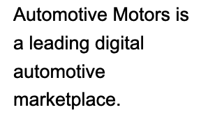
Line spacing for email fonts
Line spacing is the vertical distance between lines. It is measured as the percentage of the letter size. You can set the desired spacing for your emails just in the tabs and sections where you've just set your sizes.
According to Email accessibility guidelines, the best line spacing varies between 150% and 200%.
Email fonts over banners
Since the text over a banner is part of an image, it will render the same across all email clients. And it is expected to be festive enough. So you may choose any.
Please be advised that it’s better to choose a legible font style.

Email font color
You should follow only two rules:
1. Keep the number of colors to a minimum
We recommend using the font colors from your brand guidelines. If you want to highlight a sentence, a phrase, or a link, just use bold. In most cases, using too many colors is ambiguous. But keep in mind that this advice is our subjective opinion.
2. Use contrast colors
If you intend to use different colors, use contrasting colors to make your copy legible for color-blind people. Be sure to check if they are contrasting enough with the following tools:
Accessible colors to check the color contrast of the email body (copy and other elements, excluding imagery),
Coblis, color blindness simulator — it checks whether your images are accessible for color-blind people.
Accessibility guidelines for email fonts and email copy as such
In a nutshell, you should consider these guidelines for several reasons:
To enable color-blind people to read your emails and implement the needed colors in your email design project.
To enable people with visual impairments to listen to your emails with screen readers.
To enable your users who are extremely busy to check their emails while driving or cooking and ask Siri to “read” their incoming messages.
To enable dyslectics to read your emails, as many of the people who suffer from dyslexia are not aware of it, but reading unadapted texts is quite unbearable to them.
Keep your email design to a maximum of two sans-serif fonts.
So, the guidelines to make your email text accessible:
Consider color contrast.
Make your texts left-aligned for easier perception of email copy by dyslectics — avoid center-aligned texts.
Always add punctuation marks at the end of every bullet point.
Keep font size 14 pixels or more.
Do not underline texts.
Avoid Italic. If you need to highlight any part of your text, use only bold type!
Do not use all caps!
Consider legible fonts for your emails.
Use not more than two fonts.
Combine different fonts with thick and thin strokes.
Considering all the above, we can say there are no professional fonts that are legible and look nice across all kinds of devices. You always have to choose between sans-serif fonts.
Apart from choosing the right email font, you need to make our emails accessible by sticking to the guidelines mentioned above.