Fonts are essential to any design, whether print, web, or email. Whether designing or developing emails, you need to understand what you can and can’t do with fonts. Otherwise, you could face the worst-case scenario: Your email—which you spent hours crafting—is unreadable.
Let’s look at the basics of fonts in email and progressively enhance your email designs where possible.

Font color
Choosing the right font will help you set the characteristics of your branding, while the color will help your message stand out and add to its uniqueness.
When choosing your font color, ensure there is enough contrast between the font and the background color so it is easy to read. The Web Content Accessibility Group (WCAG) has set up guidelines for contrast ratios to ensure your email (or website) is accessible and readable for users with visual impairments.
If you use fonts on background images, remember to include a thoughtful fallback background color. Although a few email clients cannot show background images, the image may take longer to load, and you don’t want the user to miss out on the message.
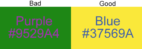
Tip: Black (#000000) on white (#FFFFFF) is quite harsh, but changing black to #000001 will soften the color combination and make it easier to look at.
Web fonts in email
Selecting a web-safe font that is already available on your recipient’s device or computer will ensure your email looks exactly like your original design. It’s also the safest way to ensure your email looks as intended to the broadest audience possible.
Check out the CSS font stack for stats on the percentage of users with a given font available on their device.
If you are looking for a sans-serif font that almost 100% of users have access to Mac or Windows, Arial, Verdana, and Tahoma are safe fonts to go with. Helvetica is available on all Apple devices.
If you are looking for serif fonts that almost 100% of users have access to Mac or Windows, Times New Roman and Georgia are safe choices.
Web-safe fonts
- Arial
- Verdana
- Georgia
- Times New Roman
- Courier
Fallbacks for different ISPs:
- Apple Mail = Helvetica
- Gmail = Arial
- Microsoft Outlook = Calibri
Font stacks in email
Using a specific font in your email sets a style for your entire communication. You can select the font in the email header or as an inline style by declaring the CSS attribute font family and following it in order of preference regarding your font choices.
A sans-serif inline style font stack could look like this:
style=”font-family: Helvetica, Arial, sans-serif;”

In this case, if a user opens the email on an Apple device, they will see the text in Helvetica, whereas a Windows user who does not have Helvetica will see Arial. If Helvetica and Arial are not available on the user's device, they will see any sans-serif font that is available on their device.
Custom fonts in email
If your brand must use a font that isn’t web-safe, there are still ways to include it in your email marketing. It may happen if your brand has a commissioned font or has found one that fits their brand guidelines perfectly, but isn’t web-safe.
Web fonts are now widely supported by 50% of top email clients. When choosing a font for your emails, keep your target audience in mind.
Web fonts in Gmail
Gmail officially supports only one web font: "Roboto".
Web fonts in Outlook 2007/10/13
As usual, Outlook 2007/10/13 doesn't play ball. When you include a special web font in the font family, it will revert it to Times New Roman, whether you have specified a fallback or not.