This guide aims to explain how you can integrate Web Messenger into your flows.
To integrate Web Messenger,
1. Go to the MindBehind platform.
2. Click the Companies icon in the navigation panel. Select the company to which your assistant belongs..png)
3. Go to the “Channels” tab and click the Connect button for Web Messenger.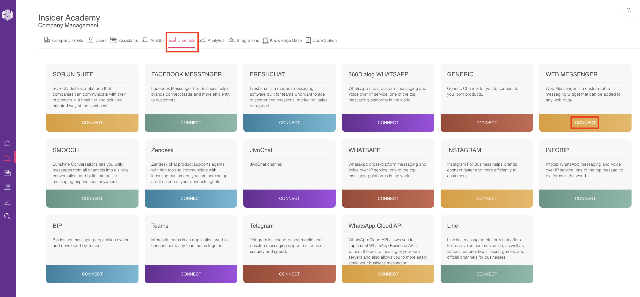
4. Fill in the name field and click the Connect button. You will see the channel you created recently.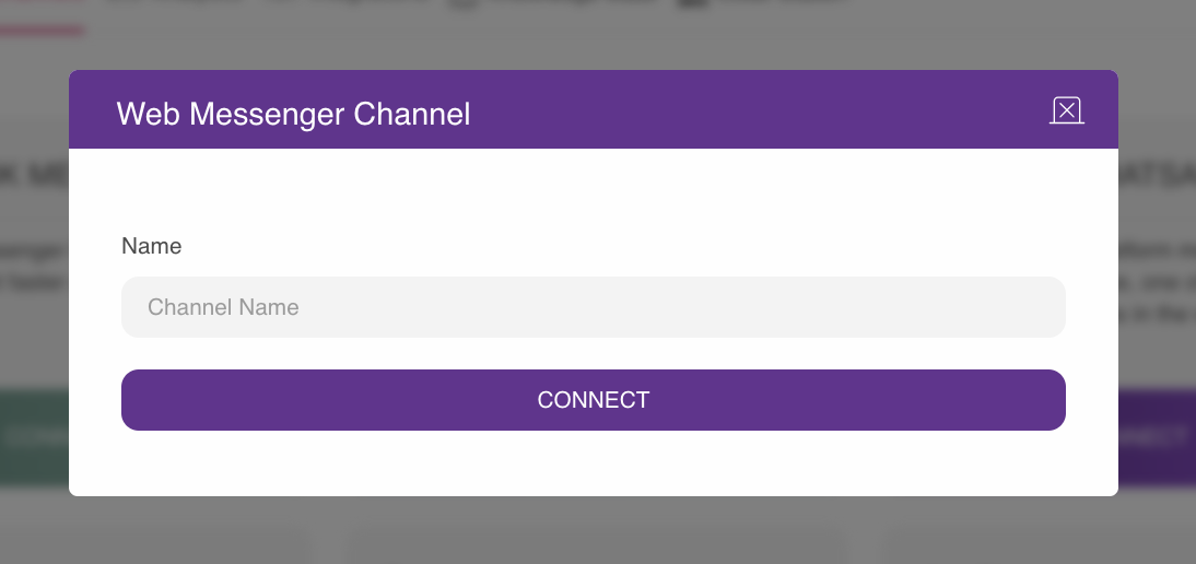
5. Click the “Assistants” icon in the navigation panel to go to your assistant. Click the View Assistant button for your assistant. 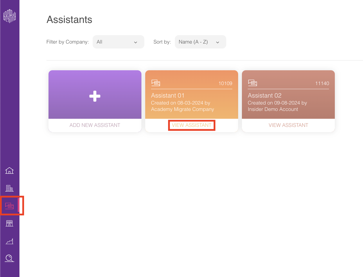
6. In your assistant, click the Publish button on the top right corner. 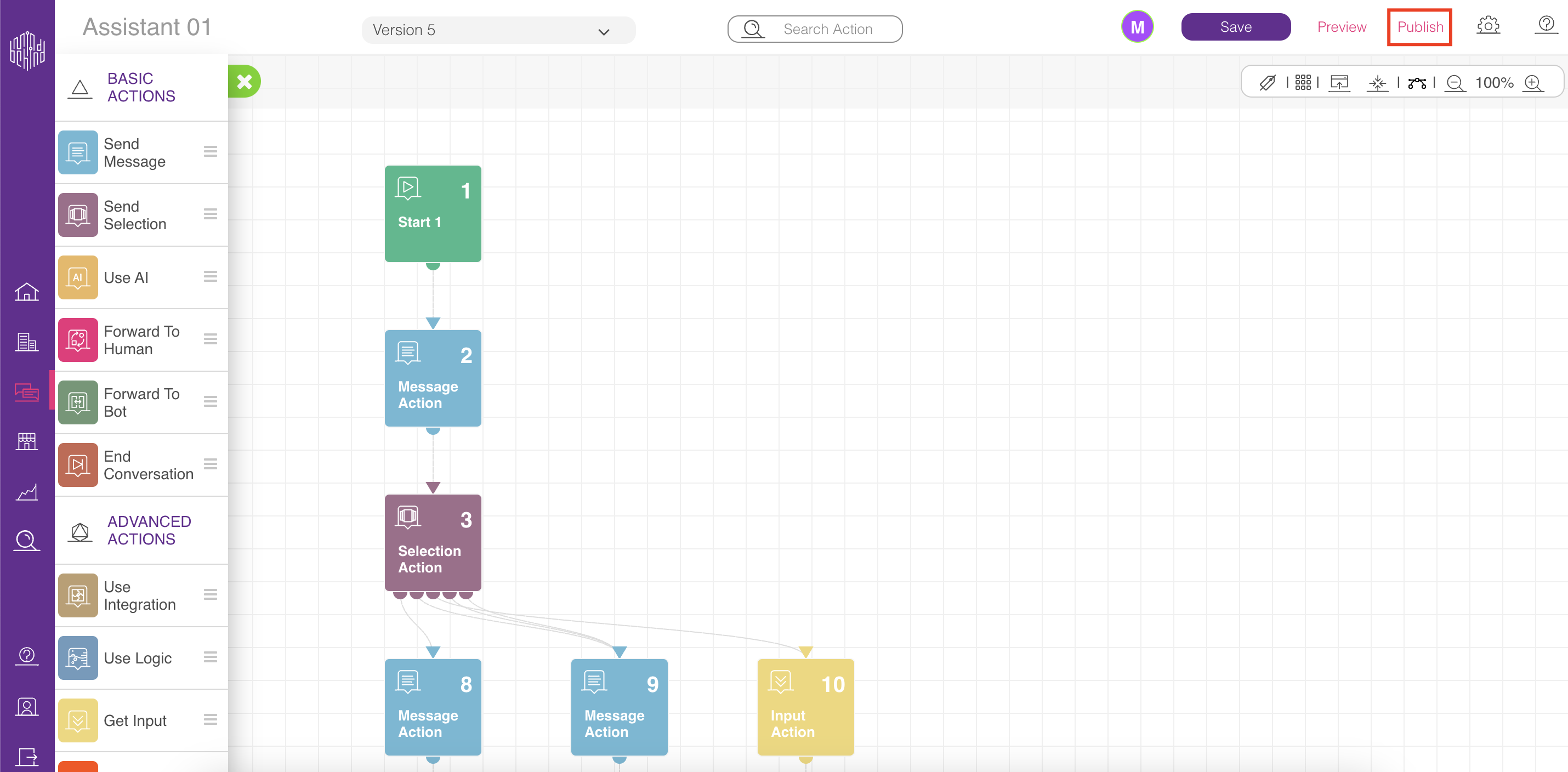
7. In the Deployments tab, to create a new deployment, click the Add Deployment button, or you can update your already live deployment. Select the Web Messenger name that you created, choose a proper Web Messenger channel (you may have many), and choose the right version of your assistant. Assistant versions are the recently saved versions of your assistant. To publish, click the Publish button. Now, you can preview your chatbot from the Channels tab.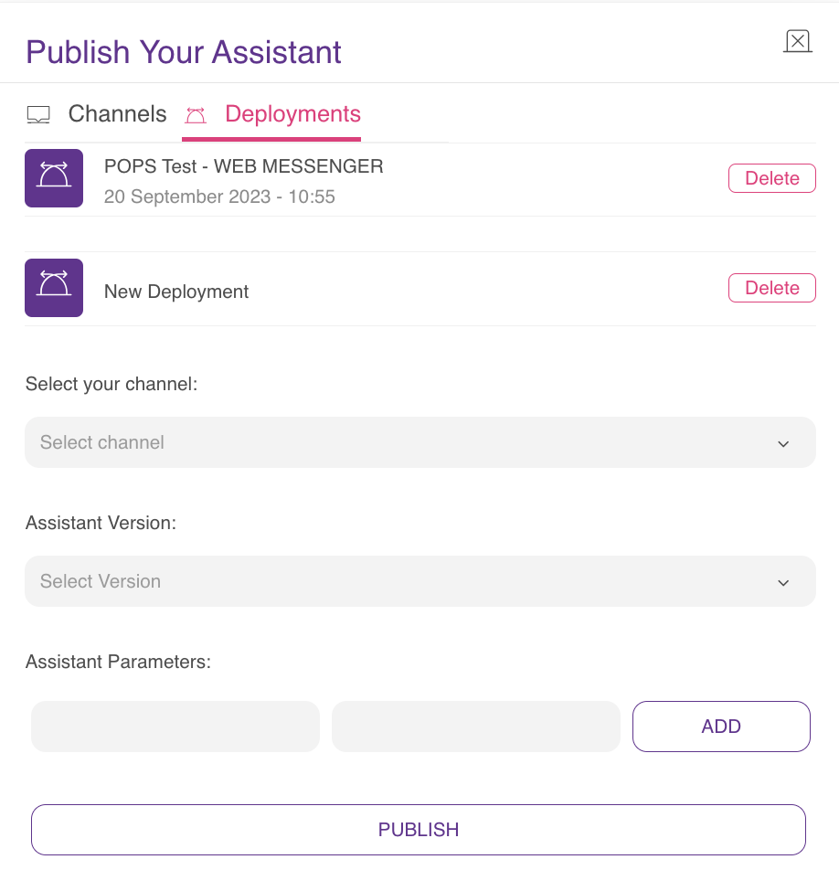
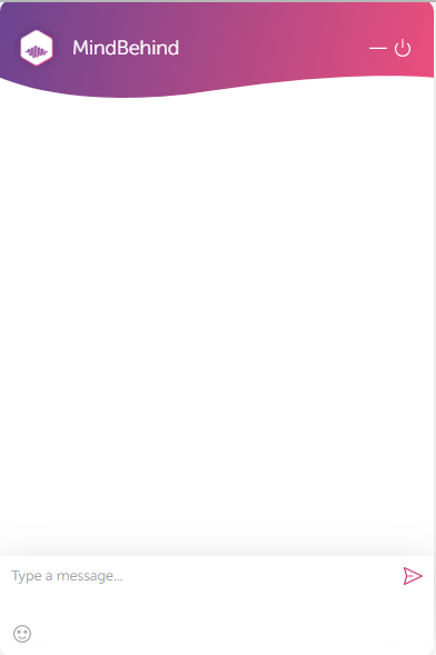
You can see the default design features of the Web Messenger below:
- Web Widget Icon:
.png)
- Company Logo:

- Company Name: MindBehind
- Design features of the Messenger:
8. To customize your Web Messenger, you can follow the first three steps you did before and click the Update icon.
9. Fill in the following fields on the Design tab:
- Background: You can upload the background image for the conversation.
- Web Widget Icon: You can choose your widget icon.
- Button Width and Button Height: You can use them to set the button dimensions.
- Brand Start Color: You can use it in the messenger header, buttons, and media messages. This is the left-side gradient color (purple by default).
- Brand End Color: You can use it in the messenger header, buttons, and media messages. This is the right-side gradient color (peach shade by default).
- Conversation Color: You can use it for customer messages, quick replies, and actions in the footer (The default conversation color is black).
Position-related fields are for updating positioning properties. 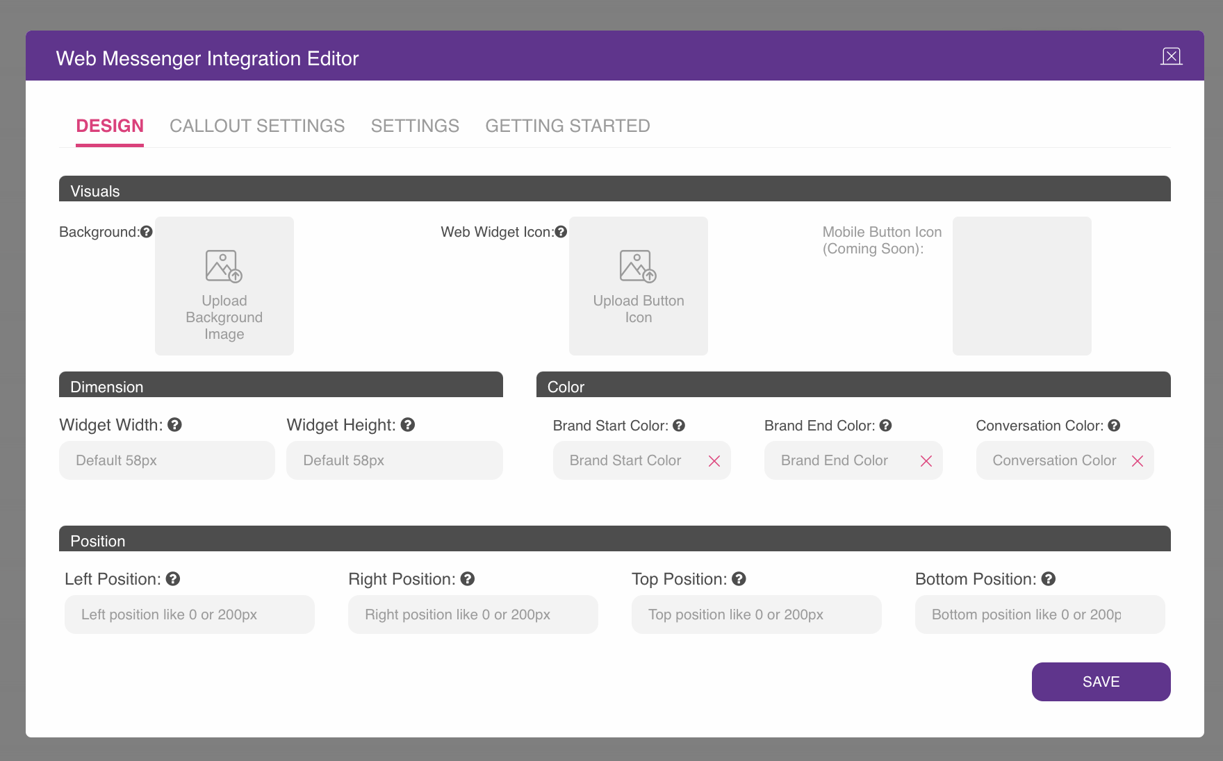
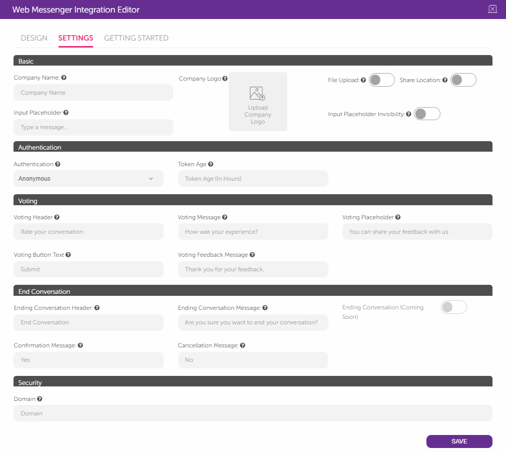
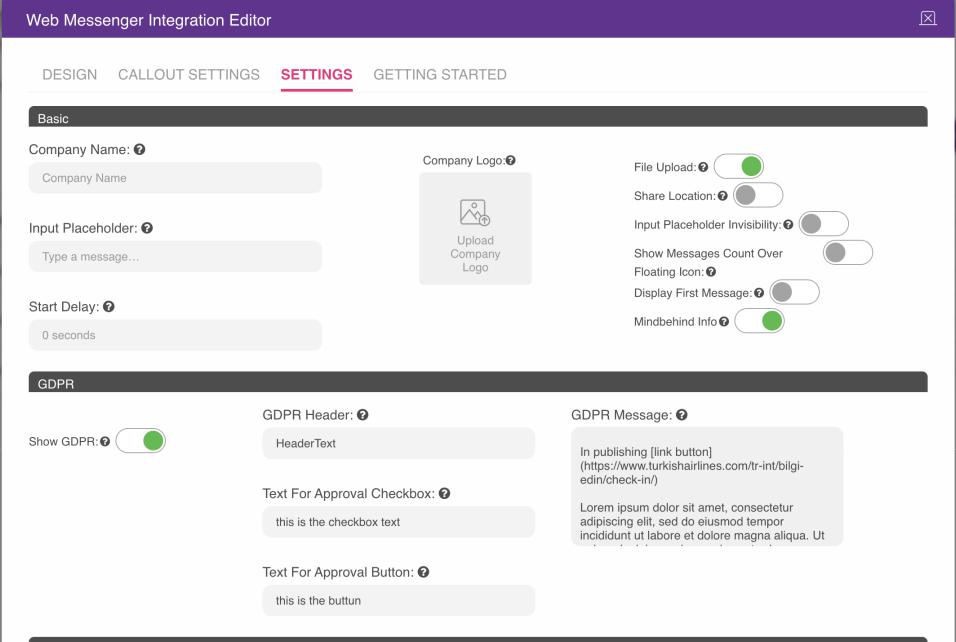
10. You can also fill in the related fields under the Settings tab to continue to customize.
You can see how you can fill in these fields below:
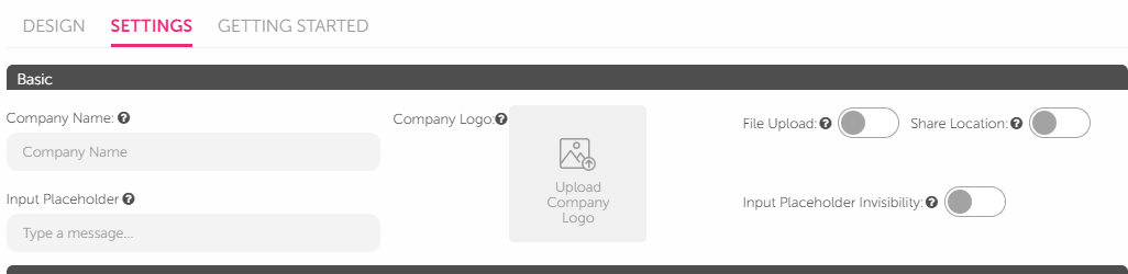
- Company Name: You can set a new company name.
- Company Logo: You can upload the logo of the brand that will appear on the icon used to open Web Messenger and on the Web Messenger widget window.
- Input Placeholder: You can choose the input placeholder text. (Input placeholder text is "Type a message" by default.)
- Input Placeholder Invisibility toggle: You can enable the input placeholder invisibility. This property can be selected for only the selection module actions: "quick reply" and "card".
Enabled input placeholder invisibility: 
- Share Location toggle: You can enable the status of location sharing.
- File Upload toggle: You can enable it for the file upload menu item.
Enabled location share and file upload are placed under the input placeholder: 
For authentication, three options are available: Anonymous, One-time password, and Token. You should set it according to your preference.
- For the Anonymous option, the messenger can start directly without any requirements.
- When the Token option is selected, “Token Age” should be set in terms of hours.
- When the One-time password option is selected, the password-related fields are shown.
Description fields are used to set the customized texts for the related description fields.
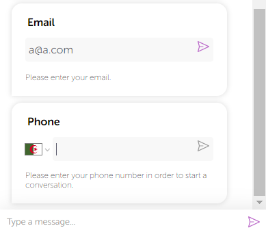
- Preferred Country: You can use it to set a predefined country code for the user log-in process.
- Name Status and Email Status toggles: You can use them to enable or disable the name and email requirements for the user log-in process.
For instance, if you set the preferred country as Algeria and enable the file, location, and input toggles, it will look like the image below: 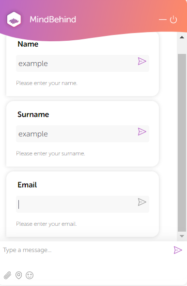
- Endpoint fields are used to set up a customized SMS provider.
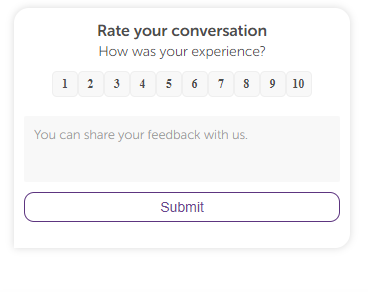
- Voting Header: You can use it to select the voting message header text. (The default voting header text is "Rate your conversation")
- Voting Placeholder: You can use it to select the voting message placeholder text. (The default voting placeholder text is " You can share your feedback with us.")
- Voting Message: You can use it to select the voting message text. (The default voting message text is "How was your experience?")
- Voting Button Text: You can use it to select the voting button text. (The default voting button text is "Submit")
- Ending Conversation Header: You can choose the ending conversation dialog header. (The default ending conversation header text is "End Conversation")
- Ending Conversation Message: You can choose the ending conversation message. (The default ending conversation message text is "Are you sure you want to end your conversation?")
- Confirmation Message and Cancellation Message: You can set a confirmation or cancellation message. (Confirmation message text is "Yes" and cancellation message text is "No" by default.) The ending conversation function will be activated in the future.
- Domain: You can set the location where the widget will work. It is deployed in MindBehind WebChat by default.
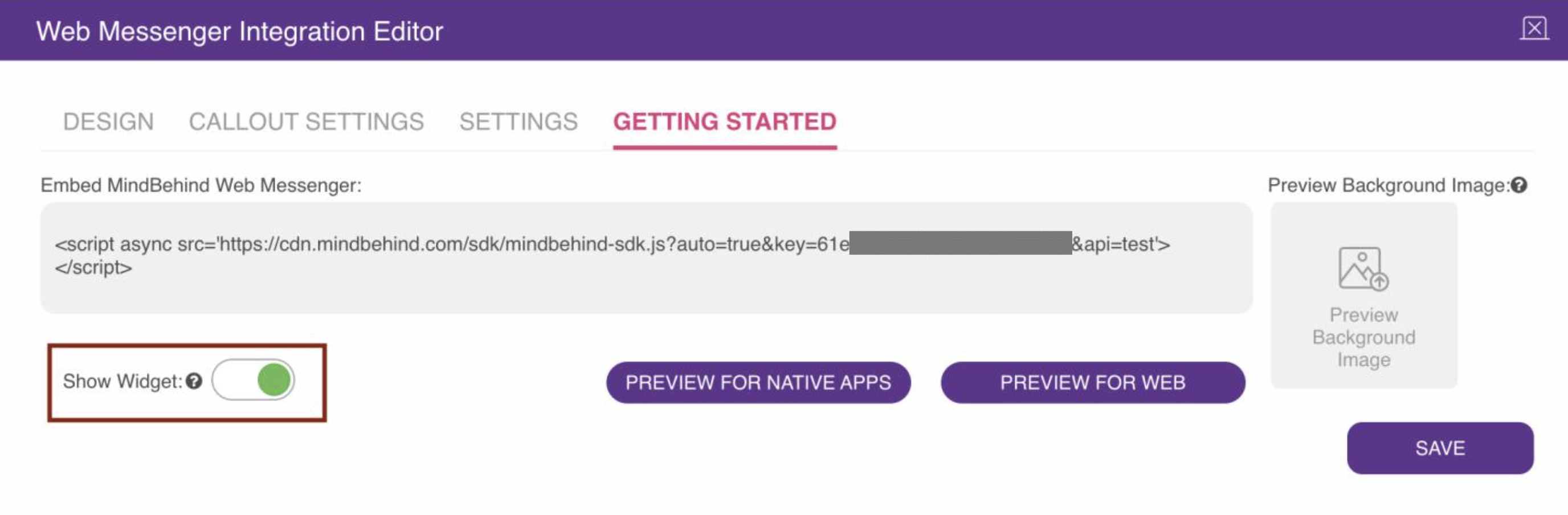
11. To preview the Web Messenger channel, click the Preview button under the “Getting Started" tab. To use the Web Messenger widget inside your website, you should copy the script and paste it before the closing tag of your HTML body. You can also add an "async" word after the script tag to load Web Messenger asynchronously with the site itself; it would work faster this way.
Sample format:
<script async src="https://cdn.mindbehind.com/sdk/mindbehind-sdk.js? auto=true&key=123abc456def"></script>
.png)
12. To set GDPR approval for the Web Messenger Channel, turn on the Show GDPR section, and the designer can make all changes possible. When Show GDPR is active, the user will be blocked from sending messages to the chatbot without approving the GDPR message. Users can read, click on links, select the checkbox, and click the Approve button to approve. After the button is pressed, the user can start a conversation with the chatbot or agent. You can take a look at what these features represent:
- GDPR Header: It defines the header in the section, with bold characters.
- Text For Approval checkbox: It defines the text near the checkbox.
- Text For Approval button: It defines the text on the approve button.
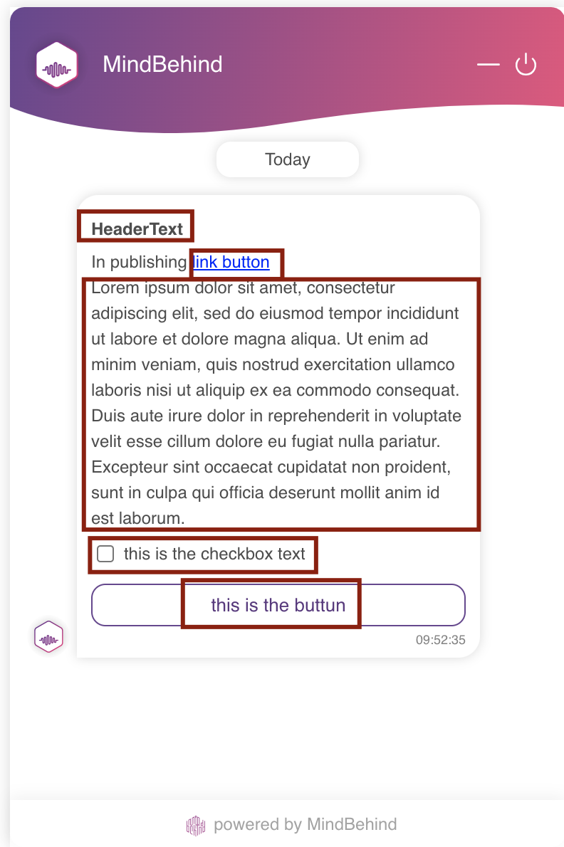
- GDPR Message: It is the text field that keeps the GDPR message and links if they are set.
13. To insert links into the GDPR Message, you can use the given format below, the designer can insert links into GDPR text, for the user to click. E.g. [link display name](https://www.websitelink.co).
14. To decide on the GDPR-OTP positioning, you can see the descriptions below:
- GDPR failed: Chatbot never starts.
- GDPR passed, OTP failed: Chatbot never starts and keeps asking for both GDPR and OTP until both are satisfied.
- GDPR passe,d OTP passed: Chatbot starts.
15. You can customize the "Start a new conversation" button text. You can see the relevant field in the image below. 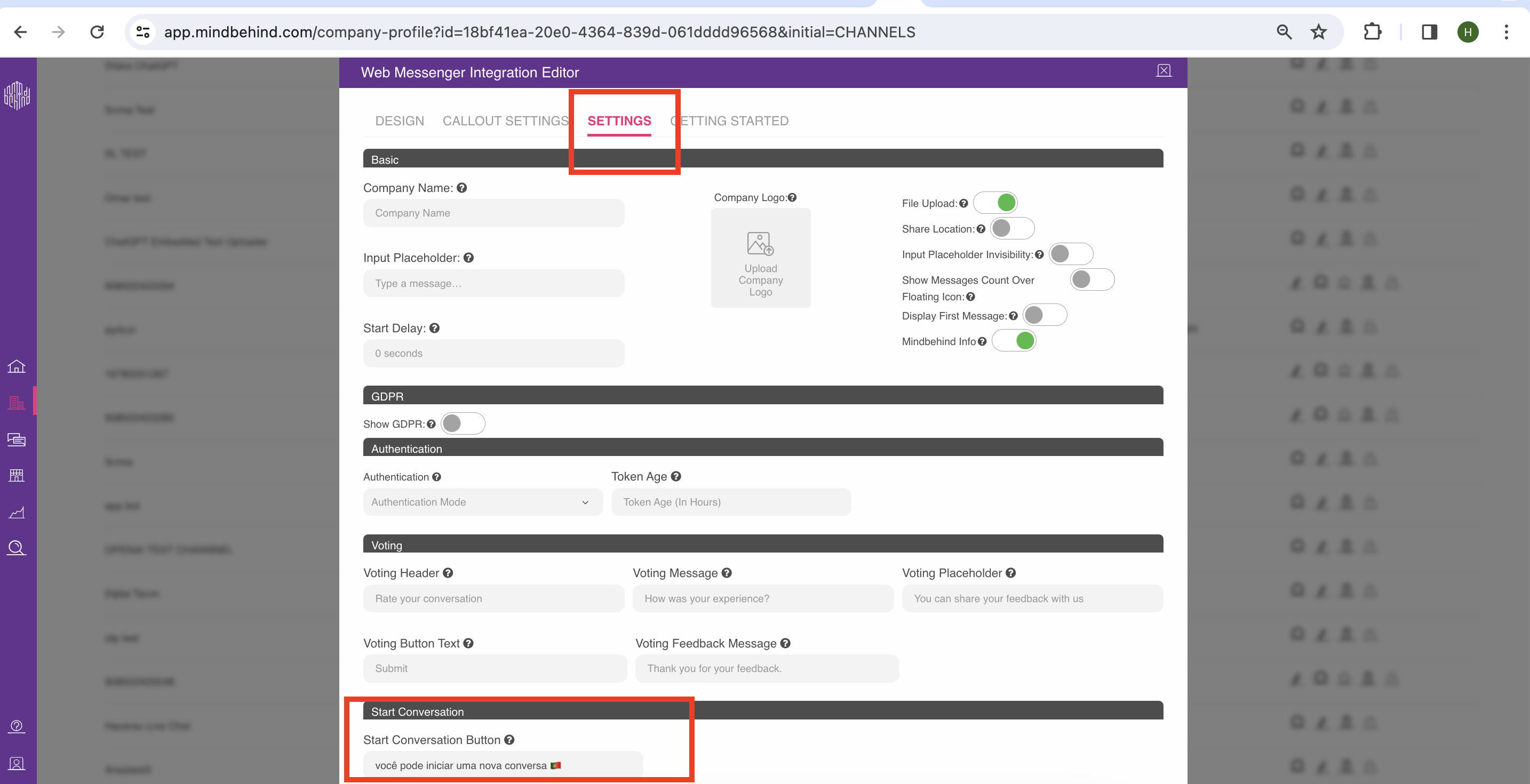
16. Click the Save button.
17. If you want to hide Web Messenger, you can disable the Show Widget toggle, and the designer can hide the widget from all places it is merged into, such as the web pages and mobiles.