Responsive Positioning lets you assign absolute positions to your elements on the screen. The position of your elements will automatically adapt to the screen size changes. You can decide on the final position of elements regardless of device variations. Therefore, you don't need to check and adjust the position of the elements again manually.
This feature is available for the following elements on Hello Bar, Hello Bar v2, Countdown Bar Templates, and InStory products: Button, Text, Text (Library), Coupon Folder, Countdown Folder, Stickers, and Emoji Slider.
Use Responsive Positioning
In the Design step of your campaign, select a template and edit an element in Action Builder. When you choose an element, you will see the Responsive Positioning feature under Settings.
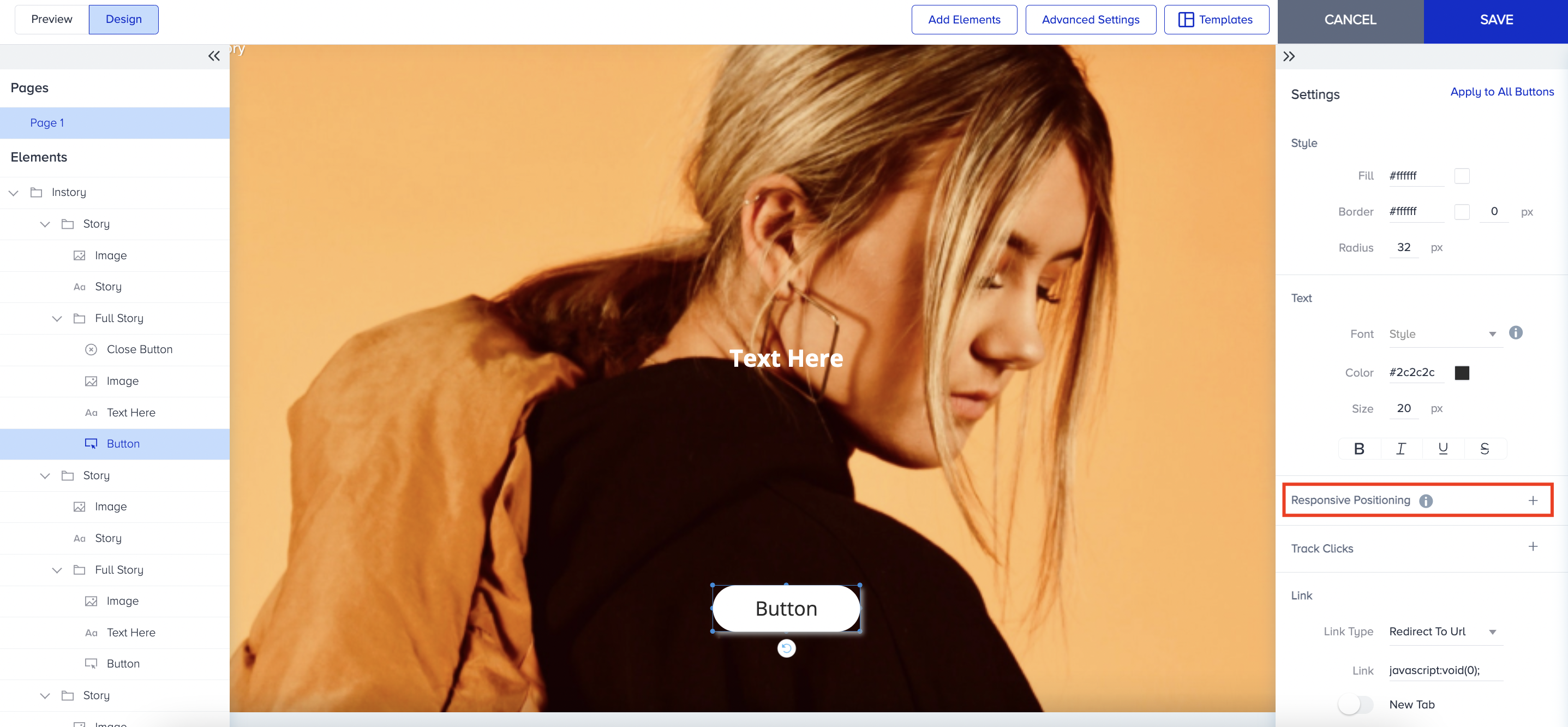
You have two options to align elements: horizontal and vertical. You can set Horizontal Positioning as Left, Right, or Center, and Vertical Positioning as Top, Bottom, or Center.
After setting the positioning, the elements will be displayed at the same pixel coordinates and adjusted for horizontal and vertical alignment.
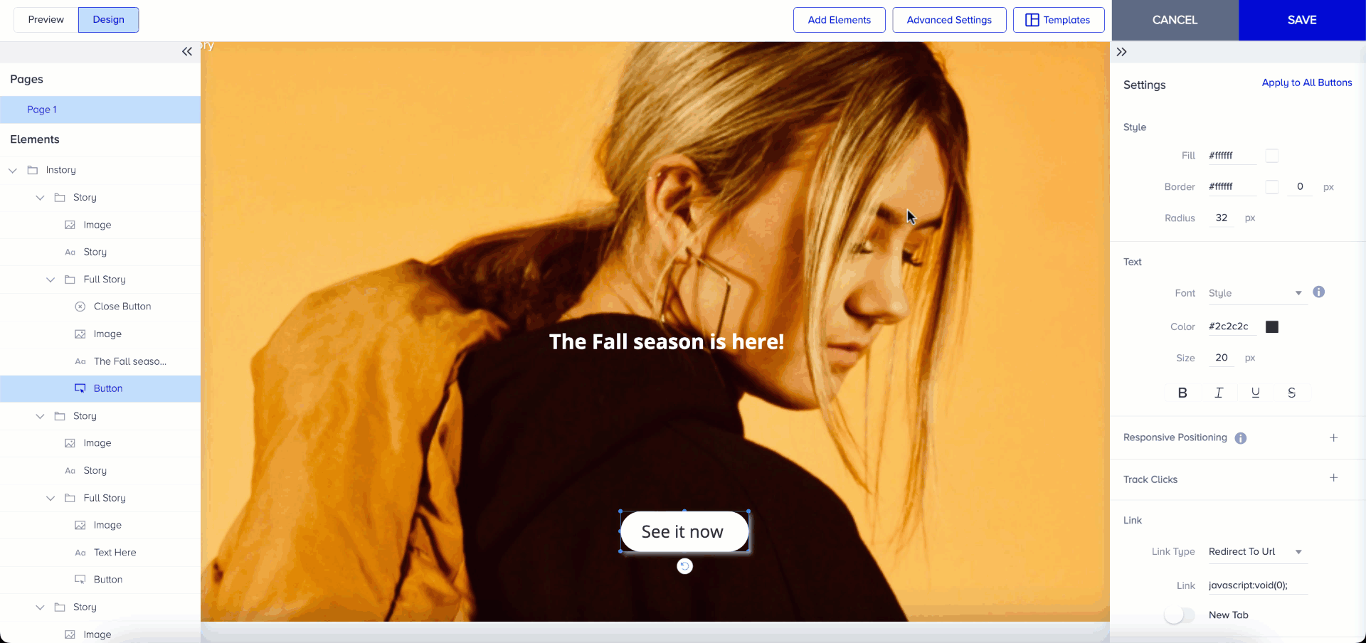
As you can see in the campaign, the positioning of the message, button, and emoji slider is fixed regardless of the device’s size. The elements have the same set position in different device sizes.
Your elements adapt easily to different device types, which gives your users a better experience on your website.
Use Cases
Create a Mobile Web InStory with a button element. The button element should be positioned at the bottom to make it easy for users to tap with their fingers. If you do not set its responsive positioning, the button will not fit on smaller devices, whereas on larger devices it will be too far from the bottom of the screen.
The result on different devices is as follows:
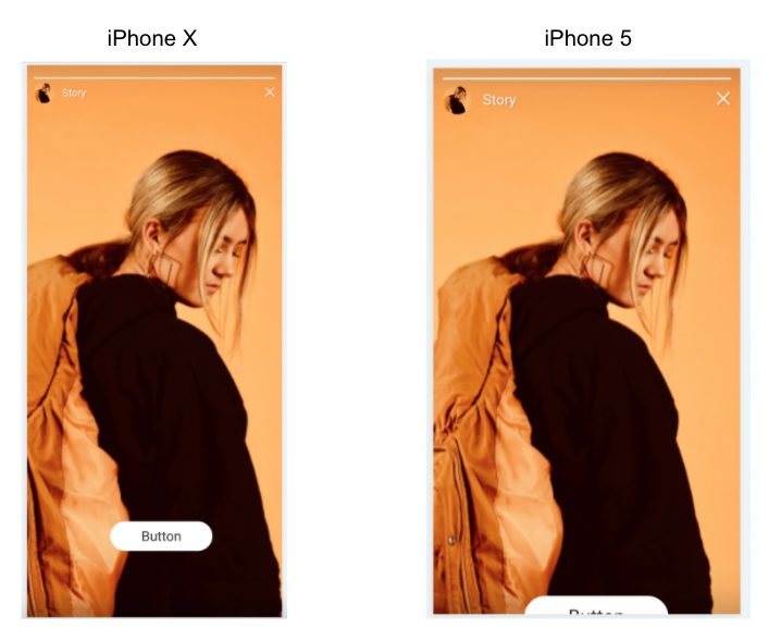 Since the button should be at the vertical bottom and horizontal center, you can set its Responsive Positioning as “Center, Bottom”. This means the distance between the button and the bottom of the screen will always be the same across devices, ensuring a consistent user experience.
When you apply the settings, your campaign has a consistent look on different devices as follows: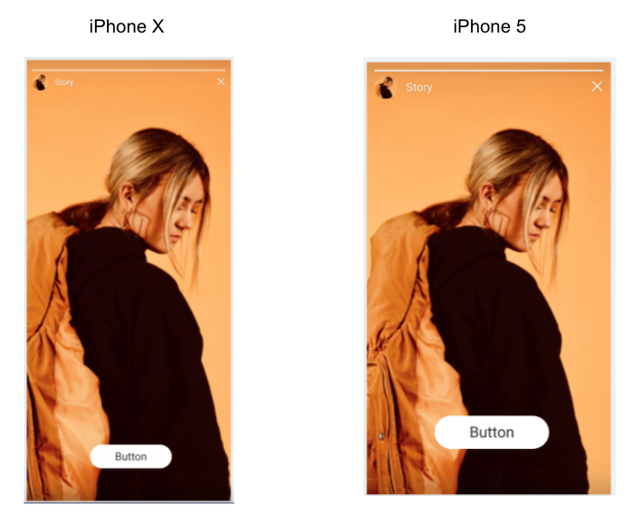
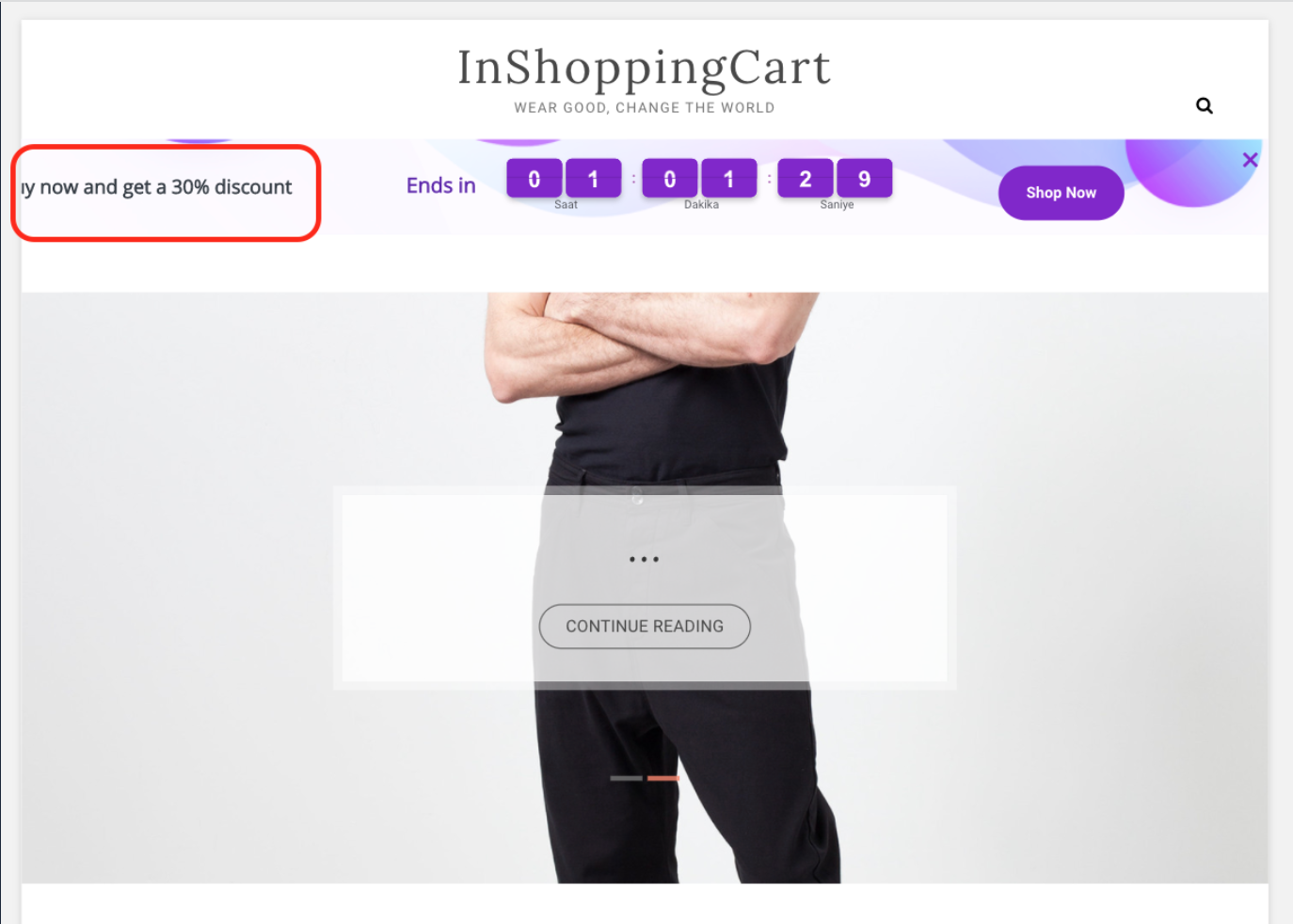
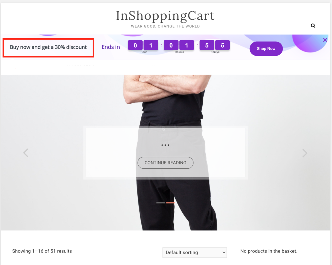
Create a Countdown Bar template with Text, Countdown, and button elements.
The text element should always be on the left part of the countdown bar. I can set Responsive Positioning to “Left, Center” because I want the element displayed on the left side across all screen sizes.
The countdown element should be at the Horizontal and Vertical Center of the template. I move the element to the center and set the Responsive Positioning to “Center, Center” so that it is always centered on the screen, regardless of device size.
The button element should always be on the right part of the countdown bar. You can set the Responsive Positioning to “Right, Center” to display the element across all screen sizes.
The distance between the text element and the countdown should never change. After deciding their position in the Action Builder, you can set them to “Left, Center” so that they can be positioned according to the left border, and their distance never changes.
For a better experience, you should set each element.
When deciding the element's position in Action Builder, you should select the closest points for Responsive Position. For example, you want to put the text on the left. If you set its horizontal position as Center or Right, since the element will decide its positioning based on the distance to the center or right border, on small devices, it will not fit the screen. To solve this problem, set it to the Left because the elements adjust their pixel positions based on the distance between the selected line and their positions in Action Builder.
For example, set the text element as “Center, Center”. It would look as follows:
However, the correct settings are “Left, Center” because the text element is so close to the left border of the screen.
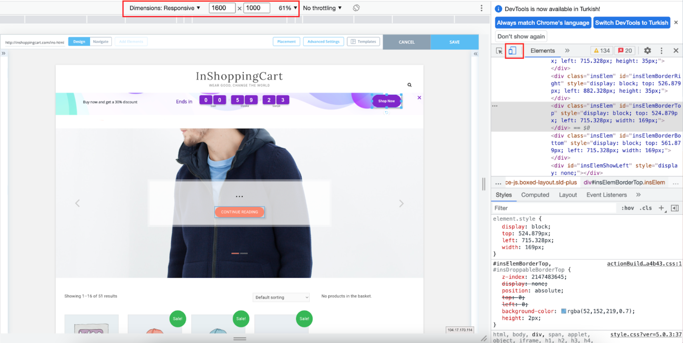
To control different device sizes, click the right mouse button, select Inspect in Action Builder, and change the page's dimensions.
If you add a background image that already includes text, be aware that the image can automatically adjust to a responsive size. You should be careful when aligning the image and the element because images adjust their responsive positions by percentage, whereas elements adjust them by pixels. You can practice the same rules above for images as well.