Designing a widget in Smart Recommender involves two main steps: defining the overall widget structure and customizing the product cards within it. The widget serves as the container on your website, while product cards are the core components displayed within the carousel.
Product cards present key product information, including images, prices, call-to-action buttons, and additional details. You only need to design a single product card, as this design is automatically applied to all cards in the carousel. This approach ensures visual consistency across the widget while simplifying the design process.
You can also refer to the video below to see the design process of a Web Smart Recommender Widget:
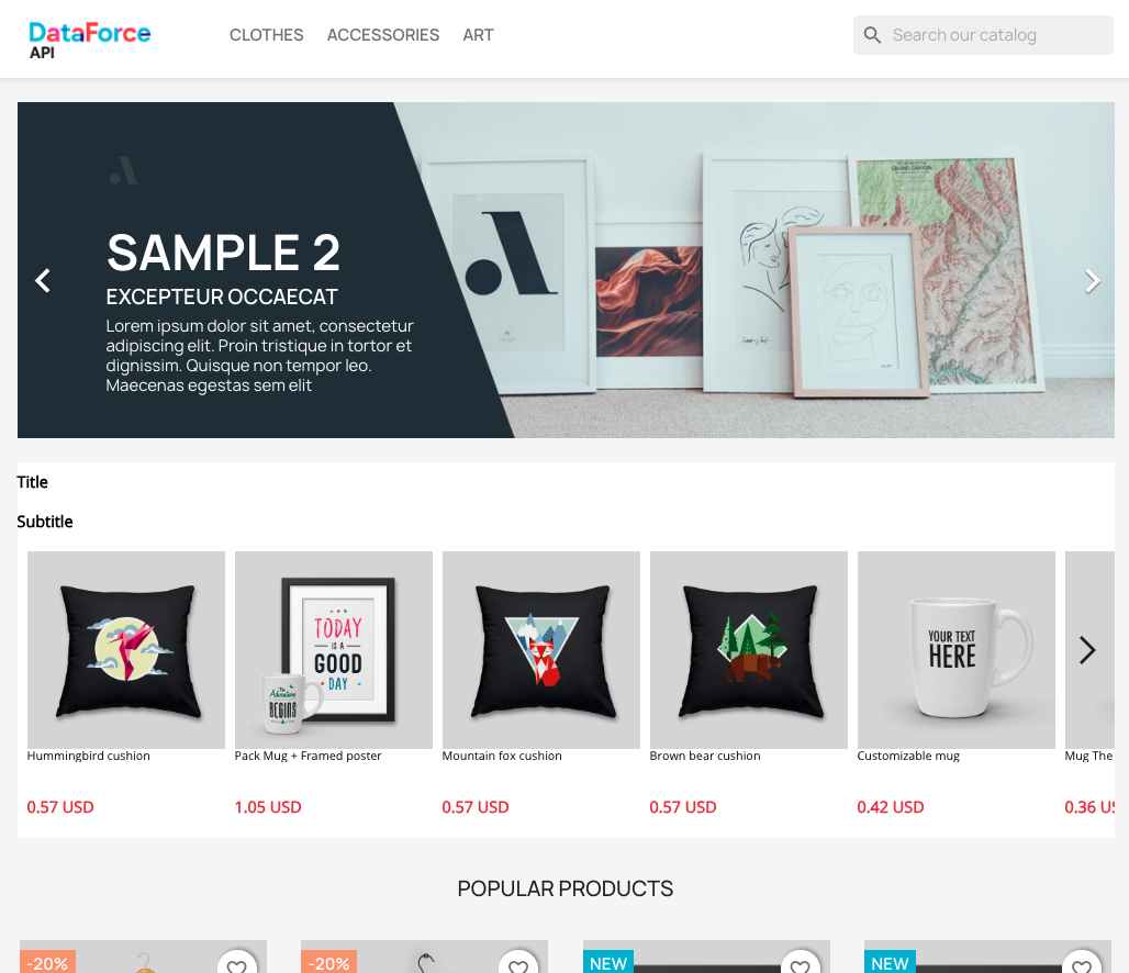
Here’s the widget to be designed in this guide:

Before starting
When creating a Smart Recommender campaign, you need to select the page type where the campaign will be displayed. This selection allows you to navigate directly to the relevant page type during setup.
Before you start designing your widgets, you need to add Page Links. Page Links let you view your website layout inside the Widget Design Editor so you can accurately place and design your widgets.
To set up Page Links, follow these steps.
Go to the Web Smart Recommender listing page.
Click the Page Links button at the top right.
Add sample URLs for each page type, such as the product detail page, category page, and cart page.
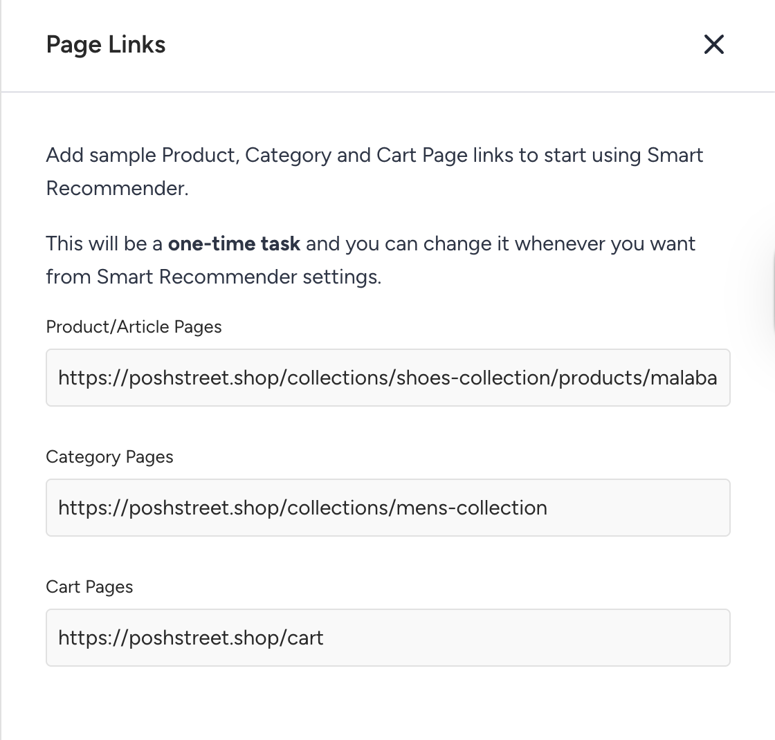
These URLs are used to simulate your website while you design your widgets. This is a one-time setup, but you can return at any time to update or change the links.
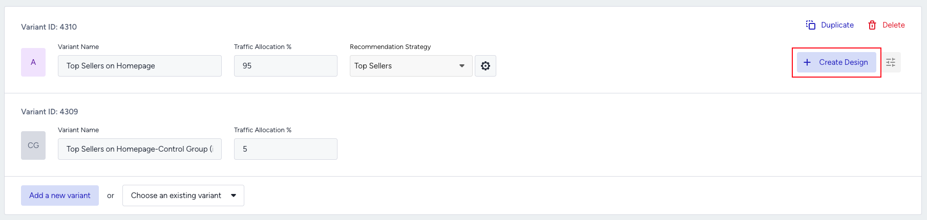
You can design widgets for multiple platforms in a single campaign. Before starting to design your widget, make sure you’ve selected all platform types you want to create a widget for on the design step of your campaign.

After selecting your platforms, you can start designing. Click the Create Design button next to your strategy.
Step 1: Choose your widget template
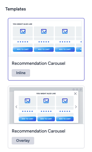
When you begin, select one of the available widget templates. Smart Recommender provides two ready-made options:
Inline Carousel: Embedded directly into your webpage as part of the layout
Overlay Carousel: Displayed as a pop-up modal to capture attention
You can also choose from your previously saved custom templates in this selection modal.
To select a template, hover over the desired option and click Select.
For this walkthrough, we will continue with the Inline Carousel template.
Step 2: Set up the widget frame
After selecting a template, you need to choose a location on your website where the widget will appear. When you hover over your site, the borders of each element will be highlighted. Once you’ve identified the element you want to use, click on it to view the available append options.
Once your widget is placed on your site, its width is automatically determined by the section where you appended it. From the Top Bar, you can:
Customize append locations for desktop, tablet, and mobile, placing your widget in different spots depending on the platform.
Switch device types to preview how your widget will appear on various devices.
Adjust the orientation of your tablet and mobile devices between portrait and landscape to see how your widget adapts across different views.
After checking your widget on different platforms, you can switch to the Design tab from the Top Bar to start designing your widget.
Step 3: Adjust carousel settings
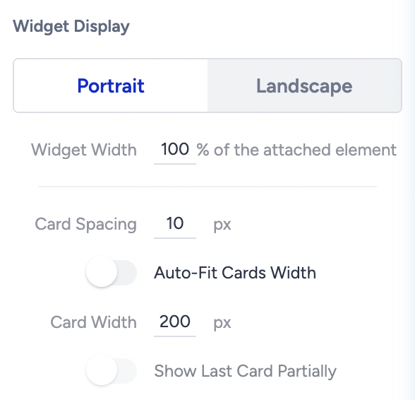
Let’s start by adjusting the carousel. To decide how many cards will appear on the first page:
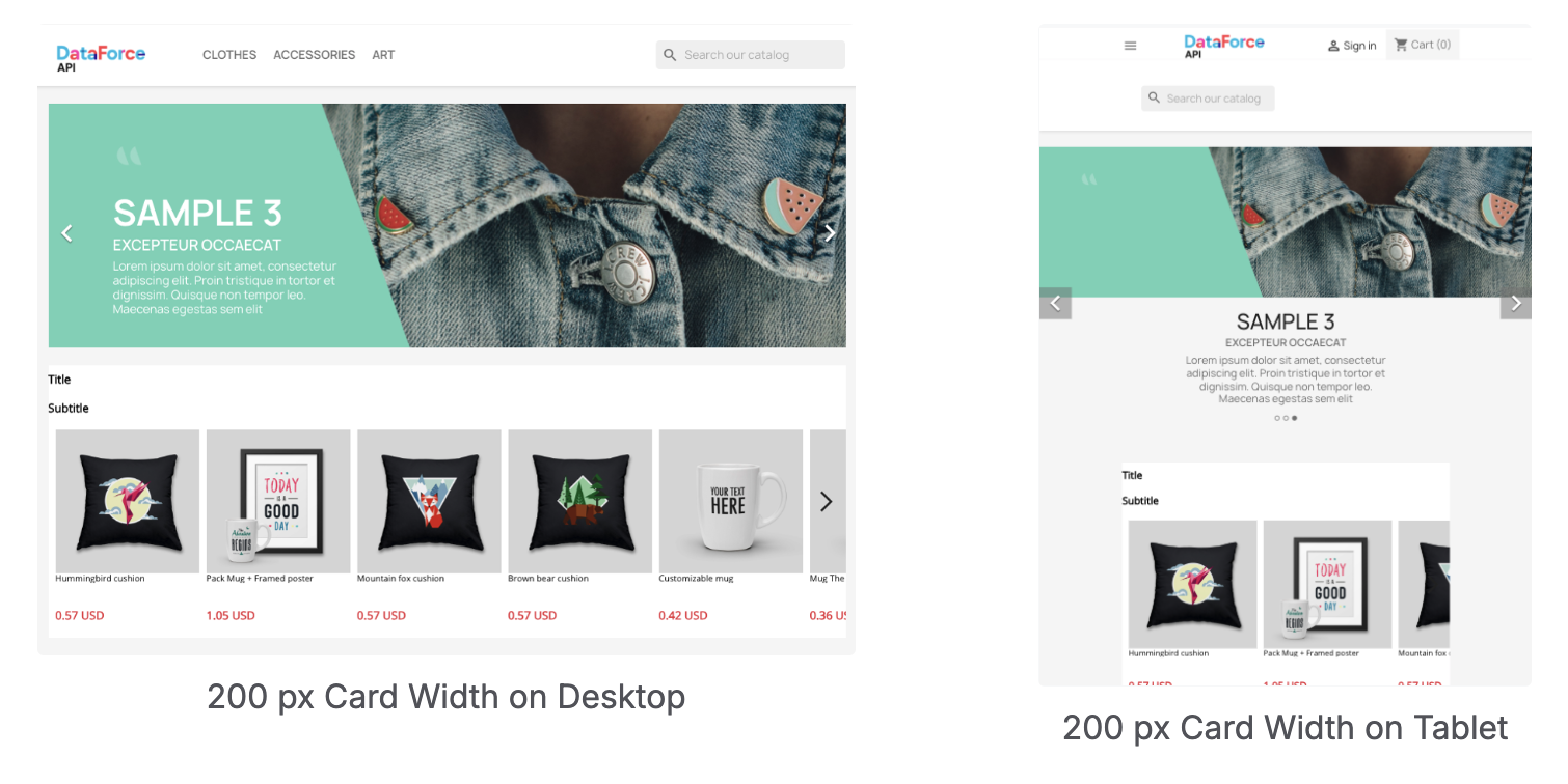
You can set the card width by entering an exact pixel value, or
Enable the Auto-Fit Cards toggle and simply choose the number of cards to display.
Example:
Pixel Width (200px): On desktop, this might show 5 full cards with part of a 6th product card at the edge, depending on the device’s width. On a tablet, it might show 2 full product cards and half of a 3rd card, again adjusting based on available space.
Auto-Fit (5 cards): Exactly 5 full cards appear, filling the space perfectly for each device type, dynamically adjusting to the screen width.
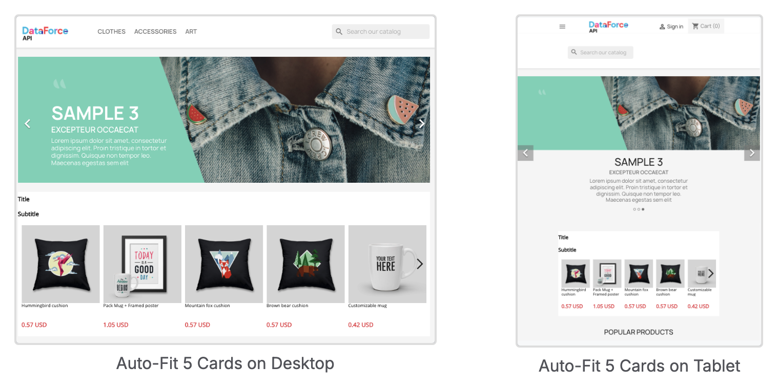
For this walkthrough, let’s enable Auto-Fit Cards and display 5 full cards plus half of another product. To do this, click on Recommendation Carousel from the left sidebar, then adjust the Widget Properties in the right sidebar.
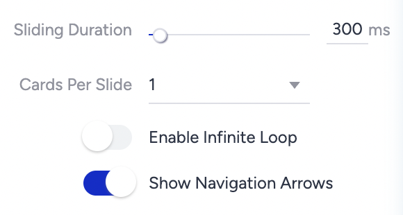
Next, let’s configure the Sliding Settings. Here, you can:
Define the animation speed of the sliding effect.
Choose how many cards should move with each arrow click.
Enable or disable looping of slides.
Show or hide navigation arrows.
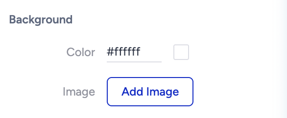
Finally, to ensure the carousel matches your website’s design, you can customize the background color or upload an image. In this walkthrough, we select the same background color as the website from the Background settings of the Recommendation Carousel.
Step 4: Adjust header settings
To customize the layout of your header, start by selecting the Header element from the left sidebar. In the right sidebar, you can choose the layout orientation for your title and subtitle.
Once you’ve set the layout, select the Title element to adjust its settings. To enter a title, click directly on the title in the canvas area and type in your text.
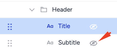
If you don’t want to use a title or subtitle, you can hide the element from the left sidebar by clicking the hide icon next to it. For this example, let’s hide the subtitle.
Next, you can fine-tune the background or text properties, such as the font and size, for the Title element. Let’s select a background color, change the font, and add 15px of padding to the text.
To give radius to the corners of the title, click on the Border settings and set radius values for each corner of the Title element.
Before moving to the Product Card
So far, we’ve designed the frame of the widget (carousel + header). Now let’s move to the most important part: the product cards.
Product cards are the building blocks of your widget. They usually include:
Image (with optional badges)
Product details (name, prices, discounts)
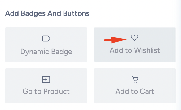
CTA buttons (e.g., Add to Cart, Add to Wishlist)
Designing a product card should always follow the same sequence:
Start with a Layout: Decide how many slots you need based on a reference of what you want to show to your users.
Add Elements: Fill the layout slots with product details.
Fine-tune Properties: Adjust fonts, colors, padding, and alignment.
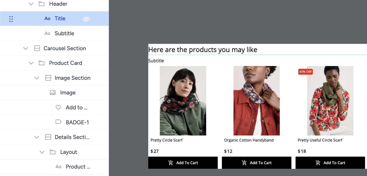
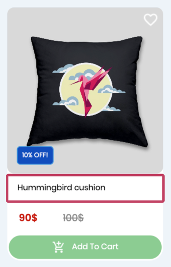
Here’s the final card to be built in this guide:

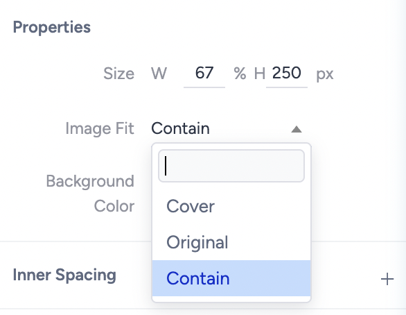
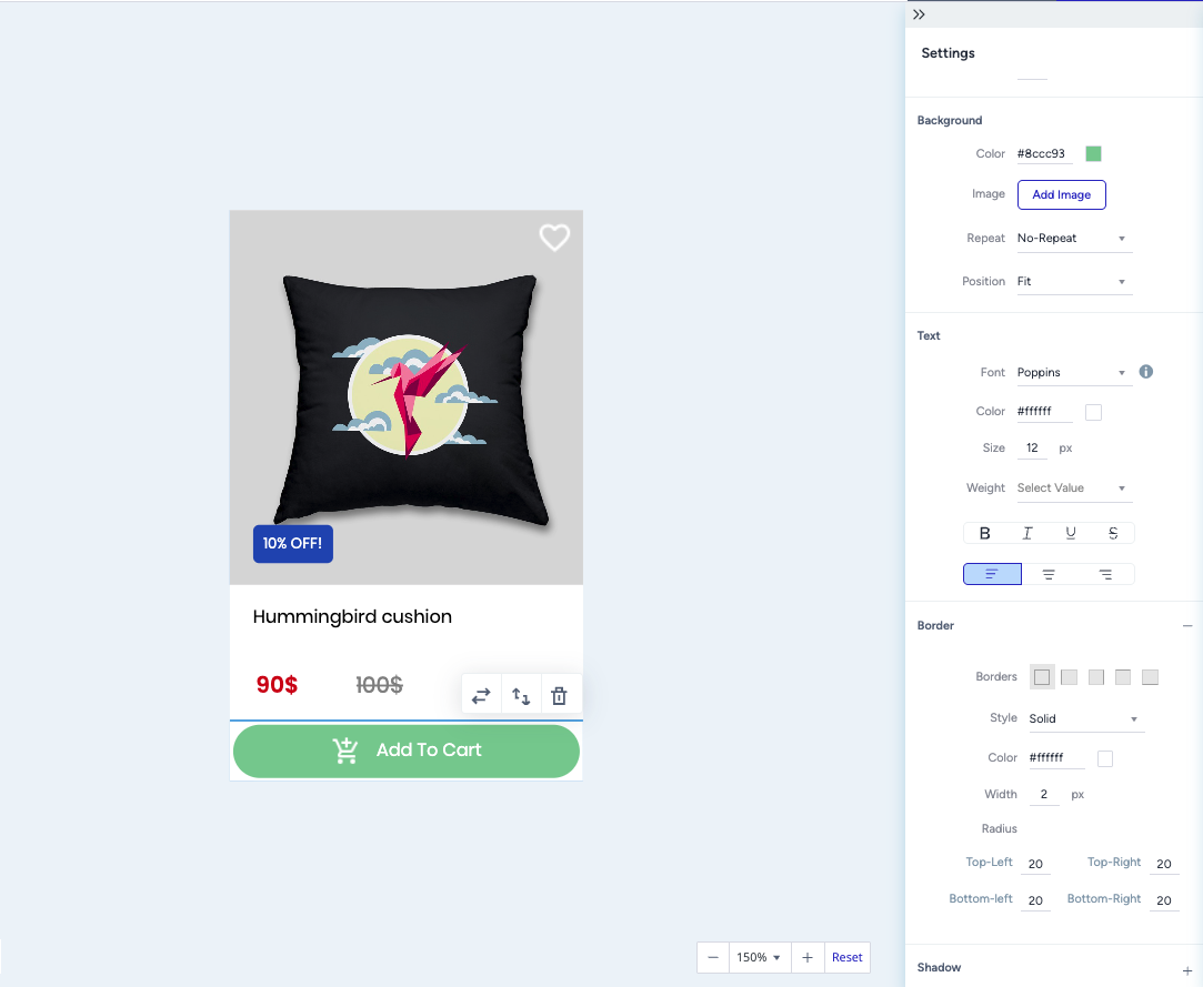
Step 5: Arrange product card image section
To design the image area in the reference product card:
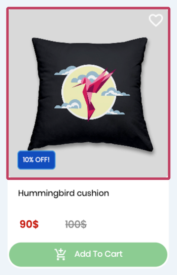
Click on the Image element from the left sidebar. You can adjust the width percentage of the images or change the height of the image element. Let’s keep the width 100% and select the image fit as Cover to make sure there’s no space around the image.
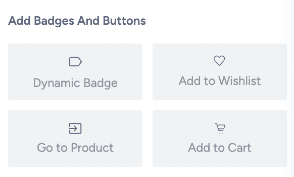
After adjusting the image, let’s add a dynamic badge to highlight the products by clicking on the Dynamic Badge button on the right sidebar.
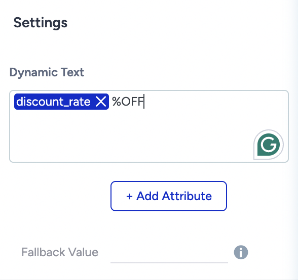
After adding a dynamic badge, you can add a static text or add dynamic texts using the product attributes. Let’s show discount rates dynamically to highlight the discounts.
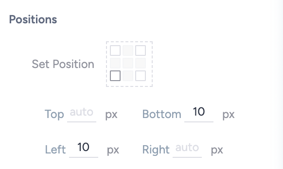
Then, in the positions settings, you can adjust the position of the badge by selecting a corner. Let’s put it on the left bottom corner and adjust the placement by giving pixels to left and bottom corners to give a space.
Give it a padding to add spaces around the text and change the color from the background settings and change the font from the text settings.
Now, let’s add another badge to the image. Click on the Image element from the left sidebar then select Add to Wishlist button. You can again select a corner to locate the button from the position settings and give space to the corners.
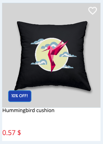
Here’s how the product card looks so far now:
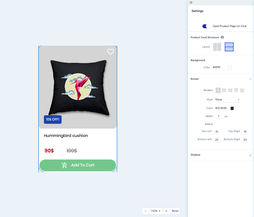
Step 6: Build the product card layout
Layouts act as containers, allowing you to add elements without worrying about sizing or alignment. Each product card comes with a pre-designed layout that includes a product name and price. For this example, let’s delete the existing layout from the left sidebar using the delete icon.

It’s best to plan what you want to display on your product card before selecting a layout. You can also add multiple layouts if needed.
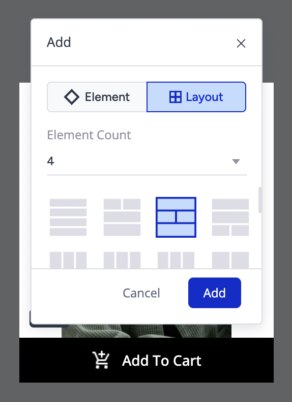
In this case, we show the product name, sale price, original price, and an Add to Cart button. Since we need four elements, click the plus icon on the product card in the canvas, then select Layout. Choose 4 elements as the count, and you’ll see different layout options available. Select the one that best fits your design.
Step 7: Add elements to the card
Once your layout is in place, you can start adding elements to bring the product card to life. Click the plus icon inside the layout and choose the element you’d like to insert.
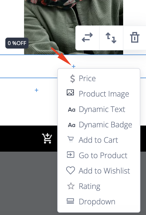
Product Name: Select the Dynamic Text element and link it to the Name attribute. Then, set the element’s height and padding and adjust the font settings as needed.
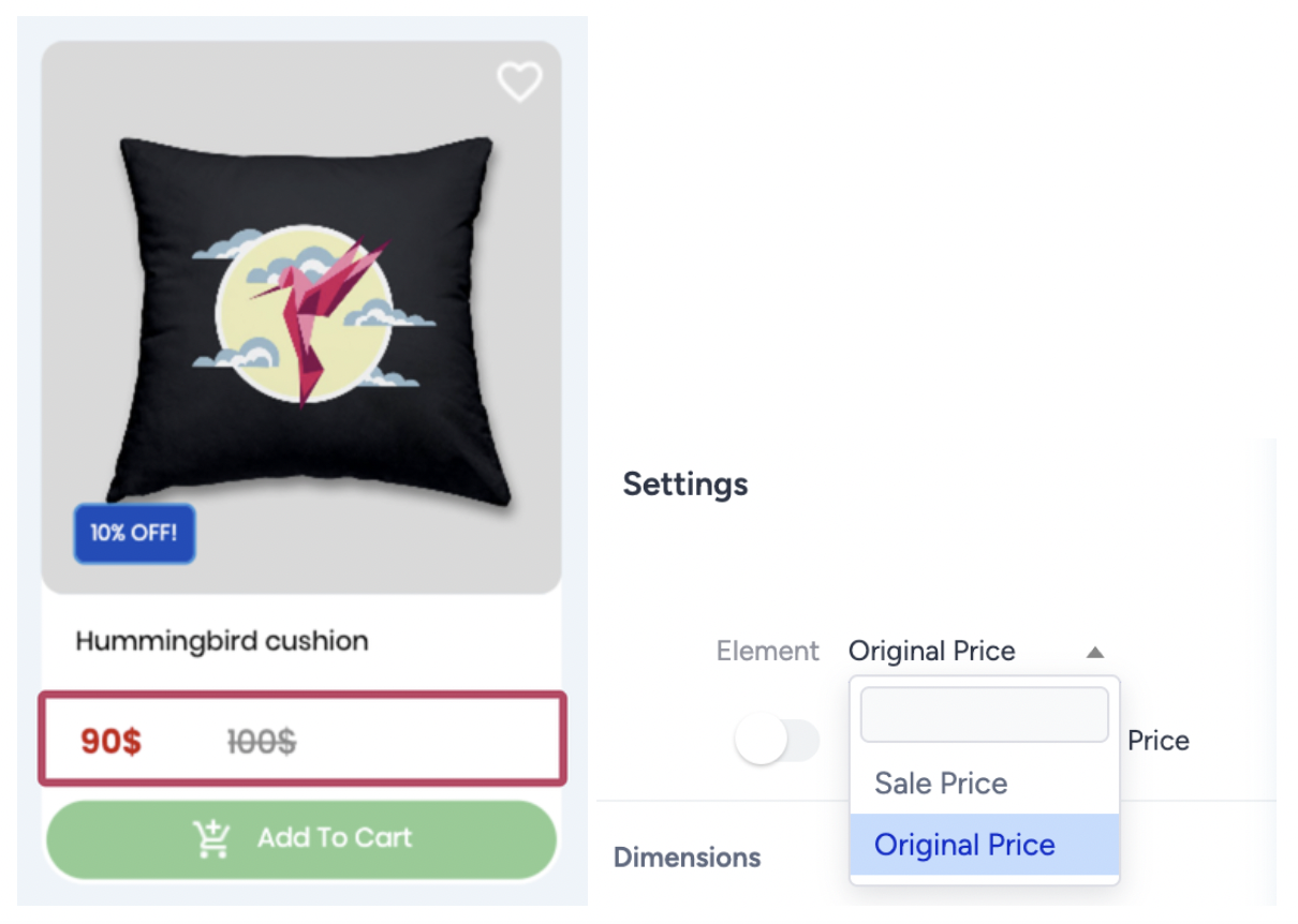
Sale Price and Original Price: Add a Price element, then choose the price type from the settings dropdown. Use the sliders to arrange the element containers within the layout. Let’s customize the prices by changing the colors and applying a strikethrough style to the original price in the font settings.
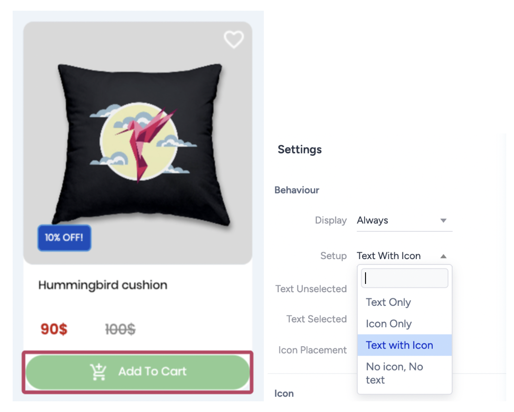
Add to Cart Button: For the last element, add an Add to Cart element. To include an icon, switch the setup to Text with Icon.
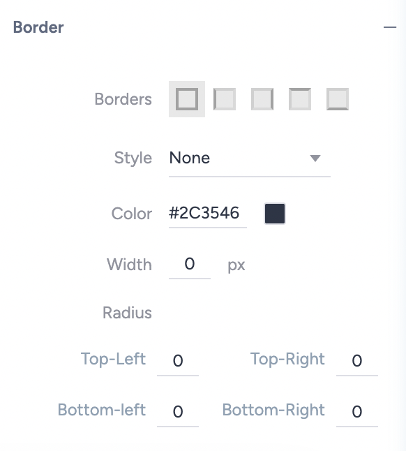
Next, customize the button’s background color and border. To edit the border, click the plus icon next to the border setting, select Solid as the style, and define the color, width, and radius. Here’s how the product card looks after applying these settings:
Why can’t I change the width of an element?
The widget’s width is determined by your website placement, while the product cards adapt to that width. The total height of each product card depends on the elements you’ve added. Once the card’s height is set, it defines the overall widget height. Always preview your design across platforms to make sure it looks clean and responsive.
Let’s make the final adjustments to finalize the product card. Start by giving a radius to the Image section. Select the Image Section from the left sidebar, then change the radius setting to 10.
Then, let’s adjust the radius settings of the Product Card element to make an aligned look.
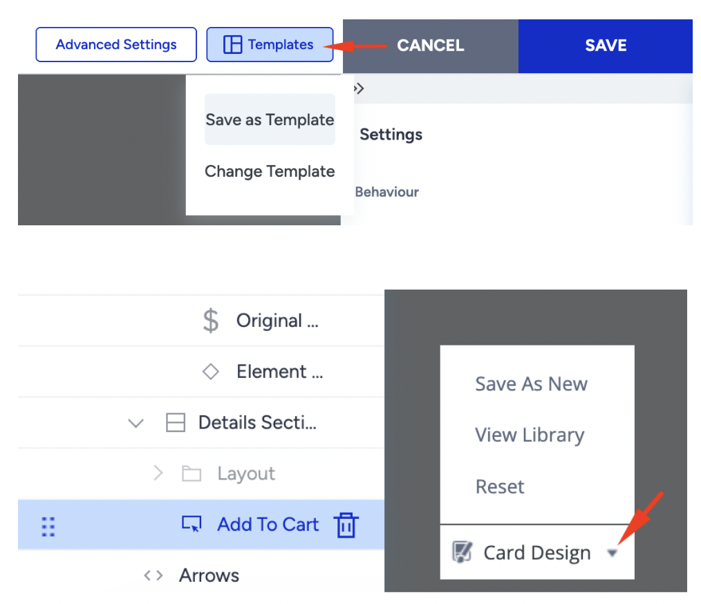
Step 8: Save and reuse your design
When your design is ready, you can save the entire widget template or just the product card layout. Saved templates appear in the Templates Menu, so you can reuse them in future campaigns without starting from scratch.
You can save the entire template from the Top Bar, and save individual product cards from the Card Design menu at the bottom-left of the canvas.
Final Check
Switch to Preview Mode and review your widget on desktop, tablet, and mobile. Make sure the carousel scrolls smoothly, product details are easy to read, and CTAs stand out clearly.

Once everything looks good, your widget is ready to launch.