Suggested readings: Why are colors in emails reverted in dark mode?, What can we do to avoid issues in the dark mode?
Dark Mode reverses the color palette we usually use and displays lighter text and icons on a darker background instead of dark text on a white background.


This article answers the following questions:
- Where do people encounter dark mode?
- Which email clients support dark mode?
- What are the benefits of the dark mode?
- What kind of challenges might affect your campaigns?
- What can we do to avoid facing issues in the dark mode?
- How does dark mode differ on various email clients?
- How can you prepare designs for both light and dark modes?
- How does Insider help you?
Where do people encounter dark mode?
Almost everywhere. Since it is a trending user interface alteration, most operating systems, browsers, mobile apps, and software programs provide it. Most importantly, email clients offer this option to users.
Which email clients support dark mode?
Mobile Apps:
- Gmail App (Android)
- Gmail App (IOS)
- Outlook (Android)
- Outlook App (IOS)
Desktop Clients:
- Apple Mail
- Outlook 2019 (MAC OS )
- Outlook 2019(Windows)
Web Clients:
- Outlook.com
What are the benefits of the dark mode?
- It's good for your eyes as it decreases eye strain.
- It reduces screen brightness and extends battery life.
- It can improve content legibility.
- It is new and exciting.
- The adoption rate is relatively high.
What kind of challenges might affect your campaigns?
- Different clients might have different rendering issues.
- Some clients may force dark mode.
- Dark mode may not be the best option for readability.
- Color contrast raises accessibility issues. You might want to consider this as well.
What can we do to avoid facing issues in the dark mode?
- Test your emails using the testing tools.
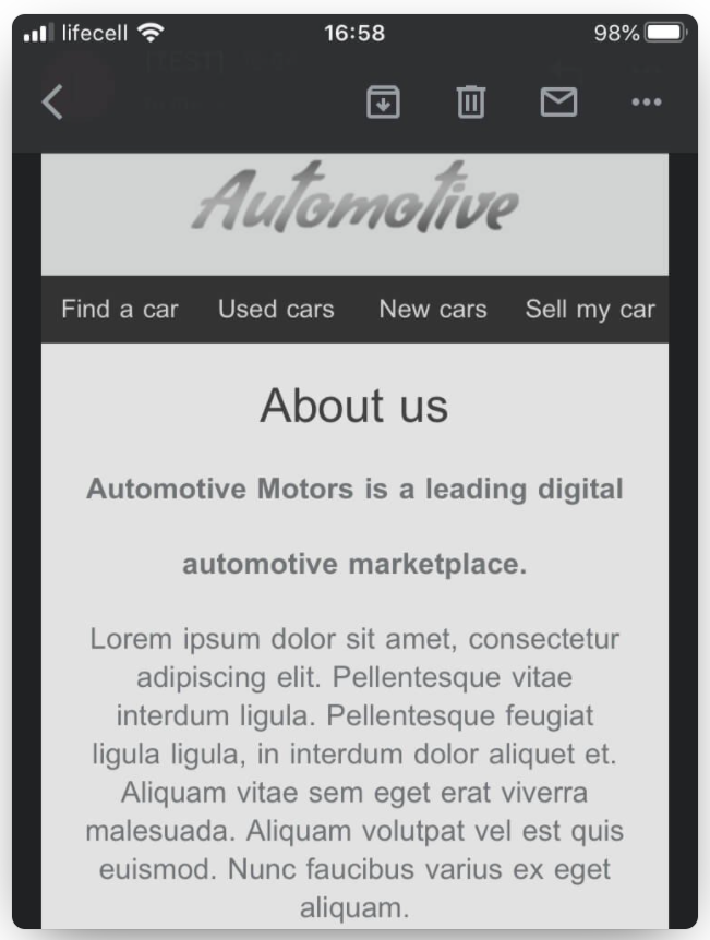
- Use images with transparent backgrounds (provided the logo is not black).

- Be careful while using dark logos/images.

- Develop email versions for dark and light modes.
- Use light framing in our texts to ensure it’s visible in the inbox.

How does dark mode differ on various email clients?
We already mentioned that email clients that use dark mode may affect your emails differently. Let's see how they can alter the HTML:
1. There might be a full-color invert, which means it inverts the background color no matter what. If you have prepared your design for the dark mode, your background will be forced to switch to a light version. Gmail App IOS 13 and Outlook 2019 Windows use that method.
2. Some email clients change the UI to dark mode, but this doesn't affect HTML rendering. Apple Mail, iPhone, iPad, and Hey.com are examples.

3. The last method used in email clients is the ‘Partial Color Invert’. It changes the light background into a dark one and dark texts to light.
How can you prepare designs for both light and dark modes?
Developers use the CSS syntax @media (prefers-color-scheme) to create both email versions (dark and light). It can detect whether the user uses dark or light mode, thus preparing for both versions.
But currently, Gmail doesn’t support it at all. Outlook only supports @media(prefers-color-scheme) when emails are opened with webmail or macOS. Apple-mail (iPad and iPhone), Mozilla Thunderbird (windows 10) and Spark support it.
How does Insider help you?
Our email testing feature helps you see real-time previews of your email designs on almost all email clients, including dark modes. You can test your mode, avoid most unpleasant surprises, and create visually appealing email designs.
Extra: You may want to take a look at the poll of Android authority.