The Items block lets you dynamically display personalized product data from your users’ behavioral events directly in your Architect Email campaigns.
Instead of manually inserting product content, the Items block automatically populates your email templates with products that individual users have interacted with, such as items left in their shopping cart, products they have recently browsed, or items they have previously purchased.
The Items Block is available in the New Drag & Drop Editor and is designed specifically for use within Architect Email campaigns, where user-level event data (cart additions, product page views, purchase history) is available to render personalized product content at send time.
This guide explains the following concepts:
Prerequisites
Before using the Items block in your email templates, ensure the following:
Your account must have the New Drag & Drop Editor enabled for Architect Email campaigns.
Your website or app must be sending the relevant behavioral events (cart updates, product page views, purchase events) to Insider One so that user-level product data is available at the time of email delivery.
A valid product catalog (feed) must be integrated with your Insider account. The Items block pulls product attributes, such as product name, image, price, and URL, from your catalog data.
Add the Items block
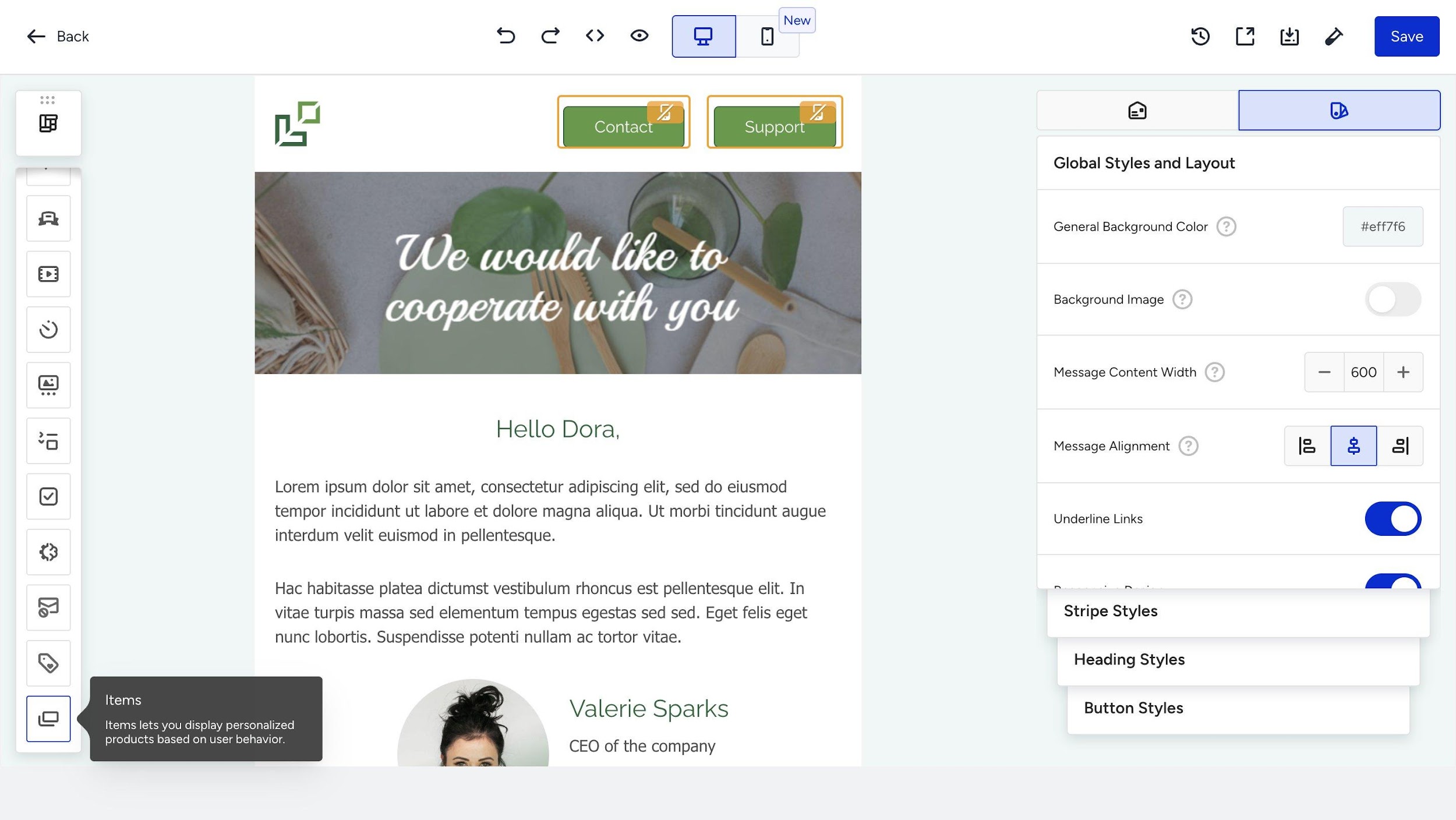
The Items block is located at the bottom of the left-hand toolbar in the New Drag & Drop Editor, alongside other content blocks. When you hover over the Items block icon, a tooltip appears with the description: “Items lets you display personalized products based on user behavior.”
To add an Items Block to your email template, drag the Items block icon from the toolbar and drop it into the desired location within your email layout.
Configure the Items block
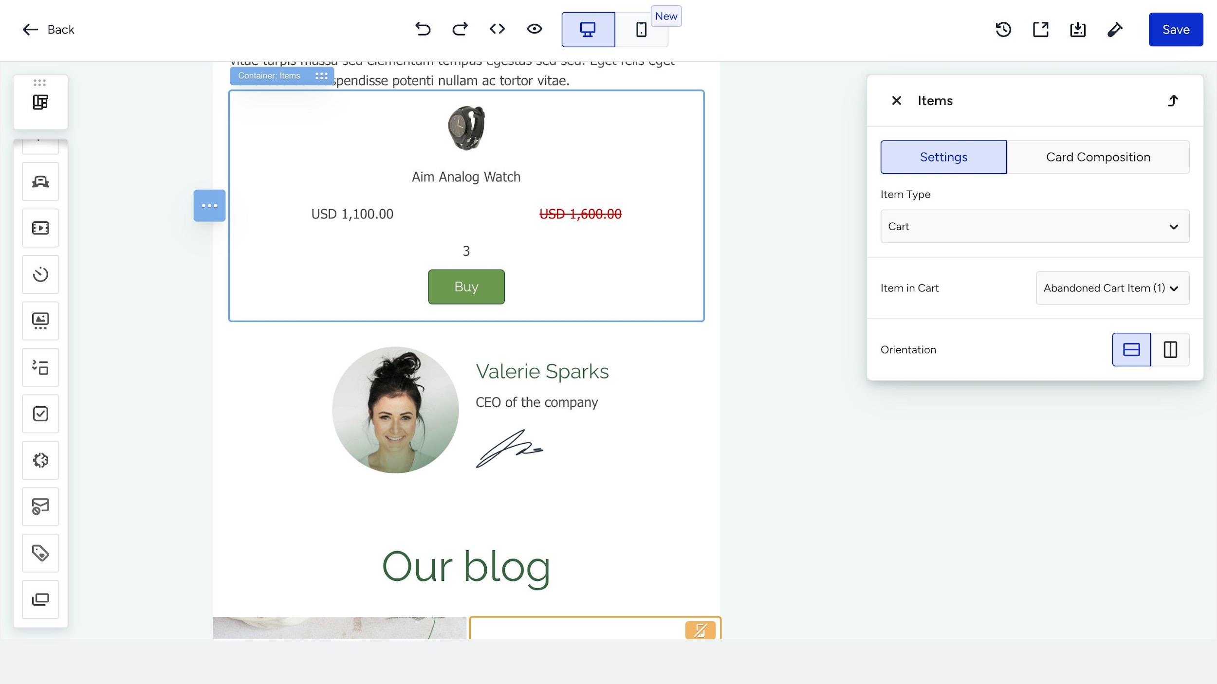
When you drop an Items block into your template, the Items panel opens automatically on the right side of the editor. Configuration is organized into two tabs: Settings and Card Composition.
Settings
The Settings tab contains the primary configuration options for the Items block.
Item Type
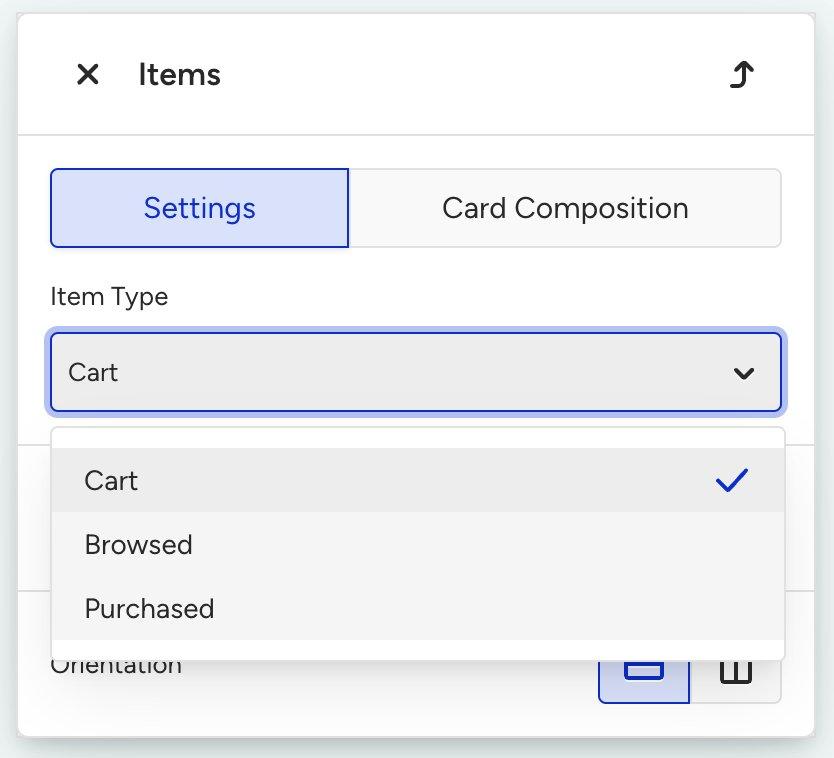
The Item Type dropdown determines which behavioral event data the block uses to populate product information. You can use one of the three available options.
Item Type | Description | When to Use |
|---|---|---|
Cart (default) | Displays products currently in the user’s shopping cart. | Abandoned cart recovery campaigns, cart reminder journeys. |
Browsed | Displays products the user has recently viewed on your website or app. | Browse abandonment flows, re-engagement campaigns. |
Purchased | Displays products the user has previously purchased. | Post-purchase follow-ups, cross-sell/upsell campaigns, order confirmation flows. |
Item in Cart (Item Selector)
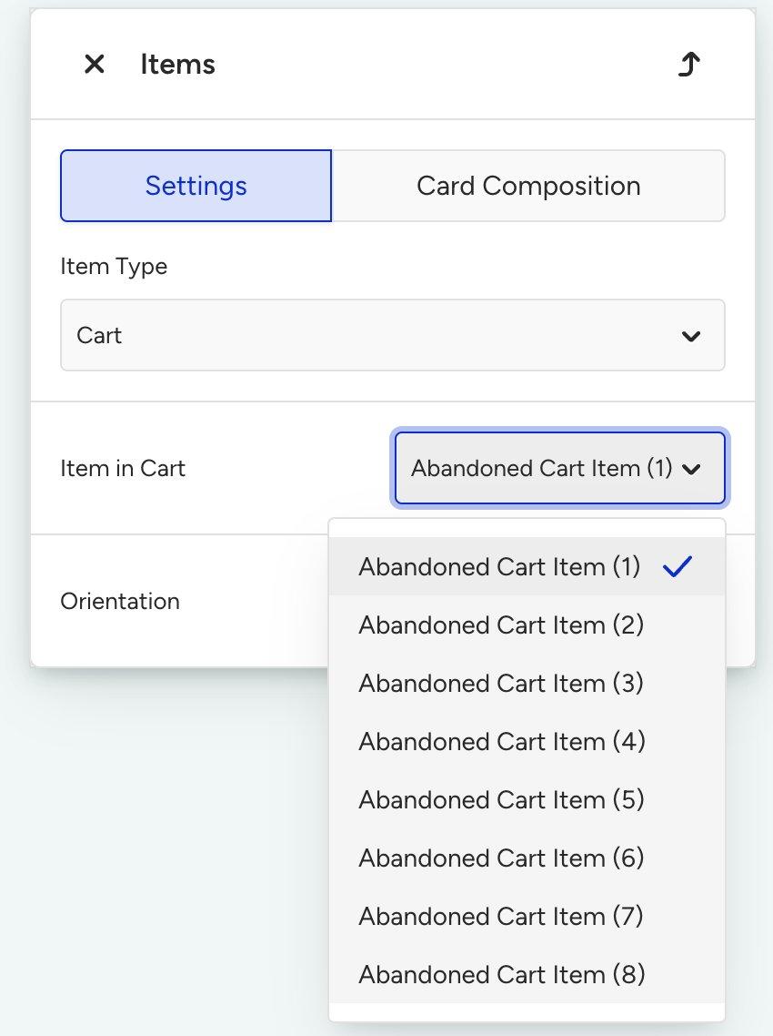
Once you select an Item Type, a secondary dropdown appears below it. This dropdown lets you choose which specific item slot the block should display.
For example, when the Item Type is set to Cart, the dropdown is labeled “Item in Cart” and lists numbered slots from Abandoned Cart Item (1) through Abandoned Cart Item (8). Each numbered slot corresponds to a product position in the user’s event data. Abandoned Cart Item (1) represents the first item, (2) the second, and so on.
This allows you to place multiple Items blocks in a single template, each configured to display a different product from the user’s cart.
Similarly, when the Item Type is set to Browsed, the dropdown changes to “Last Browsed Item (1), (2), ...” and for Purchased, it becomes “Last Purchased Item (1), (2), ...”
To display multiple products from the same event type in a single email, add multiple Items blocks to your template and assign each one a different item number. For example, use three Items blocks set to Abandoned Cart Item (1), (2), and (3) to show the user’s three most recent cart items.
When using multiple Items blocks in the same template, assign each block a different item slot (e.g., Item (1), (2), (3)). Duplicating the same slot across blocks or copy-pasting an existing block without changing its slot can cause rendering issues in the preview and delivered email. Always set a unique slot per block.
Orientation
You can choose between two layout orientations using the toggle buttons:
Vertical (default): Products are stacked one below another. Each product card takes the full width of the block. This layout works well for featuring fewer products with larger images.
Horizontal: Products are arranged side by side in a row. This layout is suitable for showcasing products in a more compact, catalog-like format.
When using Horizontal orientation, be mindful of mobile responsiveness. On smaller screens, horizontal layouts may appear cramped. Always preview your design in both desktop and mobile views using the device toggle in the top toolbar.
Card Composition
The Card Composition tab lets you control which product details appear in each product card. Each element has an on/off toggle that you can use to show or hide it in the rendered card.
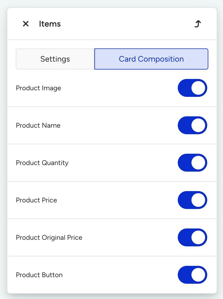
Below are the available card elements.
Element | Description | Default |
|---|---|---|
Product Image | Displays the product image pulled from your catalog. The image links to the product detail page. | On |
Product Name | Shows the product title as returned from the catalog. | On |
Product Quantity | Displays the quantity the user has in their cart. Only relevant for the Cart item type. | On |
Product Price | Shows the current or sale price of the product. Displayed in red when a discounted price is available. | On |
Product Original Price | Shows the original (pre-discount) price. Useful for highlighting price reductions alongside the sale price. | On |
Product Button | Adds a call-to-action button (e.g., “Buy”) that links to the product page. | On |
All elements are enabled by default when you first add an Items block. You can toggle any element off to remove it from the product card layout.
The Product Quantity element is only relevant when the Item Type is set to Cart. When Browsed or Purchased is selected, this element does not apply since quantity-in-cart information is not available for browse or purchase events.
Product card looks in the editor
When an Items block is placed in your template, the editor displays a sample product card so you can preview the layout. Using the default cart configuration with all elements enabled, the card preview shows:
Product Image: A sample product photo (e.g., a watch) displayed at the top of the card.
Product Name: The product title (e.g., “Aim Analog Watch”) centered below the image.
Product Price & Original Price: The original price (e.g., “USD 1,100.00”) and the sale price (e.g., “USD 1,600.00” in red) displayed side by side.
Product Quantity: The cart quantity (e.g., “3”) displayed below the prices.
Product Button: A green “Buy” button centered at the bottom of the card.
This is placeholder/sample data. The actual product information, namely image, name, prices, and quantity, will be dynamically populated per user at send time based on their behavioral event data.
Customize individual card elements
When you click a specific element in the Items block preview (for example, the product name or price), the right panel updates to show the detailed settings for that element. These settings allow you to configure the following options:
Text styling: Change the font family, size, weight (bold/regular), color, and alignment for text elements such as Product Name and Product Price.
Text trimming: Enable truncation for long product names to prevent layout overflow. Set a maximum number of characters or lines.
Currency settings: For Product Price and Product Original Price, configure the currency symbol (e.g., $, €, £, ₺), its position (before or after the amount), and the decimal format.
Price orientation: Control whether the original price and sale price appear side by side (inline) or stacked vertically.
Show Single Product Price: A toggle under the price block that divides the total line item price by quantity to show a per-unit price. For example, a total of 1,100 for 3 items would display as approximately 366.67 per item. Disabled by default.
Button styling: For the Product Button, customize the label text, background color, text color, border radius, and padding.
Item type feature comparison
The following table summarizes the available card composition elements and settings across the three item types.
Feature | Cart | Browsed | Purchased |
|---|---|---|---|
Product Image | ✅ | ✅ | ✅ |
Product Name | ✅ | ✅ | ✅ |
Product Quantity | ✅ | ❌ | ❌ |
Product Price | ✅ | ✅ | ✅ |
Product Original Price | ✅ | ✅ | ✅ |
Product Button | ✅ | ✅ | ✅ |
Item Selector Slots | 1–8 | 1–8 | 1–8 |
Use cases and best practices
Abandoned cart recovery
Use the Cart item type within an Architect journey triggered by a cart abandonment event.
Add multiple Items blocks set to Abandoned Cart Item (1), (2), and (3) to display the products the user left behind.
Enable the Product Quantity element to remind users how many units they selected, and use a clear “Buy” or “Complete Your Purchase” button.
Browse abandonment
Use the Browsed item type in a journey triggered after a user views products but does not add them to their cart.
Showcase recently viewed products with a “Still Interested?” or “Take Another Look” CTA button to drive the user back to the product page.
Post-purchase cross-sell
Use the Purchased item type in a post-purchase journey to display what the user recently bought.
Combine this with a recommendation block below to suggest complementary products, creating an effective cross-sell email.
Design tips
Vertical orientation works best when featuring 1–3 products prominently with large images.
Horizontal orientation is ideal for a compact, catalog-like layout showing multiple products side by side.
Always preview on mobile using the device toggle in the top toolbar. Horizontal layouts can become cramped on smaller screens.
Use text trimming for product names to prevent layout overflow with long product titles.
Keep CTA button labels short and action-oriented (e.g., “Buy”, “Shop Now”, “View Item”).
Use Show Single Product Price when users commonly add multiple quantities, so they see the per-unit cost.
To show multiple products, add separate Items blocks for each item slot (e.g., Abandoned Cart Item 1, 2, 3) rather than expecting a single block to render all items.
FAQ
Q: Can I use the Items blocks in standalone (non-Architect) email campaigns?
A: No. The Items block is designed for Architect Email campaigns only because they rely on user-level behavioral event data (cart, browse, purchase) available within the Architect journey context.
Q: What happens if a user has no items for the selected item type?
A: If a user has no data for the selected item type (e.g., an empty cart), the Items block section will not be rendered in the delivered email. The rest of the email content will display normally.
Q: Can I show multiple products in a single email?
A: Yes. Add multiple Items blocks to your template, each configured with a different item number from the Item Selector dropdown. For example, use three Items blocks set to Abandoned Cart Item (1), (2), and (3) to display up to three cart products.
Q: What is the maximum number of item slots available?
A: Each item type supports up to 8 numbered slots (e.g., Abandoned Cart Item 1 through 8). If a user has fewer items than the configured slot number, that particular Items block will not render in the delivered email.
Q: Can we mix different item types in the same email?
A: Yes. You can add multiple Items blocks with different item types in a single template. For example, show Cart Items at the top and Browsed Items further down in the same email.
Q: What is the difference between Product Price and Product Original Price?
A: Product Price displays the current or sale price of the product (shown in red when discounted). Product Original Price displays the full pre-discount price. Showing both together lets you highlight price reductions. The original price appears in standard formatting while the sale price stands out in red.
Q: Is the Items block responsive on mobile devices?
A: Yes. The Items block adapts to both desktop and mobile rendering. Use the mobile preview toggle in the top toolbar to see how your layout looks on smaller screens, especially in horizontal orientation.
Q: The Items block shows the wrong or unexpected product. What should we check?
A: The Items block populates from the user's behavioral event data (cart, browse, or purchase) matched against your product catalog. If an incorrect or unexpected product appears, verify that:
Your website/app is sending the correct product IDs in the relevant events (cart, browse, purchase).
Your product catalog (feed) is up to date, and the product IDs in your events match the catalog.
Mismatched or stale catalog data is the most common cause of incorrect product details in the delivered email.
Q: Can we save a template containing an Items block as a custom template and reuse it?
A: Yes. You can save a design that includes Items blocks as a custom template and reuse it across Architect Email campaigns. When you reuse the template, the Items block keeps its configuration (item type, slot, card composition). Make sure the campaign you reuse it in is an Architect Email campaign with the relevant behavioral events available; otherwise, the block will not populate.
Q: Our configured price (original or sale price) is not displaying as set up. What should we do?
A: The Items block displays Product Price (current/sale, shown in red when discounted) and Product Original Price (pre-discount) based on your Card Composition settings. If a configured price is not rendering as expected:
Confirm that both Product Price and Product Original Price are toggled on in the Card Composition tab.
Check that the product has both a price and a discounted price in the catalog. If there is no discount, only the regular price renders.
Verify the currency and decimal settings under the price element.
If the blocks still do not render as configured, remove the Items block, add it again, and then reapply your settings. Re-adding the block resolves the issue in most cases. Always confirm the result in a test email, as the editor card uses sample placeholder data.