Web Messenger is a chat window you can add to your website. It enables visitors to communicate instantly with your bot or live support team.
Web Messenger V2 (Updated Web Messenger) replaces the previous version with a redesigned interface and advanced features. Authentication, conversation starter prompts, AI disclaimer, and call-out bubble features are only available in this version.
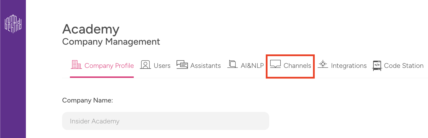
Navigate to the Integration Editor
Navigate to MindBehind Flow > Companies and select your company.
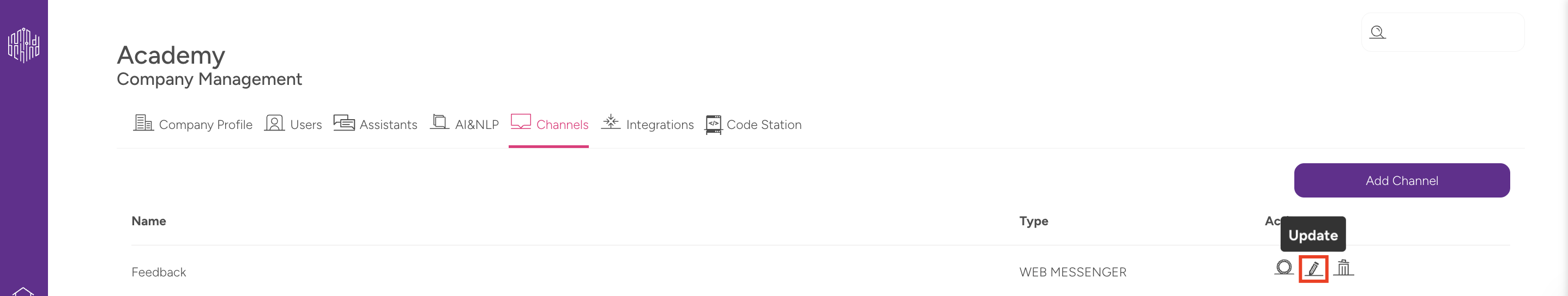
Click the Channels tab and find the Web Messenger channel in the channels list.
To update the settings of the channel, click on the pencil icon next to the channel.
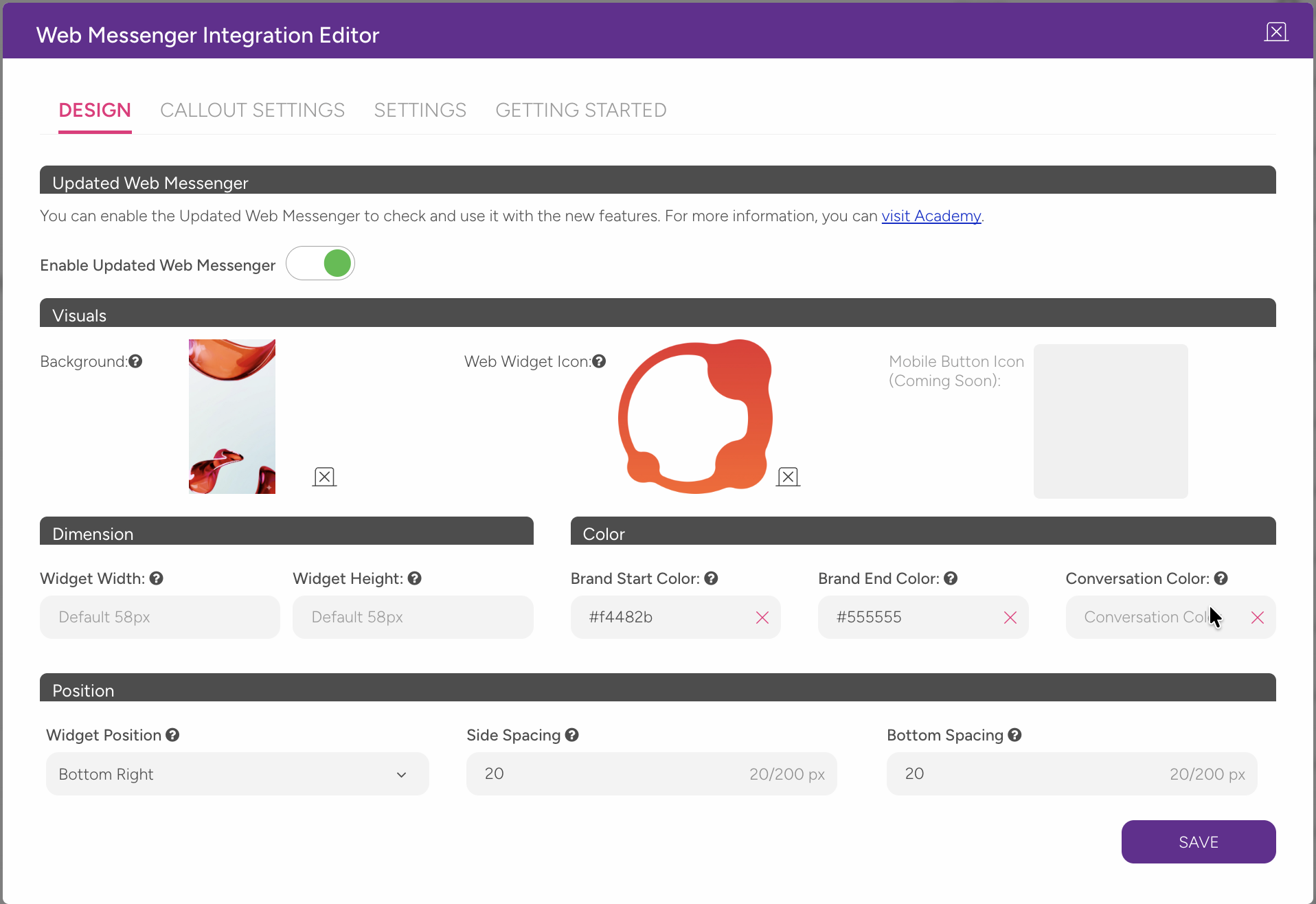
Use the tabs at the top of the Web Messenger Integration Editor to switch between different setting groups.
The panel includes four main tabs: Design, Callout Settings, Settings, and Getting Started.
Enable the updated Web Messenger
Web Messenger v2 features are available only when the Updated Web Messenger toggle is enabled.
To enable it:
Open the Design tab.
Turn on the toggle under the Updated Web Messenger heading.
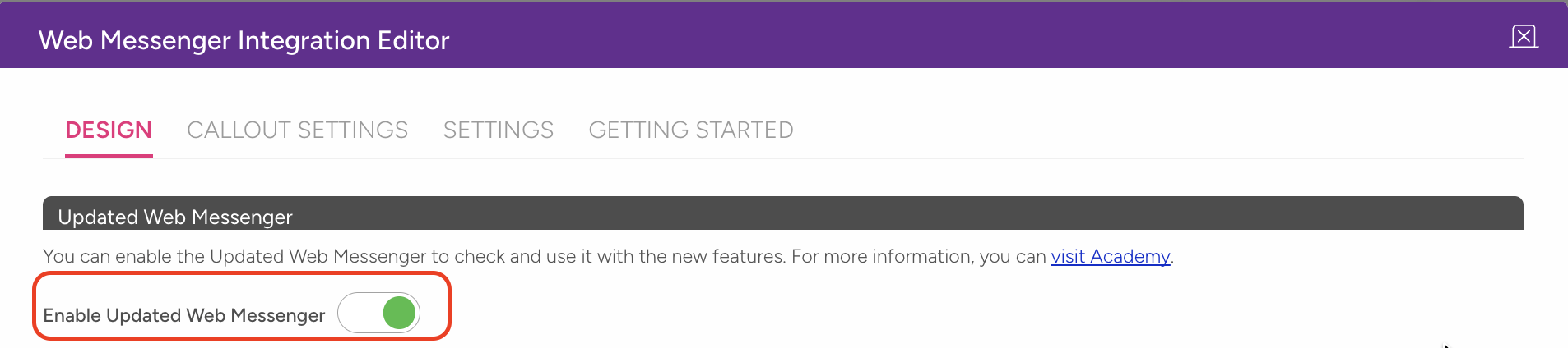
Confirm the action in the pop-up.
Click Save.
When the toggle is off, some settings are hidden or disabled.
Sections such as Authentication, Conversation Starter, and AI Disclaimer are available only when this toggle is enabled.
Design
Under the Design tab, you can customize the appearance and layout of your Web Messenger.
Visual Settings
You can configure the visual elements of your messenger, including background, icon, size, colors, and position.
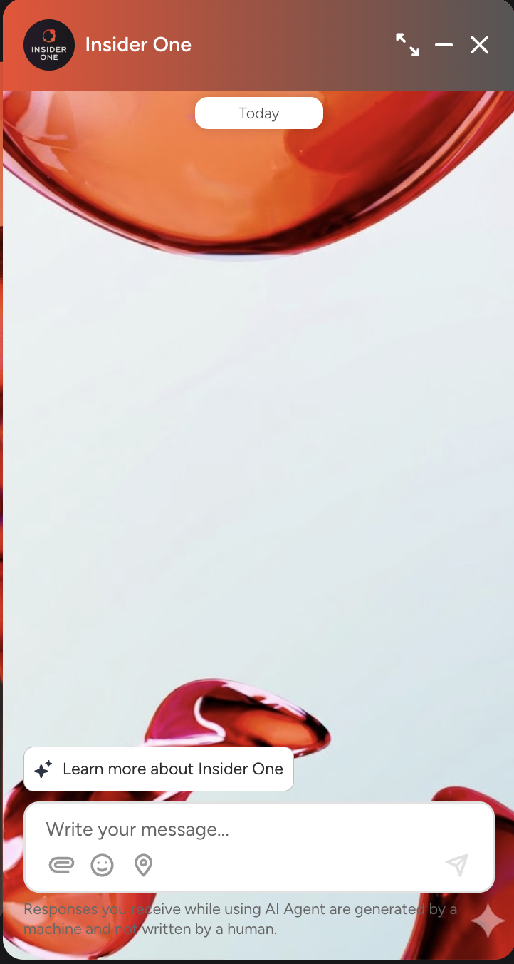
Background Image
You can add an image to the background of the conversation window.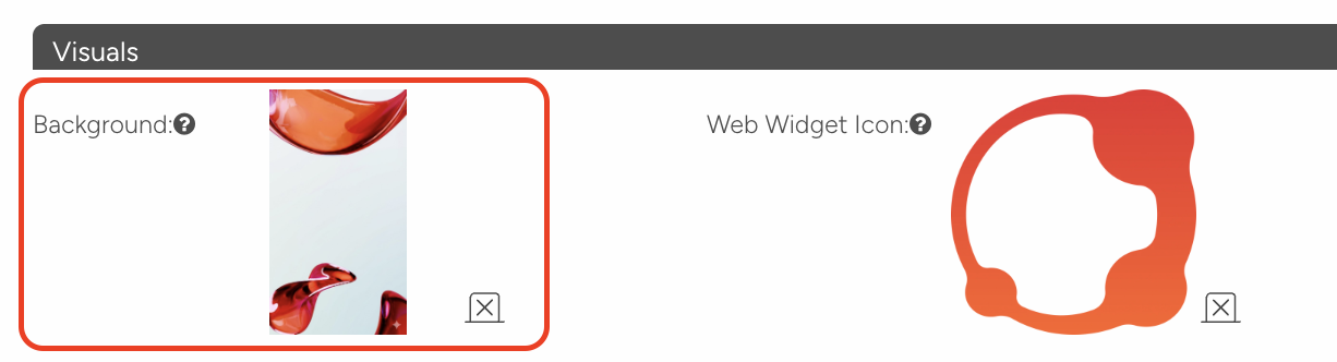
Recommended size: 390 x 443 pixels
Maximum file size: 20 MB
Supported formats: Standard image formats (JPG, PNG, etc.)
After uploading, the image appears behind the conversation screen. To remove it, click the "x" icon on the image.
Web Widget Icon
You can add a custom icon to the open button displayed in the corner of the page. This setting only applies to the button display mode.
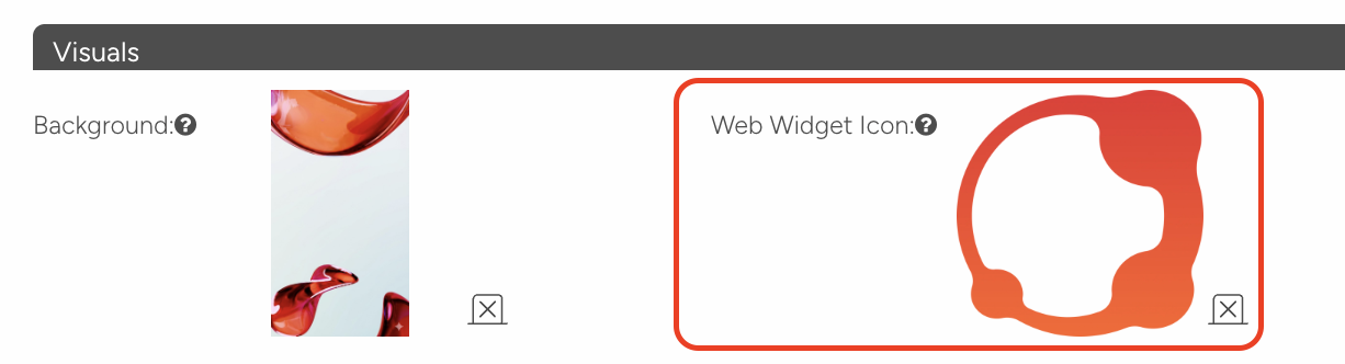
The maximum file size is 20 MB.
If no icon is uploaded, the system uses the default MindBehind icon.
Size Settings
You can set the corner button size by entering pixel values in the Widget Width and Widget Height fields.
Default value: 58 pixels (both width and height)
This setting only applies to the button display mode.
Field | Default | Effect |
|---|---|---|
Widget Width | 58 px | Horizontal size of the corner button |
Widget Height | 58 px | Vertical size of the corner button |
Color Settings
Use the color picker to configure the three color fields below.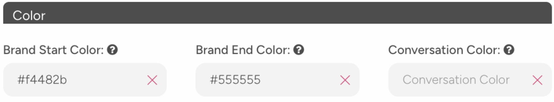
Field | What it affects |
|---|---|
Brand Start Color | Left side of the gradient color in the messenger header. Also used on buttons and media messages. |
Brand End Color | Right side of the gradient color in the messenger header. |
Conversation Color | Color of message bubbles sent by the bot. |
The visual below shows an example of the Brand Start Color and Brand End Color.
Position Settings (v2)
Position settings are simplified in v2 and include three fields:
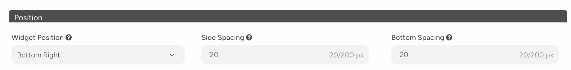
Widget Position: A dropdown with two options:
Bottom Right — default
Bottom Left
Side Spacing: Sets the spacing in pixels between the widget and the side edge of the screen.
Default: 20 pixels
Minimum: 0 pixels, Maximum: 200 pixels
Bottom Spacing: Sets the spacing in pixels between the widget and the bottom edge of the screen.
Default: 20 pixels
Minimum: 0 pixels, Maximum: 200 pixels
CALLOUT SETTINGS
The call-out bubble is a message balloon that automatically appears next to the widget when a visitor enters your site. It helps attract visitors' attention and invites them to start a conversation.
Enable Call-out
Turn on the Enable Call Out toggle at the top to activate the call-out feature.
When the toggle is off, the call-out is not displayed.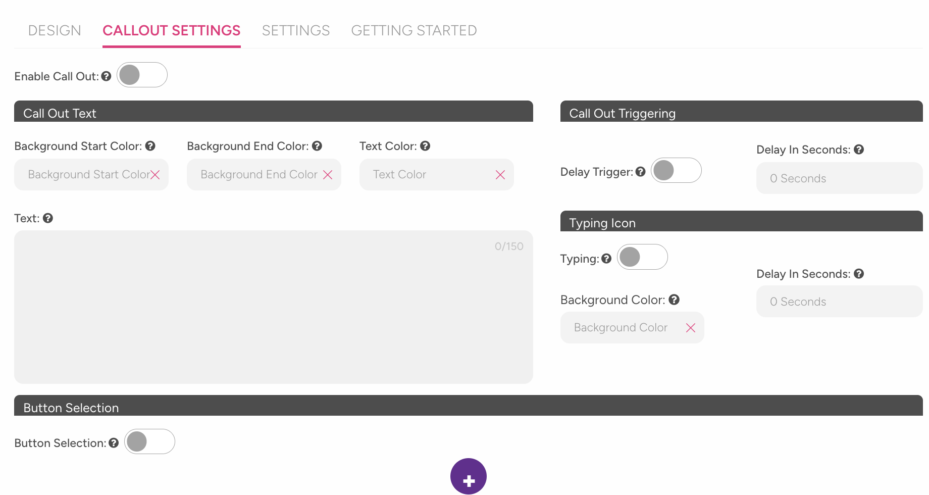
Call-out Color and Text Settings
Background Start Color: Left side of the call-out bubble's background gradient color.
Background End Color: Right side of the call-out bubble's background gradient color.
Text Color: Color of the text in the call-out bubble.
Text: The message displayed in the call-out bubble. Maximum 150 characters. For example: "Hello! How can I help you?"
Call-out Trigger Settings
Delay Trigger: Enabled with a toggle. When on, the call-out is automatically shown after waiting for a set period of time.
Delay in Seconds: Sets how many seconds after page load the call-out balloon appears. Enter 0 to show it immediately when the page opens.
Typing Animation Settings
You can display a "typing..." animation before the call-out bubble appears.
Typing: Enabled or disabled with a toggle.
Background Color: Background color of the bubble where the typing animation appears.
Delay in Seconds: Sets how many seconds after page load the typing animation starts.
The typing animation delay cannot be greater than the call-out bubble delay. If it is larger, the typing animation will never be triggered.
Button Selection
Add clickable buttons below the call-out bubble to let users start a flow or open a URL.
After enabling the Button Selection toggle:
Click the + icon to add a new button.
Fill in the following fields for each button:
Field | Description |
|---|---|
Button Color | Background color of the button |
Button Text Color | Text color on the button |
Button Text | Text displayed on the button |
Button Function URL | URL to open when clicked. The first button starts the bot by default. |
You can add up to three buttons. The first button cannot be deleted. You can delete other buttons only if at least two buttons exist.
SETTINGS Tab
Use this tab to configure general messenger behavior and input field settings.
Basic Settings
Configure the core elements displayed in the messenger and how the conversation starts.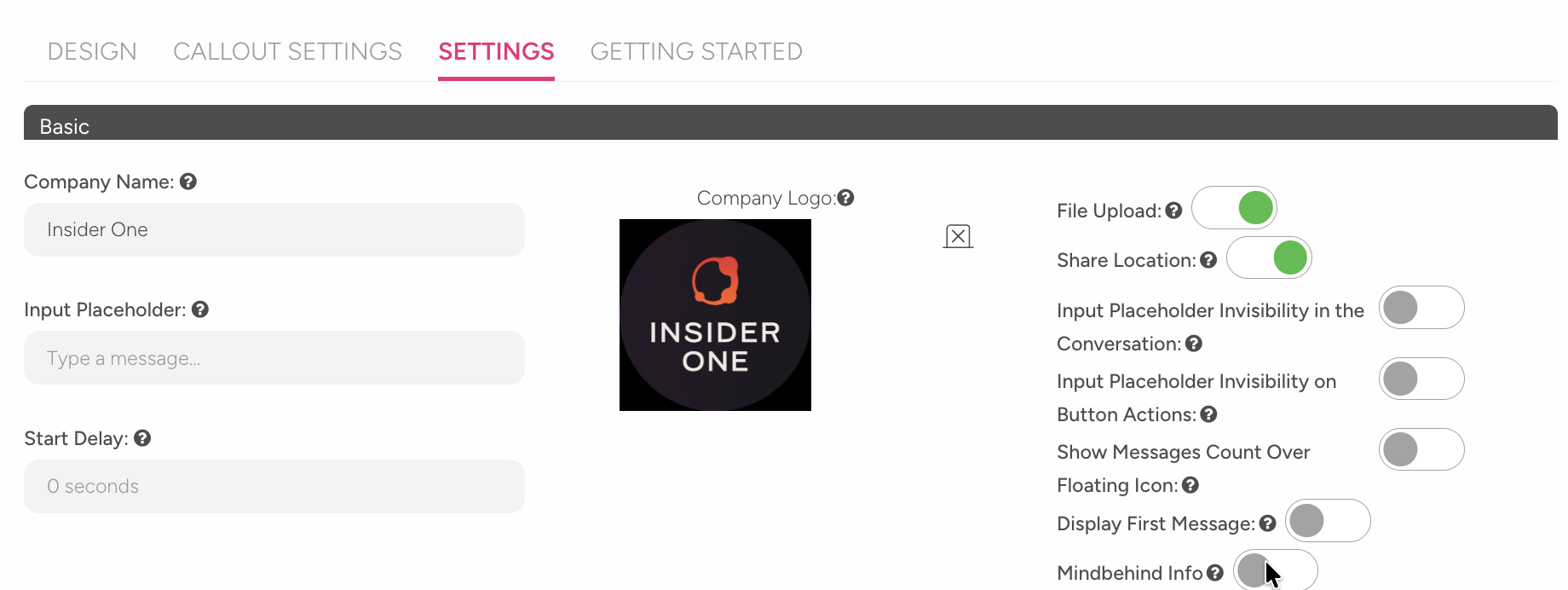
Company Name: The name displayed in the messenger header. Visitors see this name when they open the window.
Input Placeholder: Descriptive text displayed in the message input box. Default: "Type a message…"
Start Delay: Sets how many seconds before the messenger initiates the conversation. Example: entering 3 adds a 3-second delay before messaging starts.
Company Logo: A small logo displayed on the widget button. Maximum 20 MB.
Feature Toggle Settings
Enable or disable additional features available in the messenger.
File Upload: When on, users can send files along with messages.
Share Location: When on, users can share their location.
Input Field Visibility Settings
Control when the message input field is visible during the conversation.
Input Placeholder Invisibility in the Conversation: When enabled, the message input box is hidden throughout the entire conversation.
Input Placeholder Invisibility on Button Actions: When enabled, the input box is hidden only when button options are displayed.
These settings work independently of each other. You can enable both at the same time.
Notification and First Message Settings
Control how notifications appear and configure the first message shown to users.
Show Messages Count Over Floating: When enabled, the unread message count appears as a badge on the corner widget icon.
Display First Message: When enabled, a predefined message is displayed when the user opens the messenger for the first time.
First Message: Enter the welcome message shown to the user. Example: "Hello! How can I help you?"
GDPR Settings
Enable GDPR to collect user consent before starting a conversation.
Turn on the Enable GDPR toggle to activate the GDPR feature.
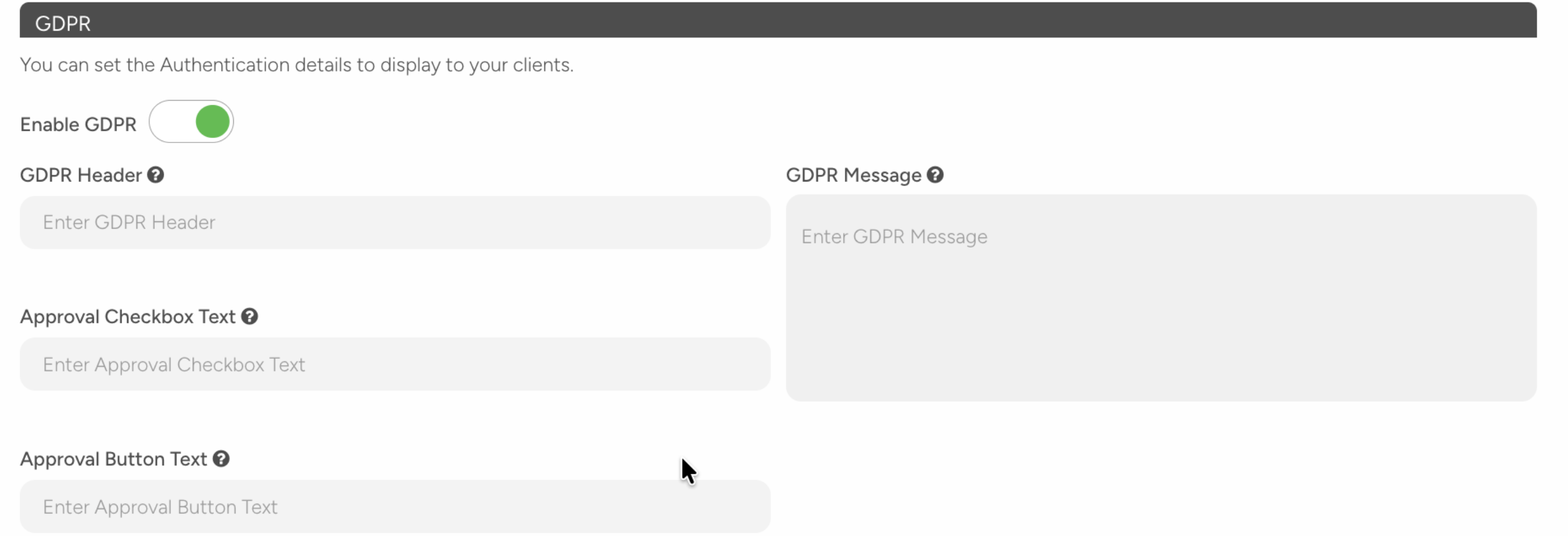
When enabled, the following fields appear:
Field | Description |
|---|---|
GDPR Header | Title of the consent window |
GDPR Message | Informational text shown to the user |
Approval Checkbox Text | Text displayed next to the checkbox |
Approval Button Text | Text displayed on the proceed button |
All fields are required. You cannot save unless all fields are completed.
Authentication Settings
You can require users to verify their identity before starting a conversation.
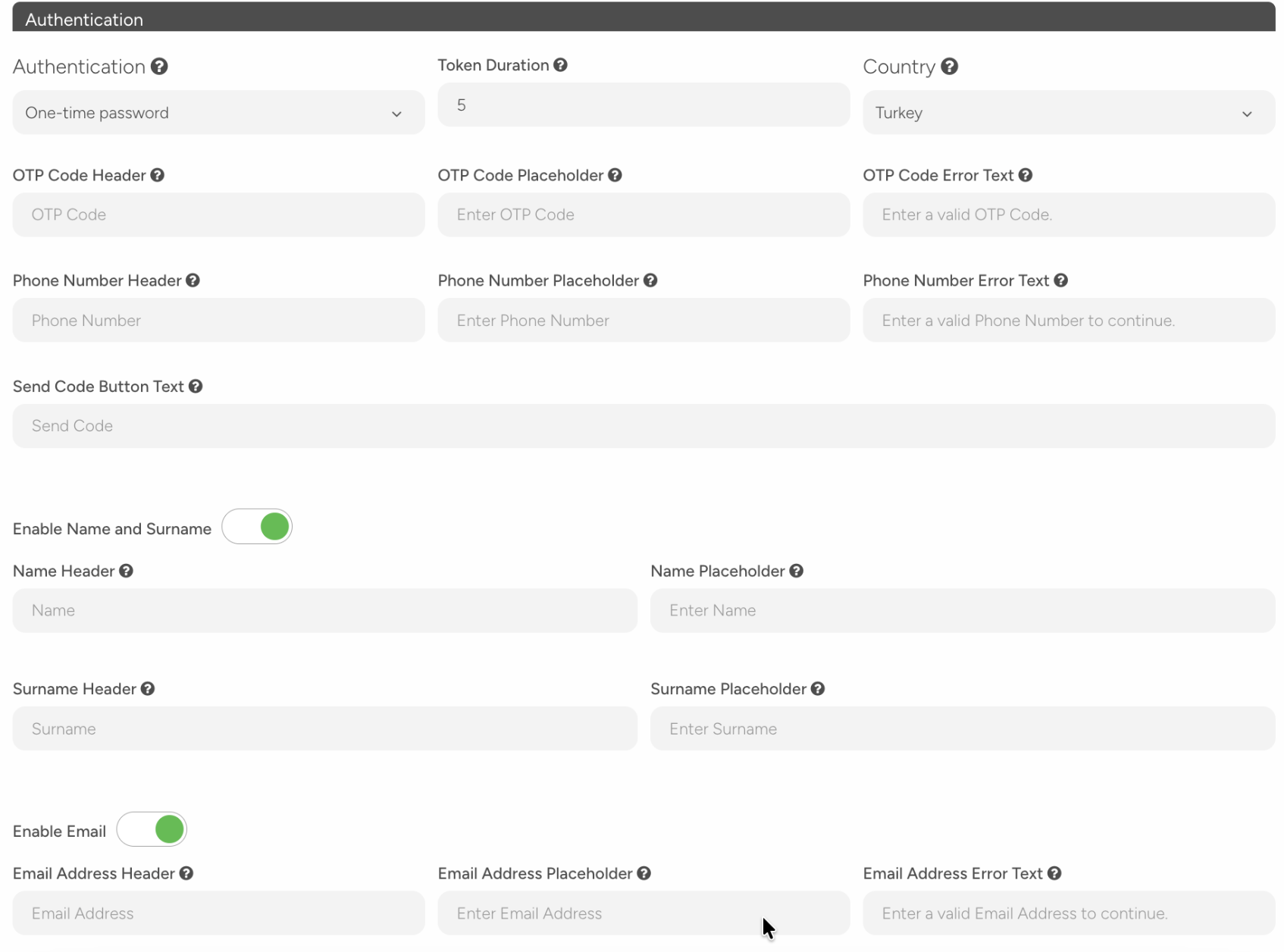
Require users to verify their identity before starting a conversation.
Authentication: Select an authentication method from the dropdown:
No authentication (default)
OTP (One-Time Password)
Token
Token Duration: Set how long the session remains valid (in hours) when using OTP or Token.
Country: In OTP mode, set the default country for the phone number field. If not set, users select their own country.
Additional fields when OTP mode is enabled
Configure the screens and fields shown during OTP-based authentication.
Phone Number Screen
Field | Description |
|---|---|
Phone Number Header | Title of the phone number entry screen |
Phone Number Placeholder | Descriptive text displayed in the input box |
Phone Number Error Text | Error message shown for invalid numbers |
SMS Verification Screen
Field | Description |
|---|---|
OTP Code Header | Title of the SMS code entry screen |
OTP Code Placeholder | Descriptive text displayed in the input box |
OTP Code Error Text | Error message shown for incorrect codes |
Send Code Button Text | Text displayed on the button used to send the SMS |
Enable Name and Surname
Turn on the toggle to ask users for their first and last names.
Field | Description |
|---|---|
Name Header | Title of the name entry screen |
Name Placeholder | Descriptive text displayed in the input box |
Surname Header | Title of the surname entry screen |
Surname Placeholder | Descriptive text displayed in the input box |
Enable Email
Turn on the toggle to ask users for their email address.
Field | Description |
|---|---|
Email Address Header | Title of the email entry screen |
Email Address Placeholder | Descriptive text displayed in the input box |
Email Address Error Text | Error message shown for invalid email addresses |
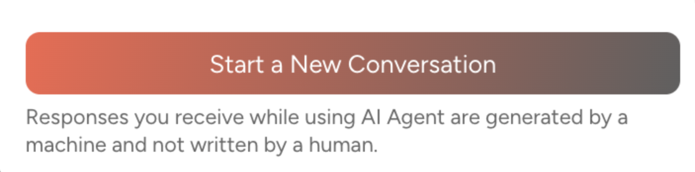
Start Conversation Button
Start Conversation Button Text on the "start new conversation" button displayed on the first screen when the messenger opens.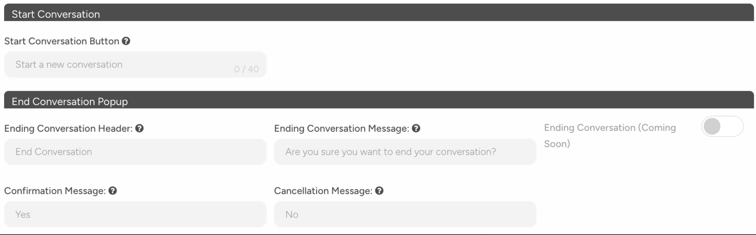
Default: "Start a new conversation"
Maximum: 40 characters, Minimum: 2 characters
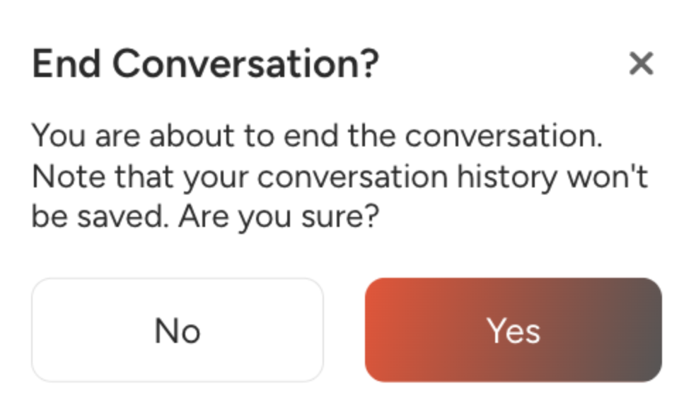
End Conversation Popup Settings
Customize the confirmation pop-up displayed when a user tries to end a conversation.
Field | Description | Example |
|---|---|---|
Ending Conversation Header | Title of the pop-up | "End Conversation" |
Ending Conversation Message | Confirmation question shown to the user | "Are you sure you want to end the conversation?" |
Confirmation Message | Text displayed on the confirmation button | "Yes" |
Cancellation Message | Text displayed on the cancel button | "No" |
Conversation Starter Prompts
Add predefined options that users can select to start a conversation when the messenger opens. This feature is available only in v2.
To activate conversation starter prompts, turn on the Enable Conversation Starter toggle.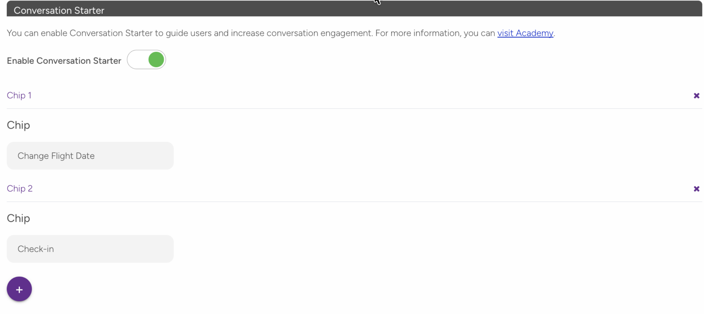
After enabling:
Click the + button to add a new prompt.
Enter the text. Each prompt must be between 2 and 30 characters.
Reorder or delete prompts if needed.
You can add up to four prompts.
AI Disclaimer
Add a disclaimer to inform users that AI-generated responses may contain errors. This feature is available only in v2.
To activate the disclaimer, turn on the Enable AI Disclaimer toggle.
After enabling:
Enter the disclaimer text in the input field. The text must be between 2 and 200 characters.
The disclaimer is displayed in a relevant section of the conversation screen.
GETTING STARTED
Use this tab to set up your Web Messenger and test how it works.
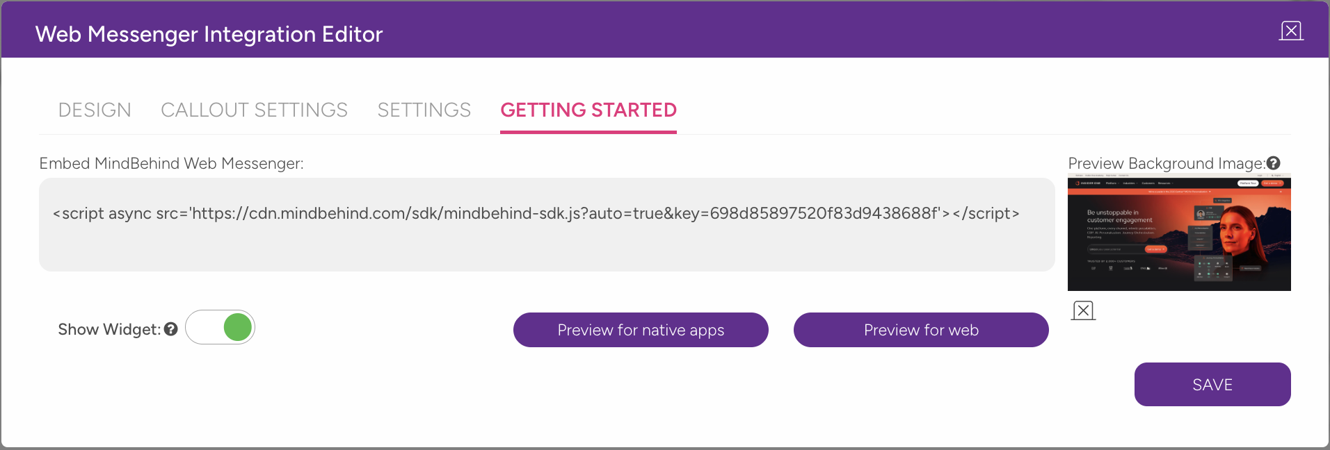
Embed Code (Script)
Copy the script code and add it to your website to enable the Web Messenger.
Paste the code inside your site’s <body> tag.
Show Widget
Turn off the Show Widget toggle to hide the widget on your website, even if the script is installed. Use this for maintenance or temporary hiding.
Preview
Use preview options to test how the messenger appears in different environments.
Option | What it shows |
|---|---|
Preview for web | Opens the messenger in a desktop browser |
Preview for native apps | Opens the messenger in full-screen mode for mobile apps |
During preview, you can upload a test background image. This image is only visible in the preview and does not affect your live site.
User Actions
Review the actions users can perform in Web Messenger v2.
Open and close the Messenger
Users can open the messenger through the widget icon.
Users can close it using the X icon or by clicking outside the window.
When reopened, the conversation continues from where it left off.

Start and end a conversation
Users can start a new conversation with the Start a New Conversation button.
Users can end a conversation from the messenger header. A confirmation pop-up appears. Users can confirm with Yes or return with No.
Write and send messages
Users can enter messages in the input field at the bottom of the screen.
Users can send messages with the Send button or the Enter key.
After sending, the message status updates from Sending... to Delivered.
Attach files
If file upload is enabled:
Users can use the attachment (paperclip) icon next to the input field.
Users can select a file from their device.
The file is sent with the message.
If the file size or format is not supported, an error message appears.
Share location
If location sharing is enabled:
Users can use the location icon next to the input field.
The browser requests location access permission.
If permission is granted, the user’s location is shared.
If the location cannot be shared, an error message appears.
Send emojis
Users can use the emoji icon in the input field to add emojis to messages.
Resize the Messenger
Users can expand or minimize the messenger window with the resize icon in the upper corner. 
Message types
Web Messenger v2 supports the following message types:
Text messages are the most plain message type. They contain plain text sent by the bot or a live agent.
Bot message bubbles follow the Conversation Color setting.
Photo or image content sent by the bot or agent. Images can be viewed in full screen by clicking on them.
Button messages include selectable options sent by the bot. Users can choose an option through buttons.
Buttons typically become inactive after selection.
The input field can be hidden while buttons are displayed, depending on the input field settings.
Location messages include map or address information shared by the bot. The location can be opened in a map application.
File messages include documents such as PDFs, Excel files, and other attachments sent by the bot or user.
The file name and size are displayed, and the file can be downloaded.
Carousel messages display a horizontally scrollable list of cards. Each card can include an image, title, description, and button.
Users can navigate between cards and interact with them through buttons.
Limitations and important notes
Side and bottom spacing: Must be between 0 and 200 pixels.
Call-out text: Maximum of 150 characters.
Start Conversation button text: Must be between 2 and 40 characters.
Conversation starter chip count: You can add up to 4 chips.
Conversation starter chip text: Must be between 2 and 30 characters.
AI disclaimer text: Must be between 2 and 200 characters.
Call-out button count: You can add up to 3 buttons.
Typing animation delay: Cannot exceed the call-out delay.
Image and logo file size: Maximum file size is 20 MB.
GDPR fields: All fields are required when GDPR is enabled.
OTP fields: All fields are required when OTP is enabled.
Troubleshooting
"I clicked the SAVE button, but nothing happened." → One of the required fields may be empty. If GDPR is enabled, fill in all four fields. If OTP is enabled, fill in the phone, SMS, and button text fields. Check for red error messages on the page.
"The call-out bubble appears, but the typing animation doesn't show." → The typing animation delay must be less than or equal to the call-out delay.
"I can't see the Conversation Starter section." → This feature is available only in v2. Go to the Design tab and enable the Updated Web Messenger toggle.
"I enabled AI Disclaimer, but the text isn't accepted." → The text must be between 2 and 200 characters.
"I tried to delete a call-out button but couldn't." → The first button cannot be deleted while other buttons exist. Delete the other buttons first or disable button selection.
"The messenger isn't showing on my website." → Make sure the Show Widget toggle is enabled in the Getting Started tab.
"My widget icon isn't showing the custom image." → Custom icons work only in button display mode. Check the display mode setting.