Smart Design Creator is an elite design-to-experience automation engine. It transcends traditional editors by programmatically transforming static visual designs into high-fidelity, interactive campaign assets, eliminating development latency and empowering marketing teams to deploy pixel-perfect creative without writing a single line of code.
The value proposition: from concept to conversion
Synchronous Creative Translation: Convert Figma blueprints into interactive, production-ready campaigns instantaneously.
Intelligent Behavior Mapping: Automatically synchronize design layers with functional UI components through sophisticated structural parsing.
AI-Enhanced Continuity: For elements beyond standard library specifications, our AI-Generation Engine creates interactive placeholders, ensuring your creative vision remains uninterrupted.
The asset library and naming convention
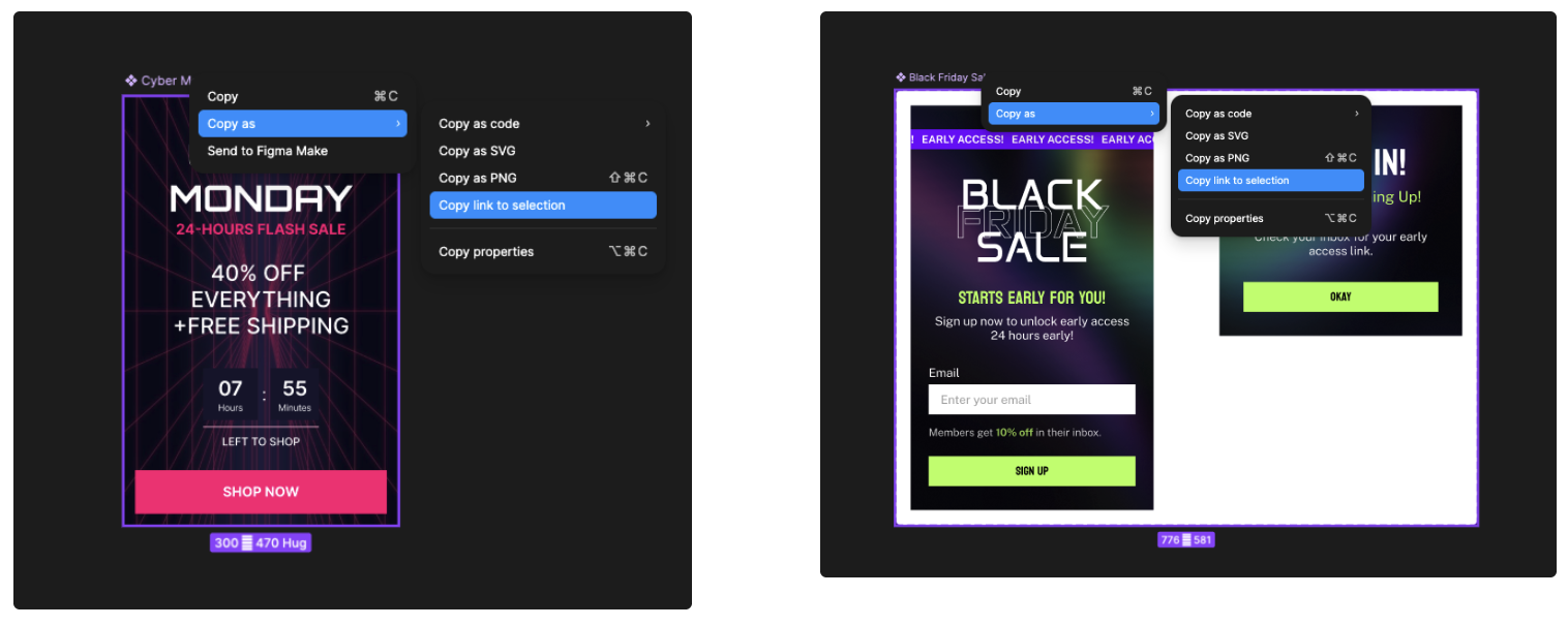
Strategic Entry Point: Access the Figma-to-Campaign Component Library
Think of the Component Library as your Master Design System. This library is the most critical asset in your deployment pipeline; it ensures that your creative vision translates into a functional campaign with zero reconstruction.
By utilizing the library, you move from "drawing boxes" to "orchestrating experiences." This foundational step guarantees:
Instantaneous Element Recognition: The system "sees" your design intent immediately.
Logic-Ready Frameworks: Every component is pre-wired with the necessary functional triggers.
Visual Continuity: What you approve in Figma is exactly what your customer interacts with on your website.
Naming convention rules
The Standardized Component Library is your foundational vocabulary. By utilizing pre-validated building blocks, your creative team ensures the platform’s parser understands the intent behind the pixels:
Every layer must follow predefined Naming Conventions. This is the catalyst for automation, allowing the system to distinguish between a static image and a functional trigger, such as a button or input field.
Maintaining a clean hierarchy and ensuring no overlapping elements prevents "silent layers" and guarantees that the final output mirrors your Figma layout exactly.
While structure is standardized for functionality, aesthetics (color, typography, spacing) remain fully fluid and editable both in Figma and within the Smart Design Creator environment.
Element (Component) usage
Always build layouts using the pre-defined components from the library.
Use clearly separated layers to ensure the platform can parse the "stack" correctly.
While names provide the logic, you retain full sovereignty over aesthetics. Colors, typography, and spacing remain infinitely adjustable within both Figma and the Insider One editor.
Key Recommendation:
Always start your design by:
Opening the component library
Copying relevant components
Building your layout using those components
The operational framework: The Figma-to-Campaign overview
To achieve 1:1 design-to-output fidelity, Smart Design Creator utilizes a logic-first integration with Figma. Adhering to these protocols ensures your creative intent is translated with surgical precision.
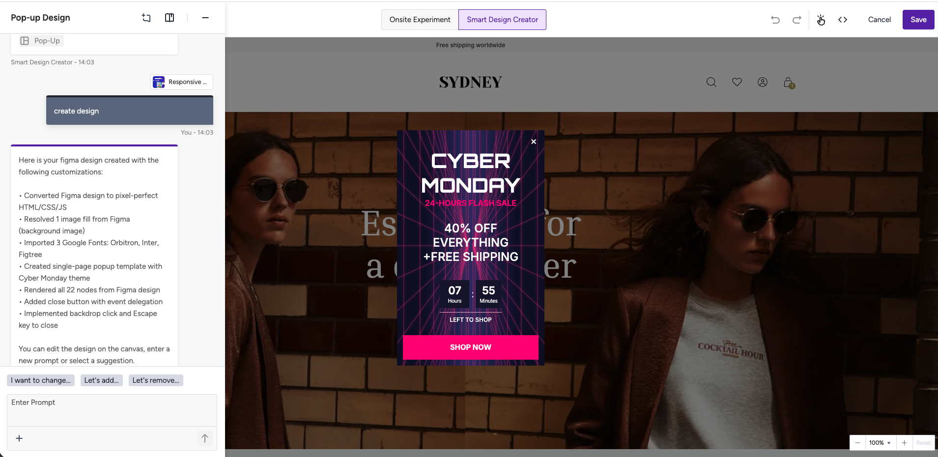
You can refer to the video showing how to import and design a Figma pop-up design:
Import and design a Figma pop-up design
Design in Figma.
Share a public link and select frame(s).
Configure access to your Figma File
Click on the Share button on the top right.
Under the Who can access section, choose Anyone and under What can they do, select the View option.
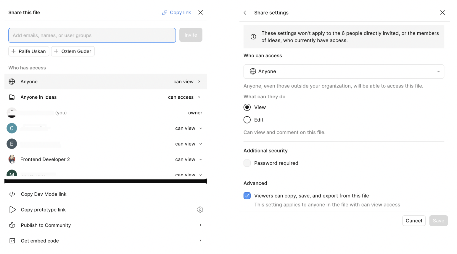
Paste the Figma link and import it into Smart Design Creator.
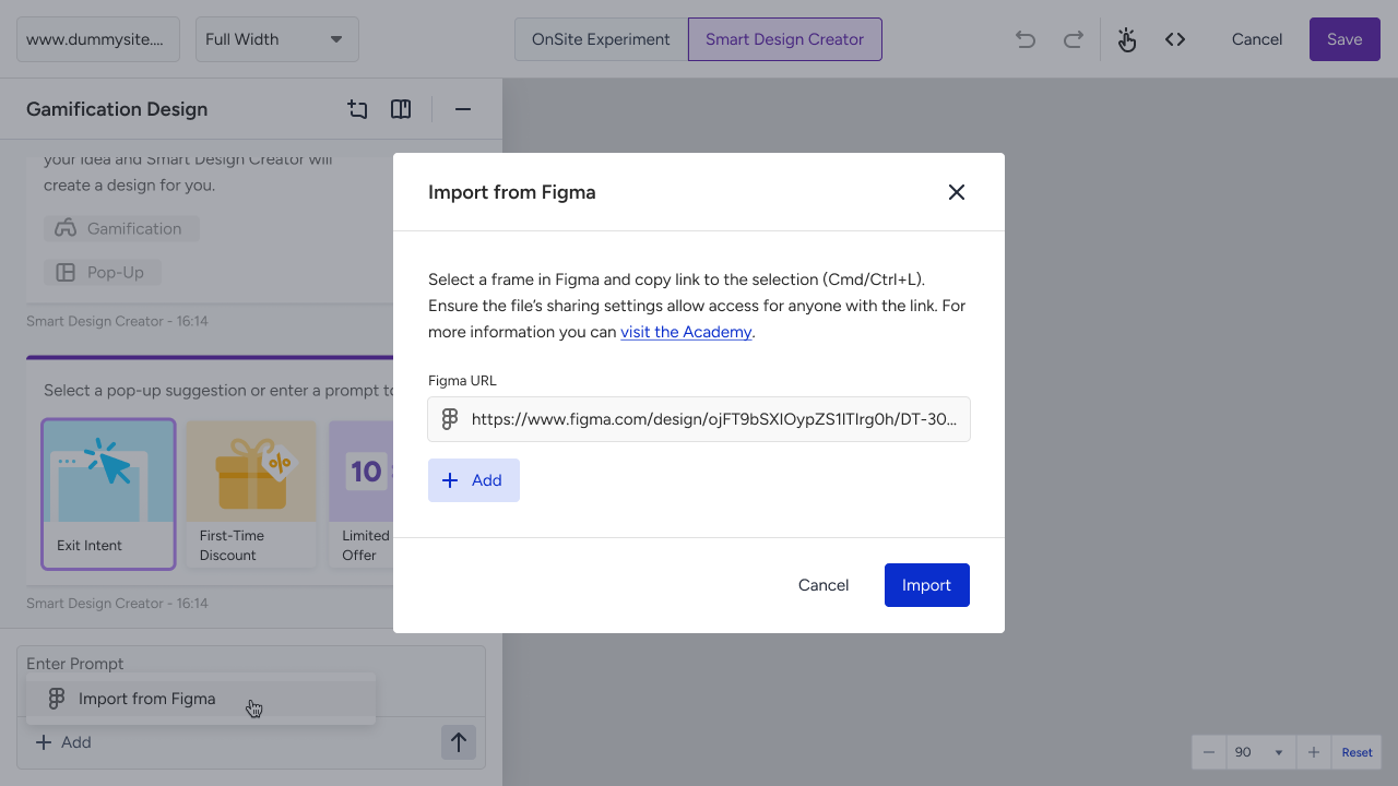
Generate your campaign.
Supported Elements
Text
Button
Images
Coupon Code
Data Collection Inputs
Email
Phone
Name
Surname
Consent
Custom Input
Only one input per type is allowed per campaign.
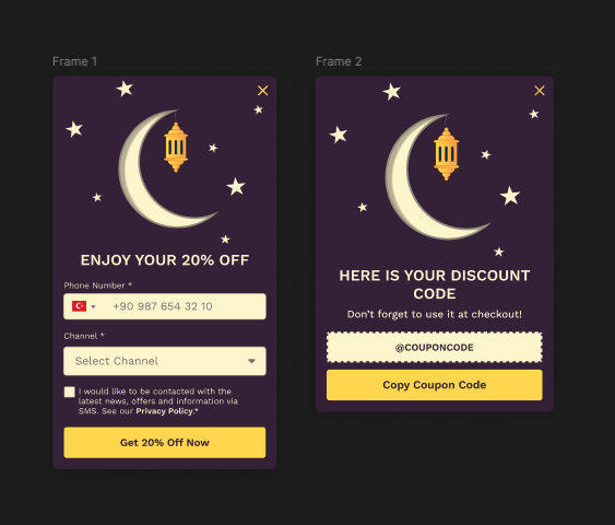
Multi-page campaigns
You can create multi-page experiences in two ways:
Option 1: Single Frame
Multiple pages inside one frame
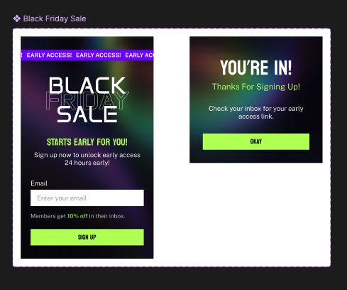
Option 2: Multiple Frames
Each frame = one page
Please be aware that pages must be:
Progressive
Visually consistent
Logically connected
Best practices
To make sure your Figma design turns into a working campaign without any issues, follow these simple rules:
Use Public Links: Make sure your Figma file is set so that "Anyone with the link" can "View." The tool needs this permission to "read" your design.
Always Use Frames: Every part of your design must be inside a Frame in Figma. If it’s just floating on the canvas, the tool won’t see it.
Stick to the Library: Don't draw your own buttons or text boxes from scratch. Always copy and paste from the Official Insider One Component Library and keep the layer names exactly as they are.
Watch Your Image Size: Keep images under 500 KB. If they are bigger, the system will shrink them for you, but starting with small files makes your campaign load much faster for users.
Keep it Neat: Make sure your layers are organized and that nothing overlaps. Use consistent spacing so the final result looks professional and polished.
Think in Steps: For multi-page designs, keep the look and feel the same on every page. This creates a "Progressive Journey" that feels natural for the user.
Include Consent: The system can add a "Privacy/Consent" box for you, but it’s better if you design your own in Figma so it matches your brand perfectly.
AI-Generated Elements:
If your design includes complex items that the tool doesn't natively support, don't worry. Our AI-Generation feature can turn them into "interactive-only" versions. This means they will look and act right in the campaign, even if they weren't part of the standard library.
Figma plan requirements
To create and manage multiple campaigns at once, your Figma account needs API access (usually found in professional or higher-tier plans).
If you can't connect, check with your IT team about your Figma MCP (Management Cloud Policy). Sometimes internal security settings block the connection, but this can usually be fixed within your own Figma settings.