According to WhatsApp Business API usage policies, brands can only initiate conversations with end-users via message templates that are pre-approved WhatsApp messages. You need at least one approved message template to create a WhatsApp campaign.
You cannot change the phone number after you create the message template.
The following are the elements of the WhatsApp message templates:
Name
The name input area is to name the message template. Use only lowercase letters, numbers, and underscores.
The message template name field is limited to 512 characters, while the message template content field is limited to 1024 characters.
Language
The language element must be the same as the language you use in the message. It will be used to match the language of the receiver base in the Segments step. For the English language, please select English (US).
Header
The header input area is optional. It can be None, Text, or Media, including images, videos, and documents.
Body
The body input area is to create the body of your message. It can only include 1024 characters, including the template variables. It is possible to use emojis and also dynamic variables in messages by including {{1}}, {{2}}, etc. in the body.
The number of variables in a template is not limited.
User attributes will replace variables to personalize the message.
It supports markdown options such as italic and bold for only one line. It breaks when a line is added. A separate markdown must be used for each line.
Text Formatting
You can use the symbols in the table below to format the text in your WhatsApp messages:
Format | Application |
|---|---|
Bulleted list | Add an asterisk (*) or hyphen (-) followed by a space before your text. For example, * text or - text |
Numbered list | Start each line with a number, a period, and a space. For example, |
| Block quote | Place an angle bracket (>) followed by a space before the text. For example, > text |
Inline code | Enclose the text with backticks (`). For example, `text` |
Bold | Enclose the text with asterisks (*). For example, *text* |
Italic | Enclose the text with underscores (_). For example, _text_ |
| Enclose the text with tildes (~). For example, ~text~ |
Monospace | Enclose the text with three backticks (```). For example, ```text``` |
Footer
The footer input area is to give additional information to the receivers. It is also an optional input field that can remain blank.
Buttons
Two types of buttons are available:
Quick Reply Buttons: They allow receivers to reply quickly to the message that you send. You can add 1, 2, or 3 quick reply buttons to your message template.
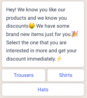
You can find the templates with Quick Reply buttons under the Conversational message type in the Design step.
When you add quick reply buttons to your template, you can add the “Response” within the new campaign.
Call-to-Action (CTA) Buttons: You can use CTA buttons to increase engagement and drive users to take action. You can add up to four CTA buttons to a message, using the following CTA types:
Visit Website: Redirects users to a web page. (Up to two buttons)
Call Phone Number: Allows users to call a phone number directly.
Copy Offer Code: Allows users to copy a promo or discount code.