Suggested reading: Create a Widget-based Smart Recommender Campaign
On the Design step of a Widget-based Smart Recommender campaign, you customize the Recommender Carousel design using the Insider One's platform:
- Smart Recommender Widget, which is the entire component with product cards, arrows, and a header
- Product Card Layout (The Advanced Product Card Designer)
- Product Card Elements
Smart Recommender Widget
After selecting your carousel template, you land on the Action Builder and start customizing it on the Design tab.
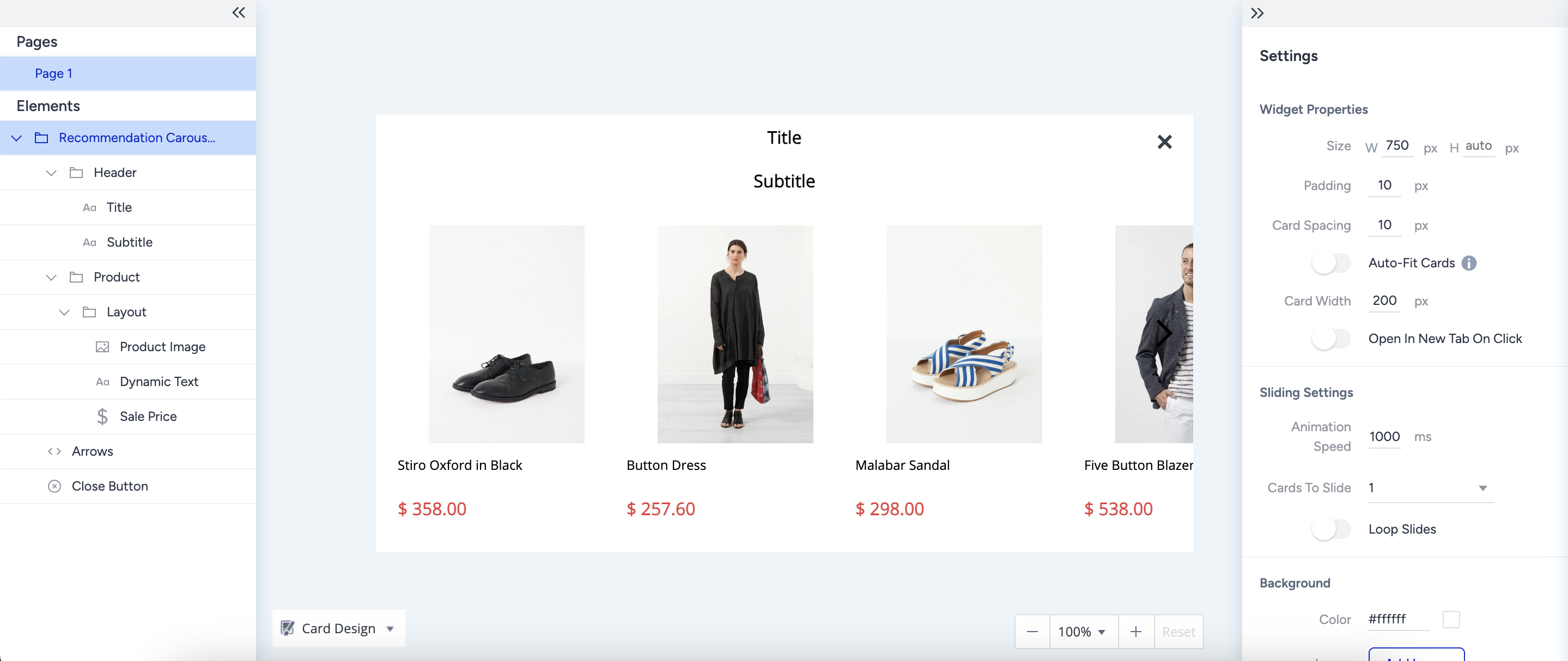
Widget Properties
Under Widget Properties, you can see the pixel size of the Recommender Widget, along with the widget padding and card spacing, to customize the components' positions.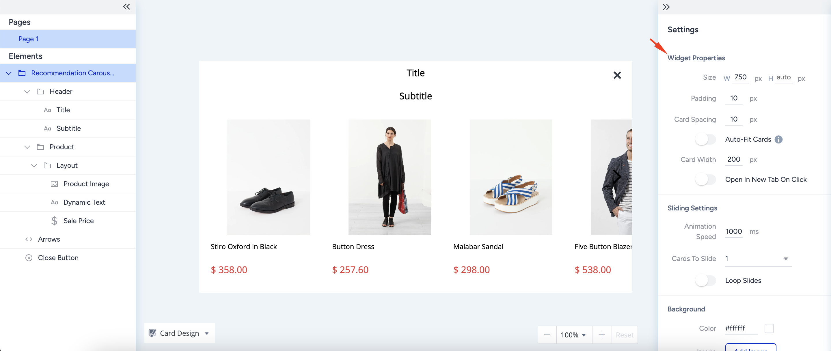
Sliding Settings
Under Sliding Settings, you can customize the navigation experience inside the recommender carousel. 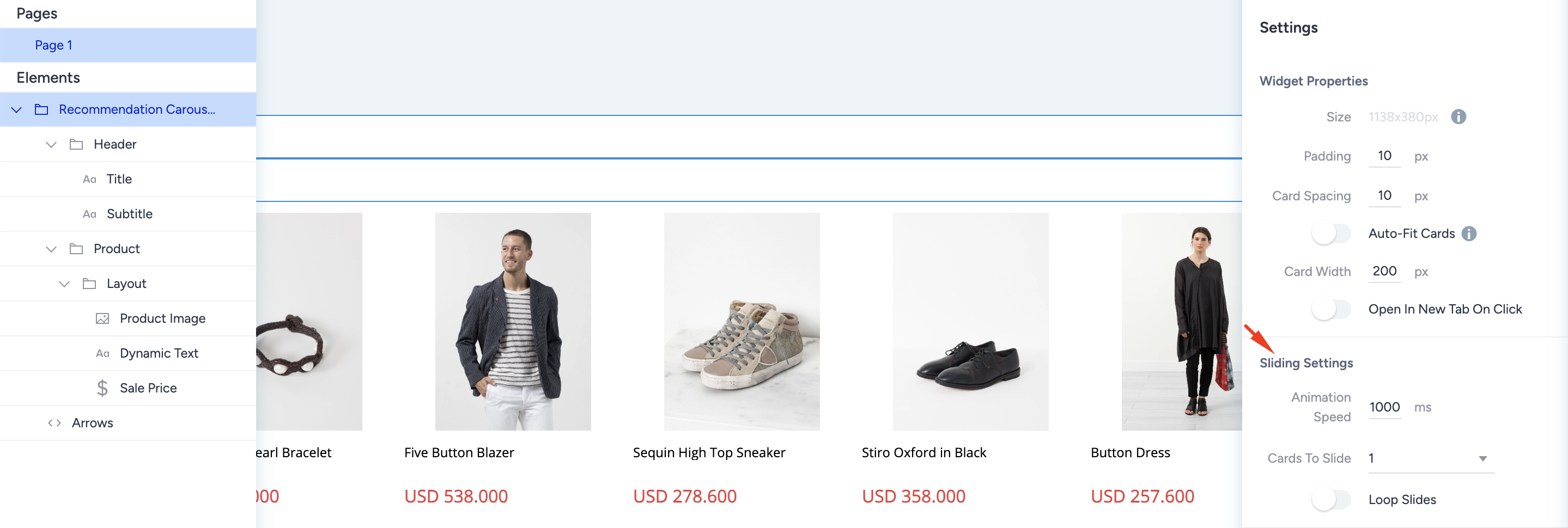
- Animation Speed: This setting adjusts the speed at which product cards slide when clicking the carousel arrows.Since the value is in milliseconds, users might not notice the small changes.
- Cards to Slide: The dropdown lets you set the number of product cards to slide with a single click. If there are fewer products on the carousel than the sliding number you set, when a user clicks on an arrow on your carousel, it takes the user to the last product in that direction.You can select a maximum of 12 products to slide once.
- Loop Slides: This toggle enables navigation through the carousel in a loop. When you enable this toggle, a user on your website can keep clicking on the same side arrow and see all products. When you disable it, the user clicks on the right arrow until they reach the last recommended product, then they need to click on the left arrow to navigate back.
Background
Under Background, you can customize the background of the recommender carousel. The background covers the entire carousel except the header, which has its own settings. You can select either a single color or a background image for customization. When you use a background image, the image will automatically fit into the available space.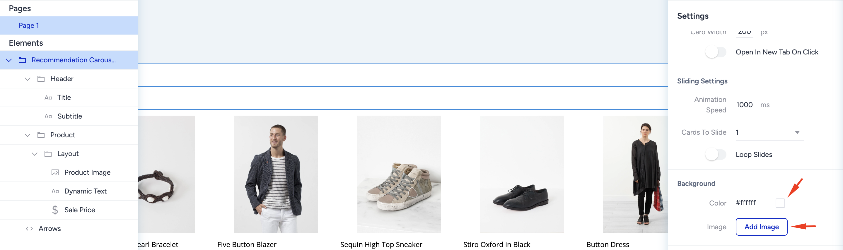
Border
The border is a generic setting that is available for almost all elements of the Recommender Carousel.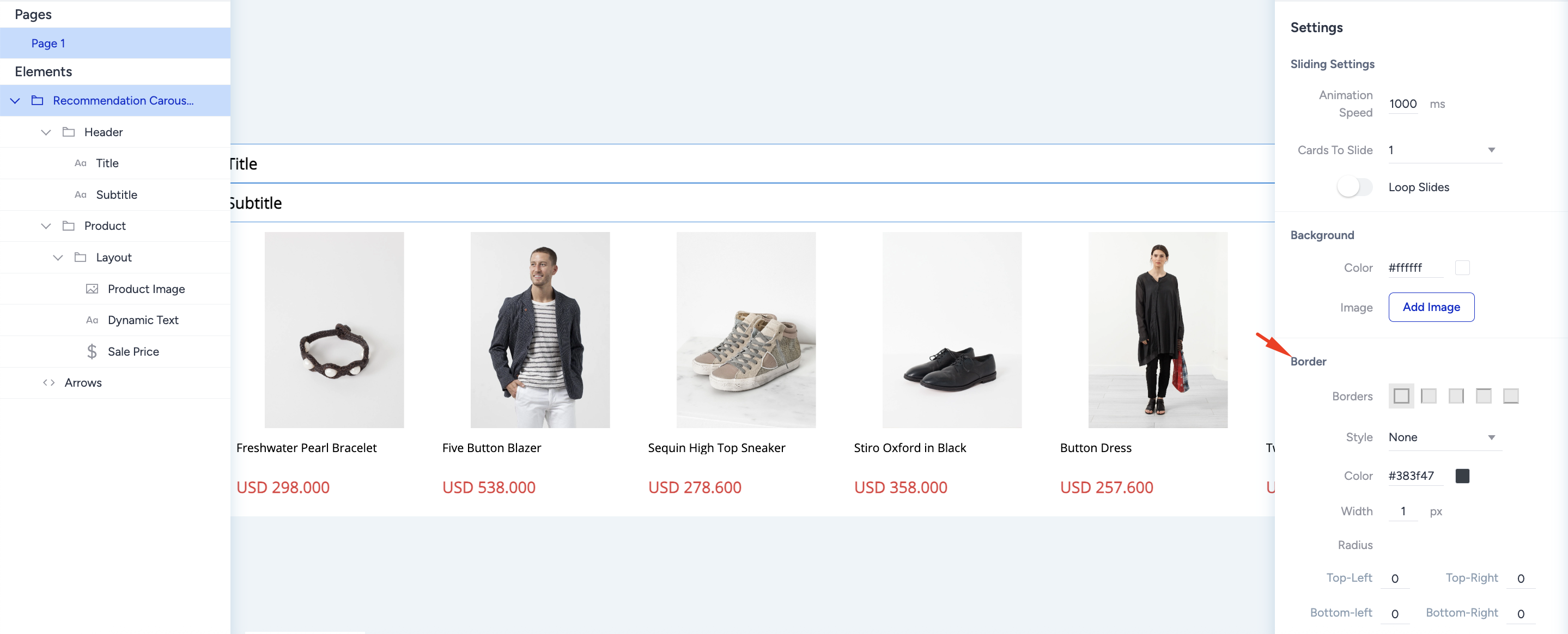 To customize your border settings:
- Select the border style from the dropdown.
- Enter the desired border width in pixels and select the border color.
- Select the edges where you want to place your borders.
- Apply a radius to the corners to soften the sharp edges.
Animations
Animations control the appearance of your Smart Recommender Carousel when users land on your website. You can select the animation type and view it for opening and closing animations.
To use and select its type, click the + (plus) button against animations and customize it.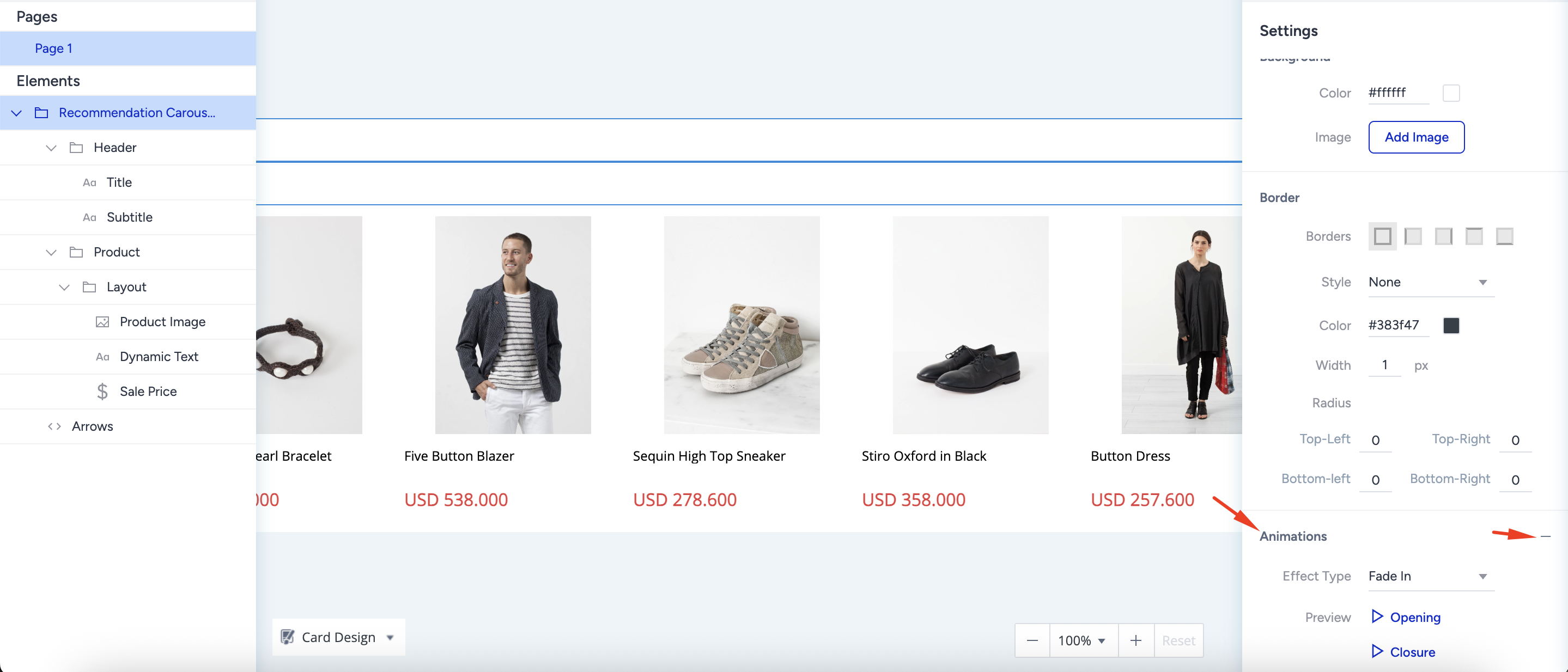
Header
The header helps you attract users' attention and state the main property of the campaign with the products that are displayed. For example, “Special Offers of the Week” or “Most Popular Products” might grab users' interest and help you drive conversions.
To customize the header, select its element from the left menu and make changes via the right menu.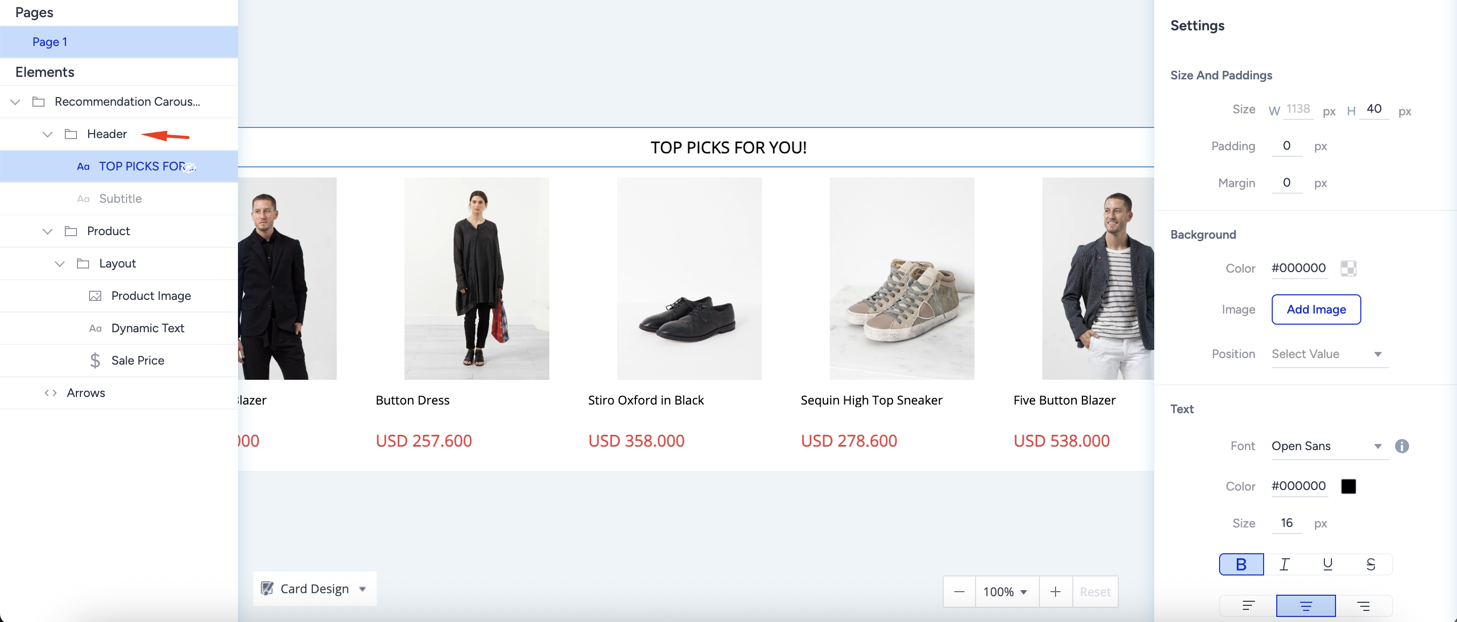
Product Card
Each Smart Recommender campaign consists of multiple product cards.
Dimensions
Under Dimensions, you see two values to customize the product card:
- Size: The size of the product card is fixed and cannot be customized manually. The overall width and height are determined automatically based on the layout and the elements inside the card.
- Padding: Padding defines the space inside the product card between its border and inner content. Adjusting the padding affects how elements are spaced within the card, but does not change the overall card size.
Background
Under Background, you can customize the background color of the product card. The background color applies to all visible areas on the product card.
Border
The border is a generic setting that is available for almost all elements of the carousel. To customize your border settings:
- Select the border style from the dropdown.
- Enter the desired border width in pixels and select the border color.
- Select the edges where you want to place your borders.
- Apply a radius to the corners to soften the sharp edges.
Product Card Layout
A layout defines the skeleton of a product card. It defines the position of each element that you put into the product card. Therefore, before designing, you need to decide on the kind of structure you want for the product card.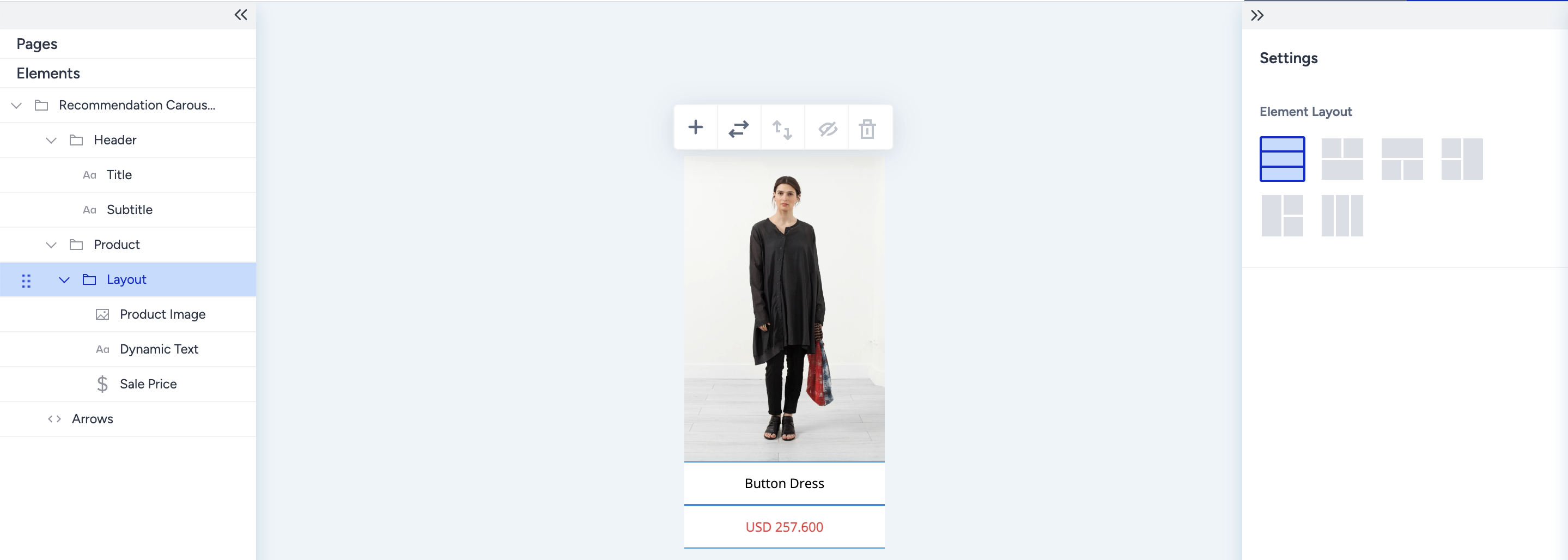
On the product card, each element is part of a layout. Layouts support a minimum of 2 and a maximum of 4 elements because:
- A product card must have an image of the product and its name. So, you need at least two elements to create a product card.
- Depending on the complexity of the design, a product card can have numerous elements. However, as the number of elements in a layout increases, default layout configurations increase exponentially.
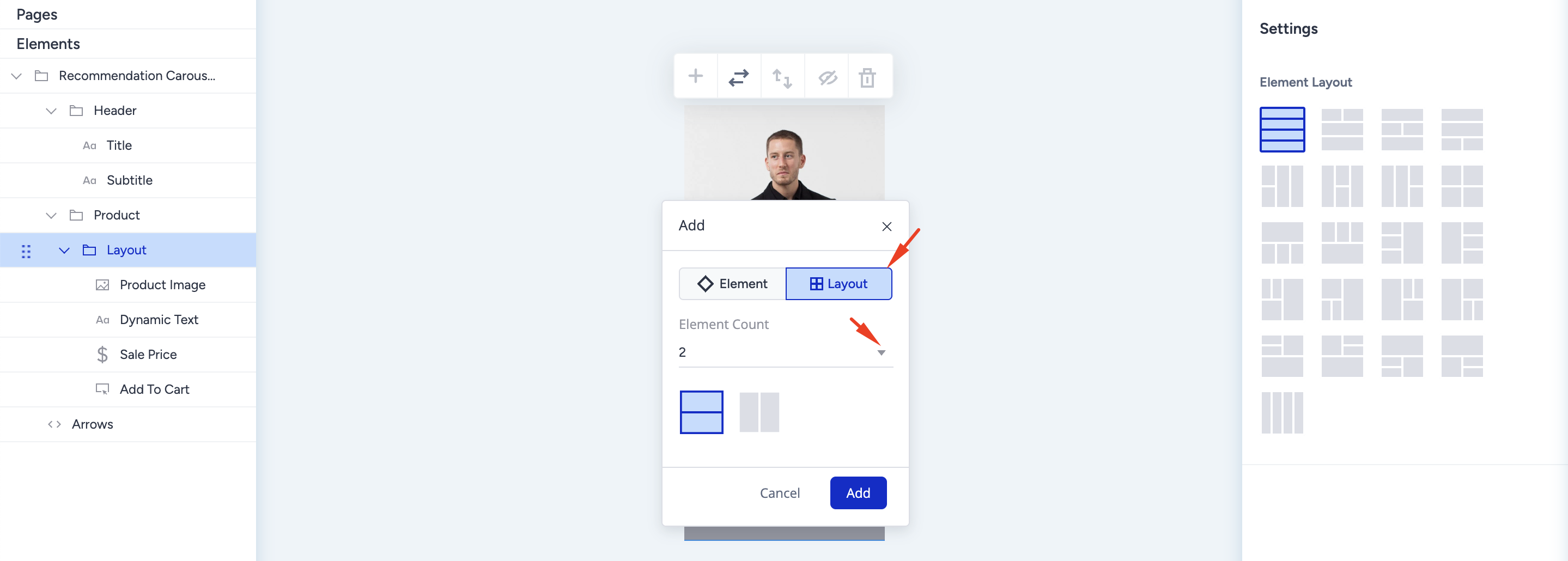
Add Layouts and Elements
The default product card layout has three elements: product image, dynamic text containing the product name, and price. You can see the offered 3-element layout configurations on the right menu.
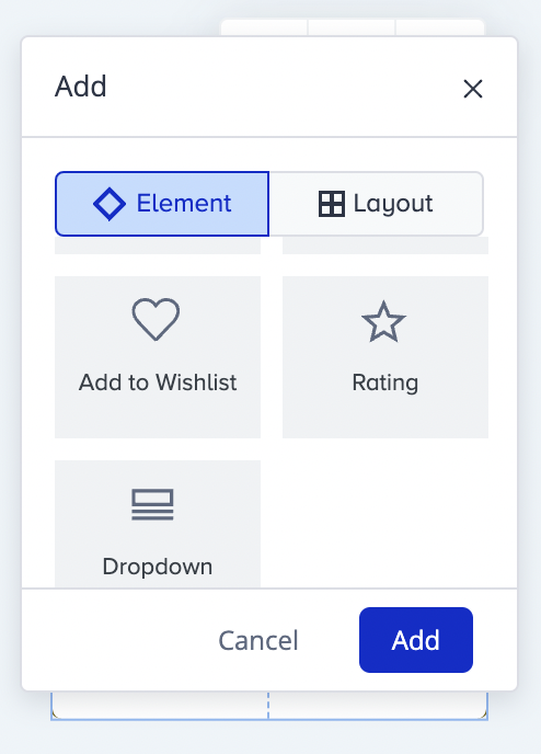
1. To add an element to your layout, click the + (plus) icon from the floating menu to select the new element you want to add. 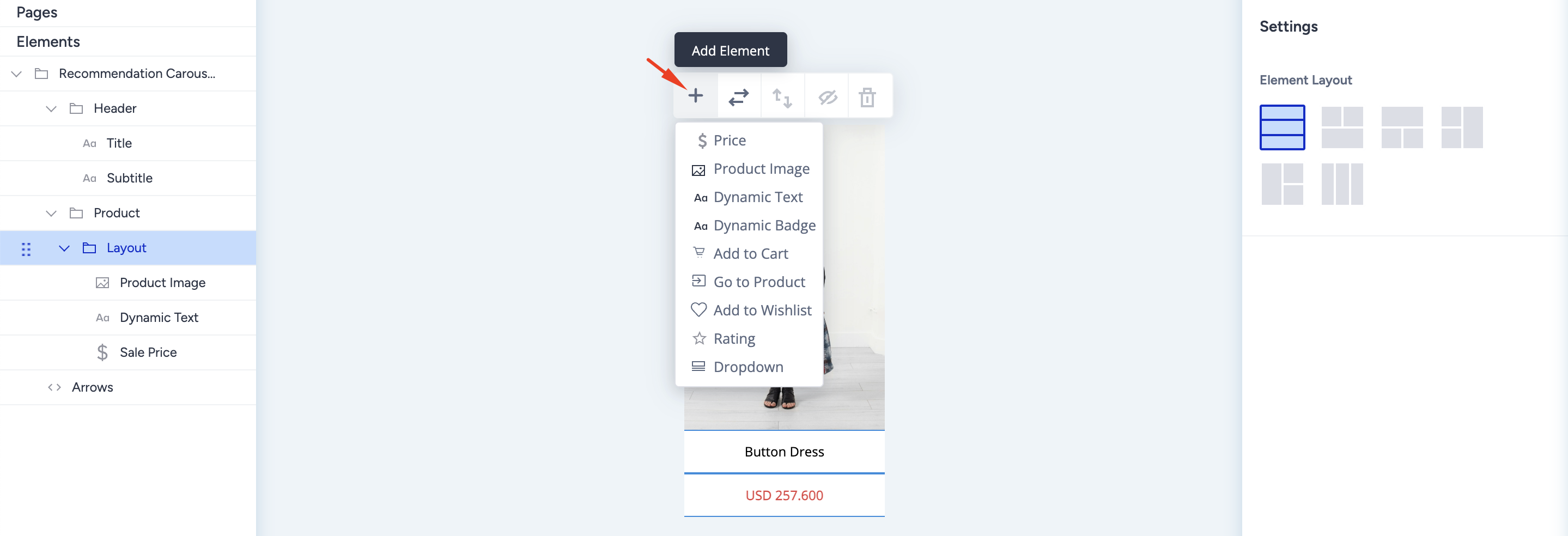
For example, after the “add to cart” element is selected from the list, it becomes a 4-element layout. You cannot insert additional elements in the same layout since you have reached the limit. Also, you can see the 4-element layout configurations on the right settings menu.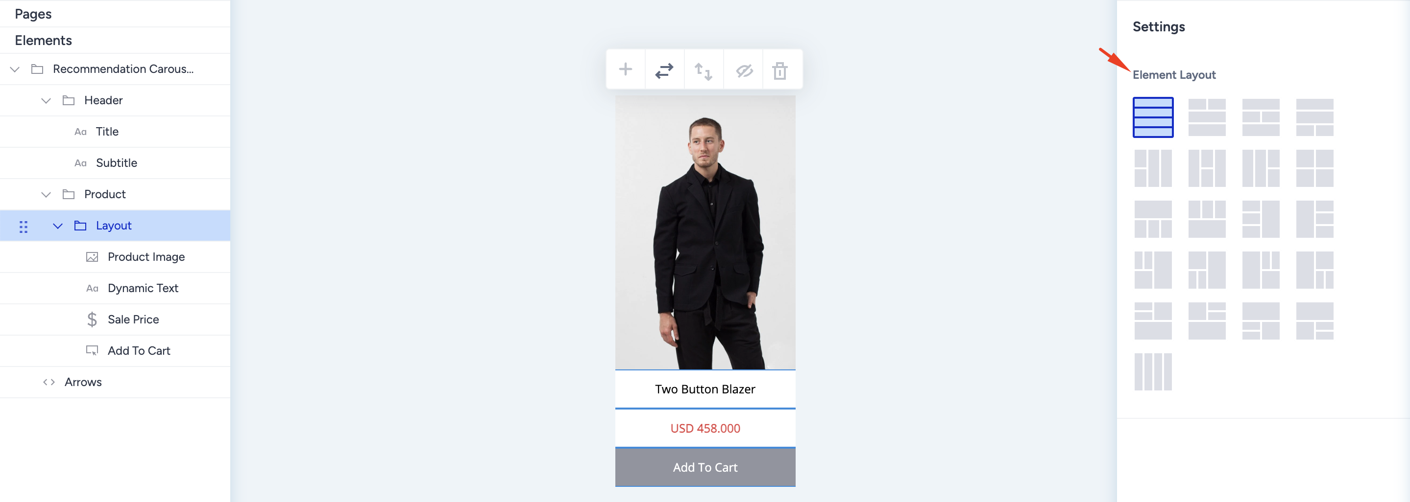
2. When you reach the maximum number of elements on the layout and want more elements on your card, you can follow two different paths since layouts only come with a minimum of 2 elements.
2.1. If you want your card design to have exactly 5 elements, add a singular element without a layout.
- To add a singular element to your layout, hover on the card's edge (up or bottom), and the + (plus) icon will appear on the edge. Click on the + (plus) icon from the floating menu to select the new element you want to add.
- Click and open the element addition menu from the add icon, and scroll to select the element you want to insert.
- The selected element appears on the product card outside the 4-element layout. This means changing the layout configuration will not affect this element.

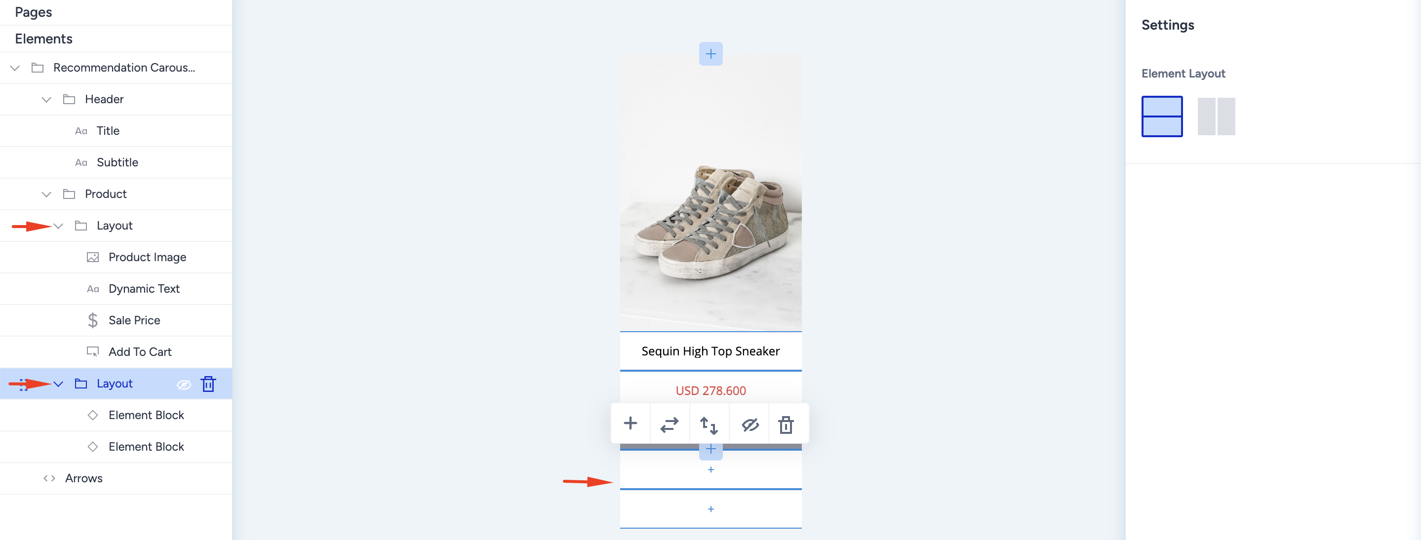
2.2. If you want to have 6 or more elements on your card design, add a new layout to your existing one.
- To add an extra layout to the existing one, hover on the card's edge (up or bottom), and the + (plus) icon will appear on the edge. Click on the + (plus) icon from the floating menu to select the layout option.
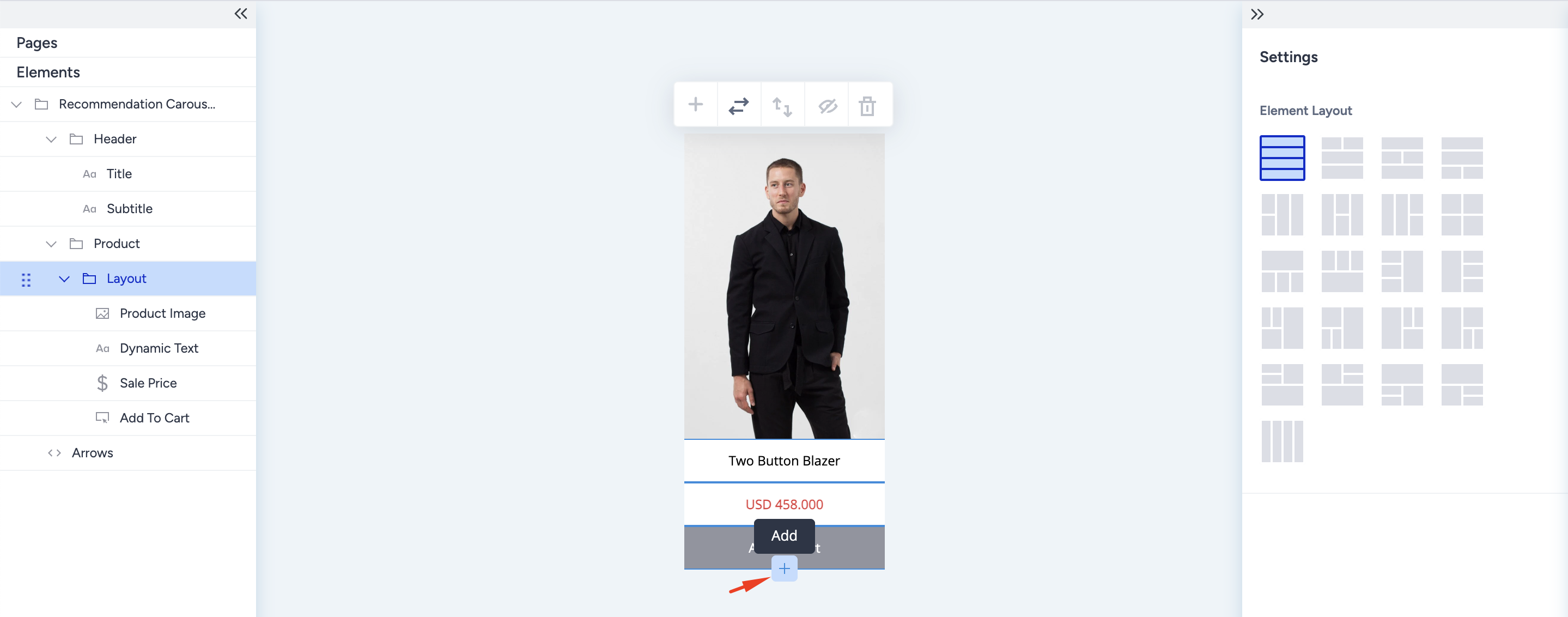
- Click and open the layout addition menu from the add icon. Decide on the number of elements and their configuration.
- The new layout appears with empty containers; click on the container to add an element.
- Once you add the elements to the empty containers of the new layout, you will see the two layouts of your product card on the left menu.
Change the layout
You can change the layout configuration directly on the product card. All layout configurations with the same number of elements are shown on the floating menu. You can also do it via the Settings on the right menu.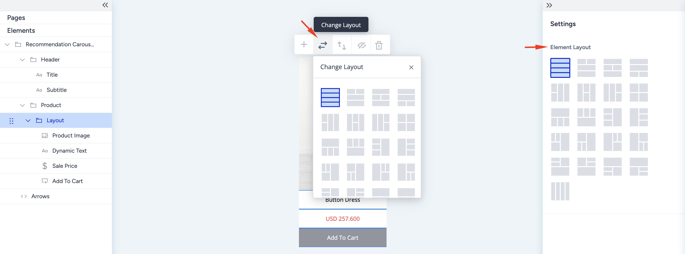
Switch the order
Layouts can swap places with each other. With this button, you can swap the places in your layout with the previous one or the next one. Select the element on the left menu and click the Switch order button on the floating menu.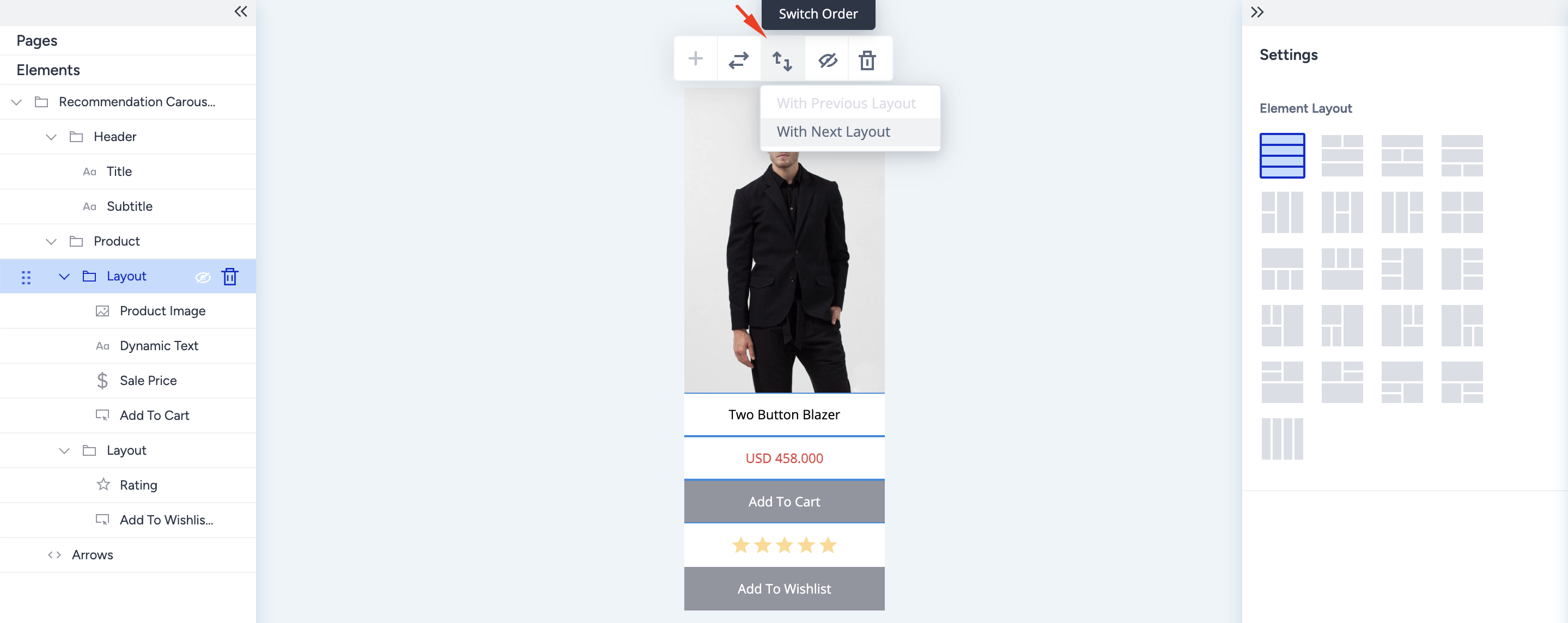
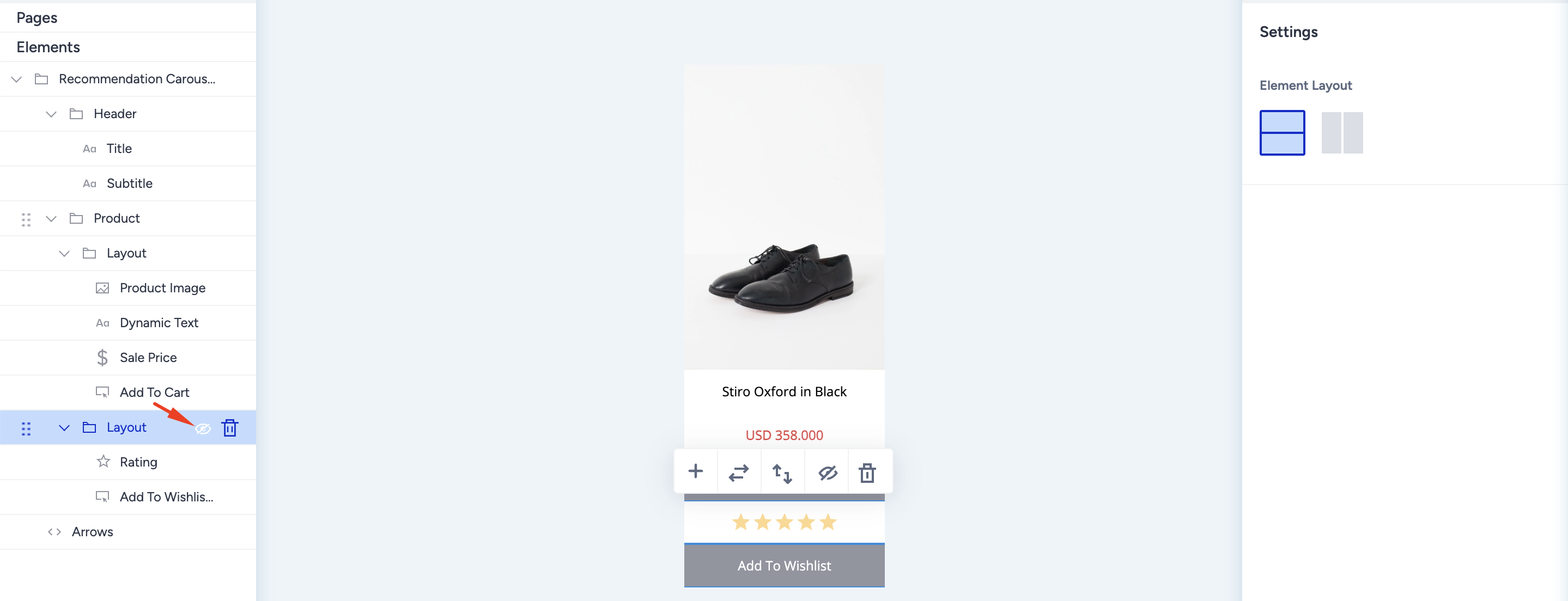
Hide the layout
You can hide layouts using either the button on the floating menu or the hide button on the left menu. Once hidden, your layout will not be visible on the design and preview tabs.
Delete the layout
You can delete a layout using the floating menu button or the Delete icon on the left menu. The same applies to elements.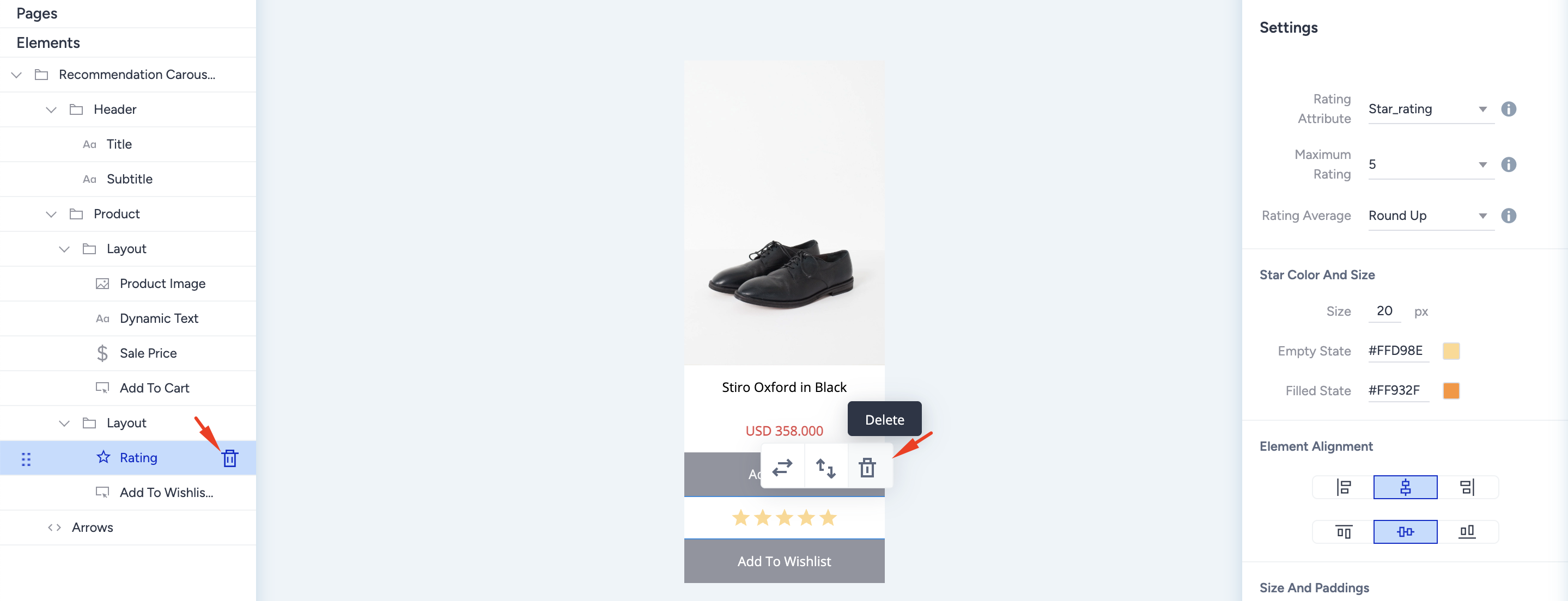
Add Badges and Buttons to an Image element
You can insert the following four product card elements on top of the product image as call-to-action button icons and badges with dynamic content.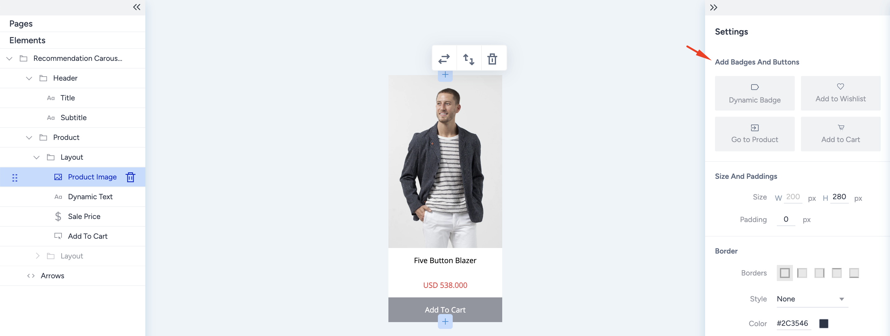
Dynamic Badge
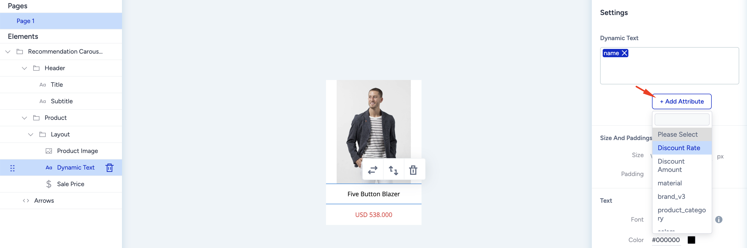
Products can have various properties to attract users' attention, such as “discounted”, “most rated”, or “starred product”. The best way to grab this attention is to put a badge on the product image. You can add dynamic product attributes inside the badge, such as discount rate, and dynamically reflect each product's discount rate.
- Discount badges: To create a discount badge, you can select “discount rate” or “discount amount” attributes from the “add an attribute” button below the dynamic text box.
- Special offer images: These are generally used on free shipping offers. You can upload any image to your badge using the background image upload feature.
- Product specifications: To identify “top-rated”, “starred”, or “low stock” products, you can use product attributes as the text entry and apply a background image for extra visualizations.
When the dynamic badge is selected from the Add Badges and Buttons setting on the product image, it appears with a default text. Under the text box on the right settings menu, click the Add Attribute button to insert a product attribute that will change according to each product's value.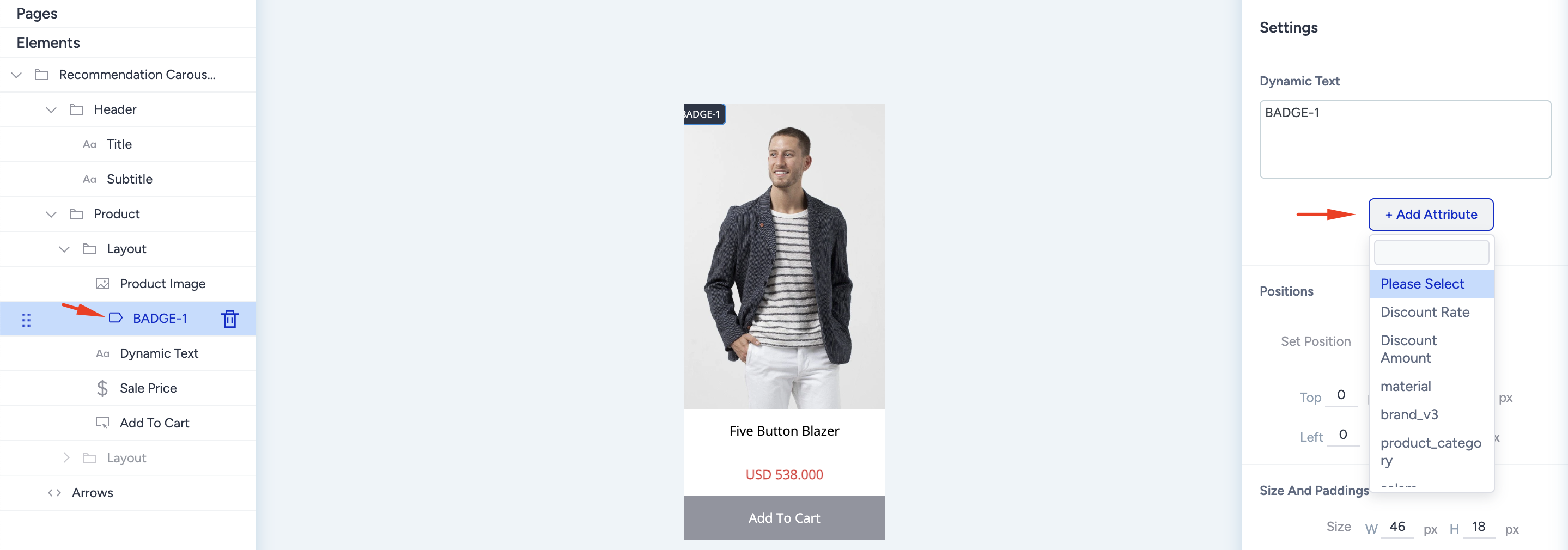
Add to Wishlist
A separate page, such as a wishlist, helps you increase engagement with the products. You can insert it on the product image as an icon or on the product card as a complete button. The complete button application is on the product card when you click the + (plus) button.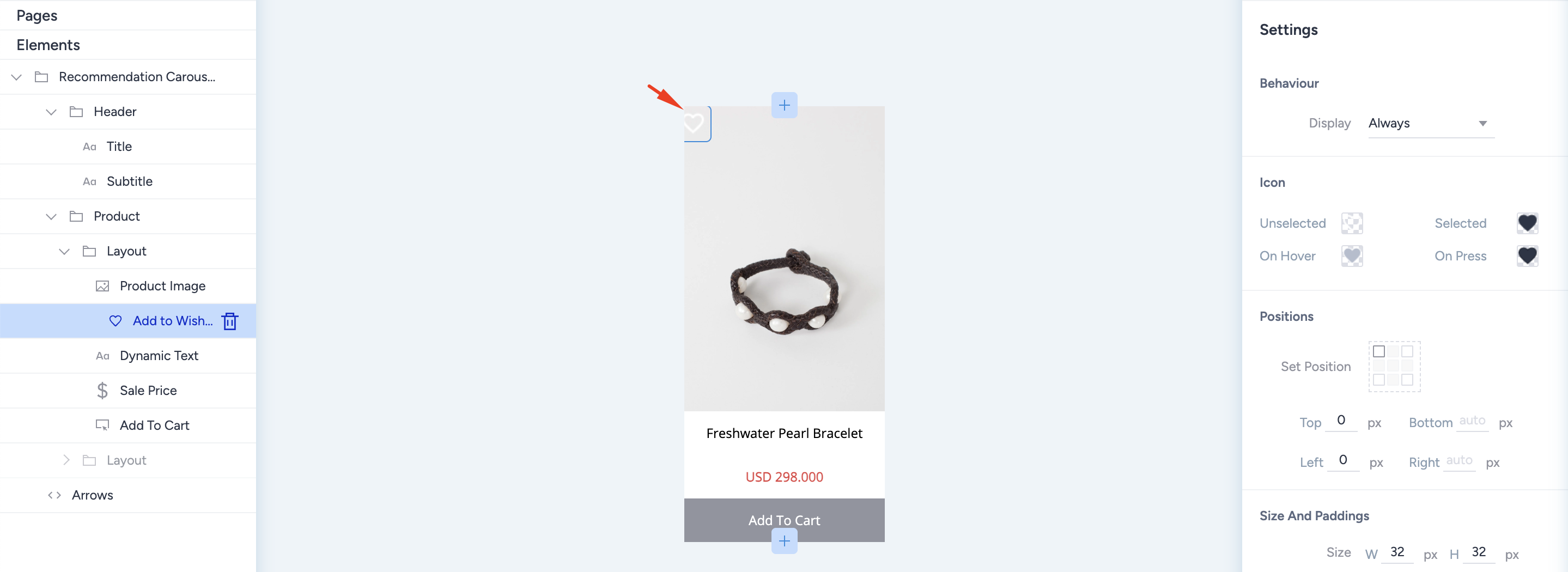
You can change its behavior to be seen, upload different icons, and set a different position.
Go to Product
To increase engagement, you can ease users' experience by using a shortcut to visit the product. You can insert a "go to product" badge on the product image as an icon or on the product card as a complete button. You can find the complete button application on the product card when you click the + (plus) button.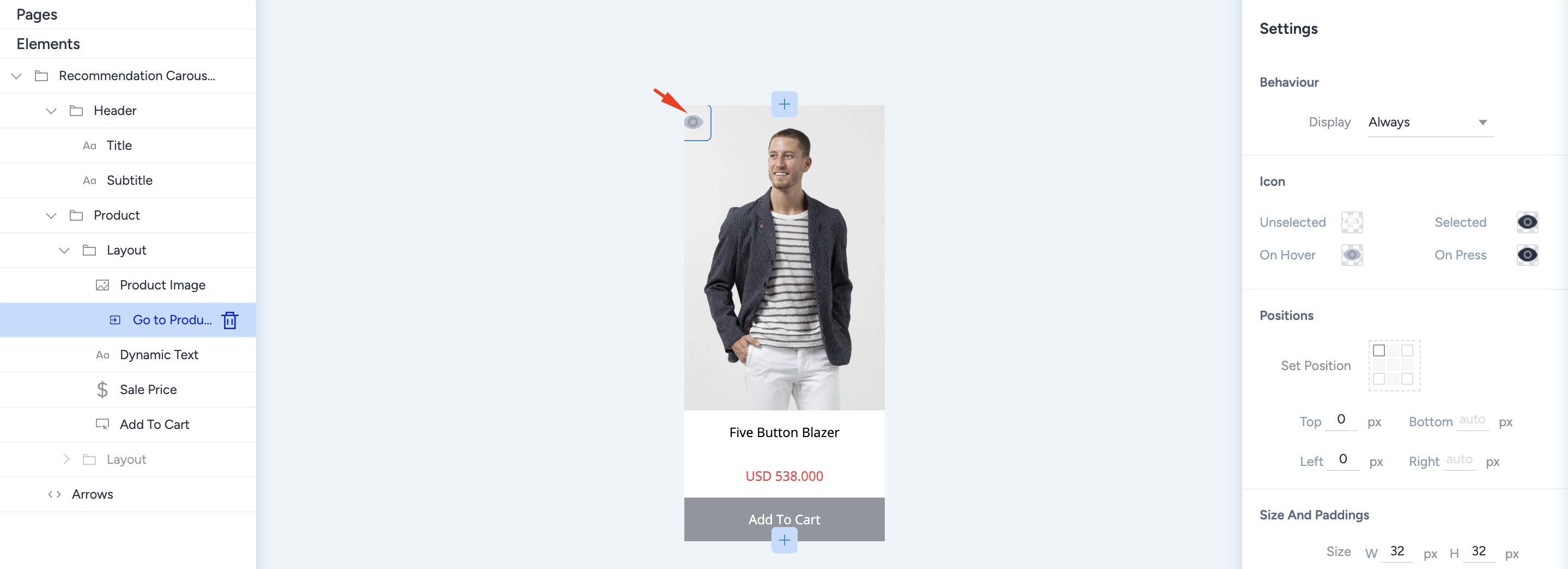
You can change its behavior to be seen, upload different icons, and set a different position.
Add to Cart
One of the most important elements on a product card is the "add to cart" call-to-action button. Like the "add to wishlist," you can place the add-to-cart action button as an icon on the product image or on the product card as a complete button.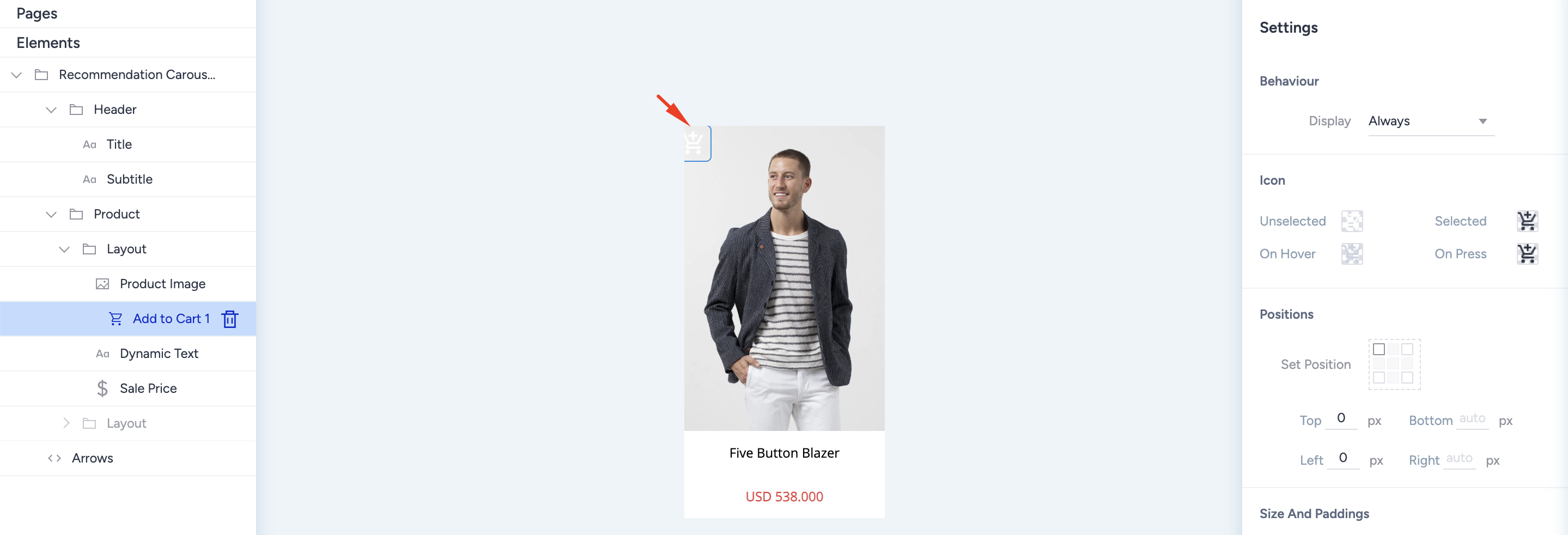
Dynamic Text and Dynamic Image
You can use Dynamic Text element on the product card with static text and dynamic attributes. You can combine static texts with dynamic texts or numbers that come from product attributes.
You can also use the Dynamic Badge element to insert background images into the designated area. Thanks to the dynamic badge, you can create promotional visuals, such as free shipping. Similar to the Dynamic Text element, you can combine static texts with dynamic ones for full customization.
Price
The product price is one of the elements of the product card. By default, the price is inserted as “Sale Price” on the product card designer. You can change the price type from the Settings menu on the right side. When you select it, the value on the product card changes automatically.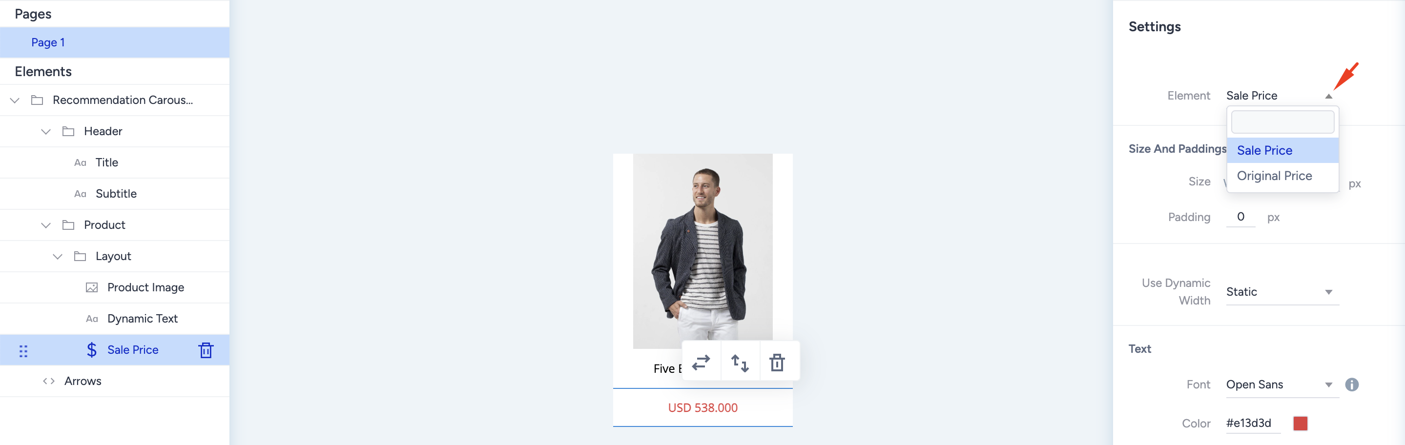
To use a discount price with the original price, add two price elements on the product card and change one to “Original Price”. You can also apply different layouts to visualize discount campaigns.
Rating Element
Thanks to visualizing product performance, rating is one of the most critical product card elements, creating value. Product ratings are pretty crucial for designing attention-grabbing product card designs. You can use the rating element to visualize both the rating with stars and the rating or review details with the number of reviews or the exact rating score.
Click the + (plus) button on the product card to add the Rating element.
After adding it, you must select the attribute corresponding to the rating. You can also use dynamic text that is offered as a product attribute. You can choose the interval for the rating scale as 0-5 or 0-10. For fractional ratings such as 5.3, you must select a rounding option for star visualizations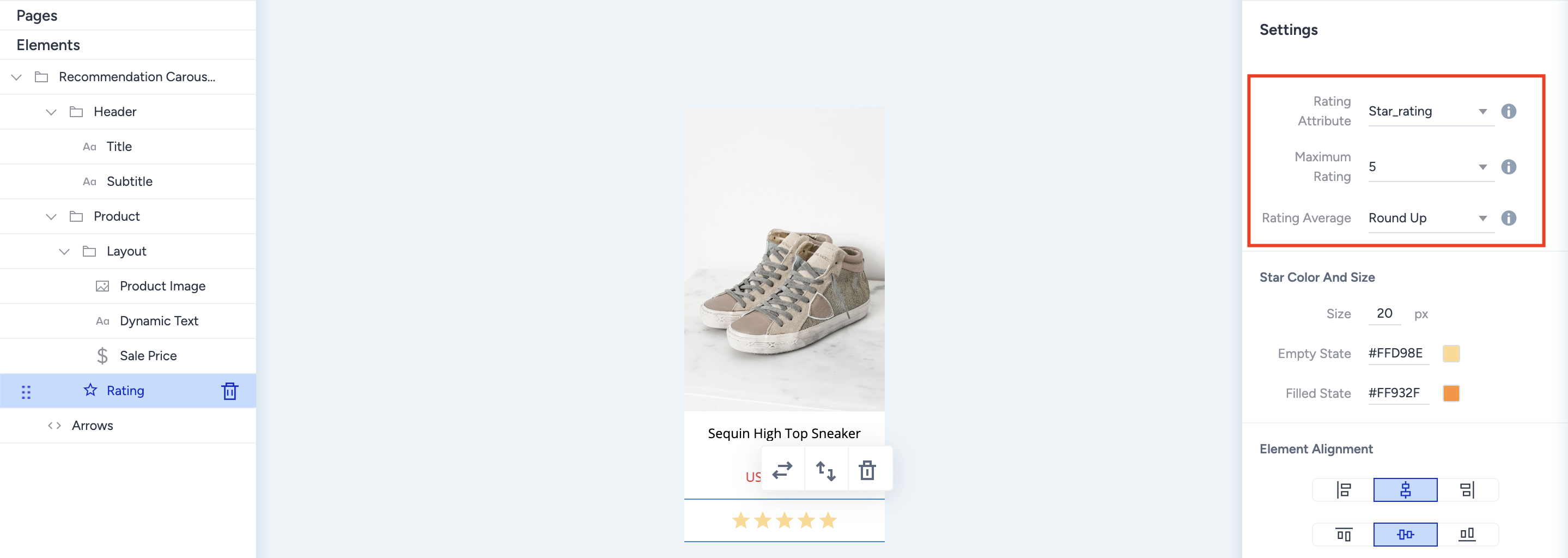
Dropdown Element
The Dropdown element enables you to display the available (in stock) variants of the recommended product using the group code. It searches the product catalog database for products with the same group code as the recommended product. You decide which attributes to use as the grouping attribute. For instance, you can group them according to the different colors of the same product or according to sizes.
Once you select the attribute on the right side menu after you add it, the dropdown element retrieves the values of that attribute from the products with the same group code and lists them inside the element. When a user selects the desired product variant, such as yellow, green, etc., the selected product’s information, such as image, price, name, etc., changes to match the existing one; therefore, users can see what the product variant chosen looks like. When the user clicks on the product image, they are led to the detail page of the selected variant product or add the selected variant product to the cart.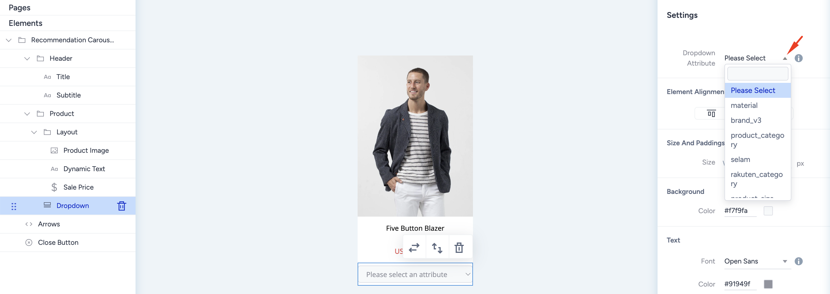
After inserting the product card's dropdown, select the product attribute for which you group your variants. Then, go to the widget layer or the Preview tab to see your dropdown's open version.
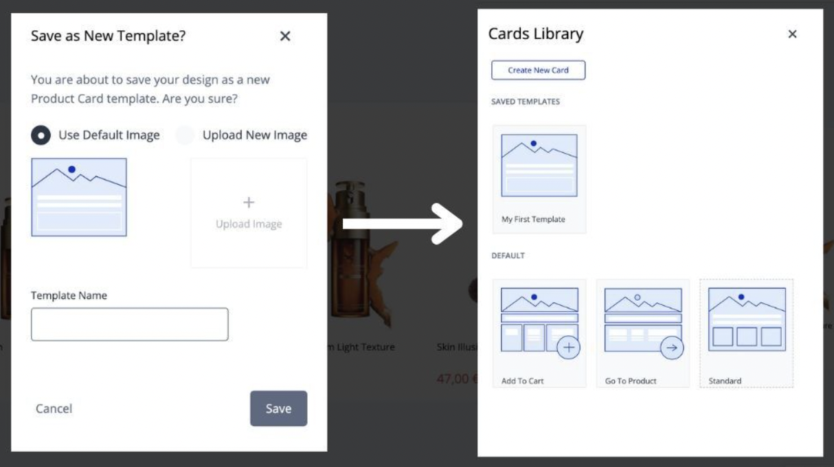
Product Card Template Library
Thanks to the Template Library inside the Action Builder, you can store your product card designs and use them on other campaigns without duplicating the entire campaign.
Use the bottom left Card Design button to save your product card design, review the product card library, and reset your design to the latest version.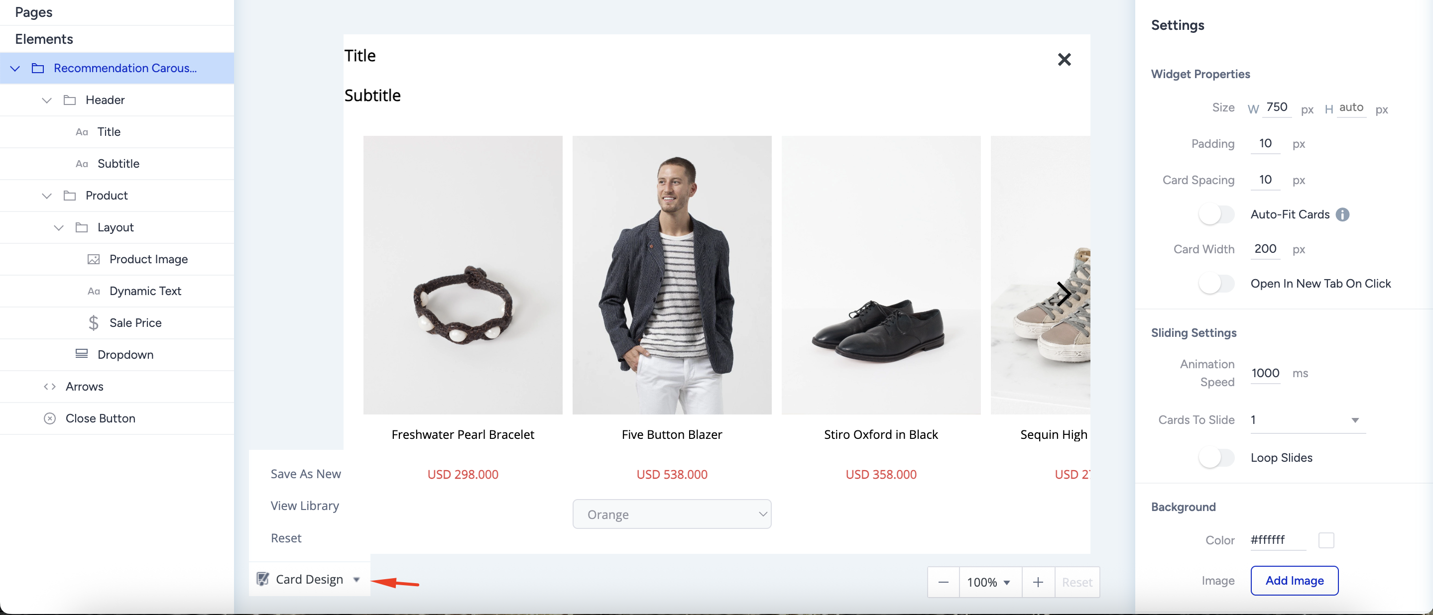
To save your card design, click Save as New from the dropdown. You can customize and name it with a visual to differentiate it easily.