A button is a beautifully designed URL link. It should be visible, and its copy should be clear and concise.

Build a CTA button
1. Pull the basic button block into your template and drop it next to the product it is related to.
2. Tap the button block in your HTML email template to activate the settings panel.
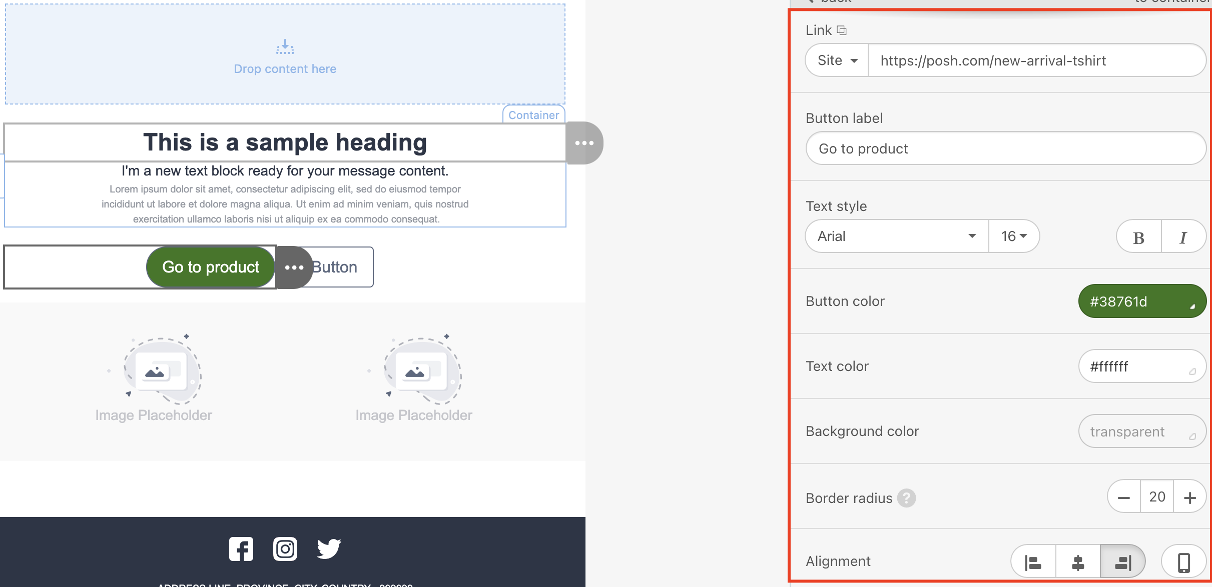 3. Insert a URL in the link area.
4. Enter your button label.
5. Set text style, such as font, font type, and font size.
6. Set button color and font color.
7. Set a border radius if you want rounded buttons.
8. Choose alignment: left, center, or right.
9. Set the button border if you like.
10. Set internal paddings. They are responsible for the whitespace inside your button. Regardless of where the users click on the button, whitespace is also clickable, making the buttons more appealing and clearer.
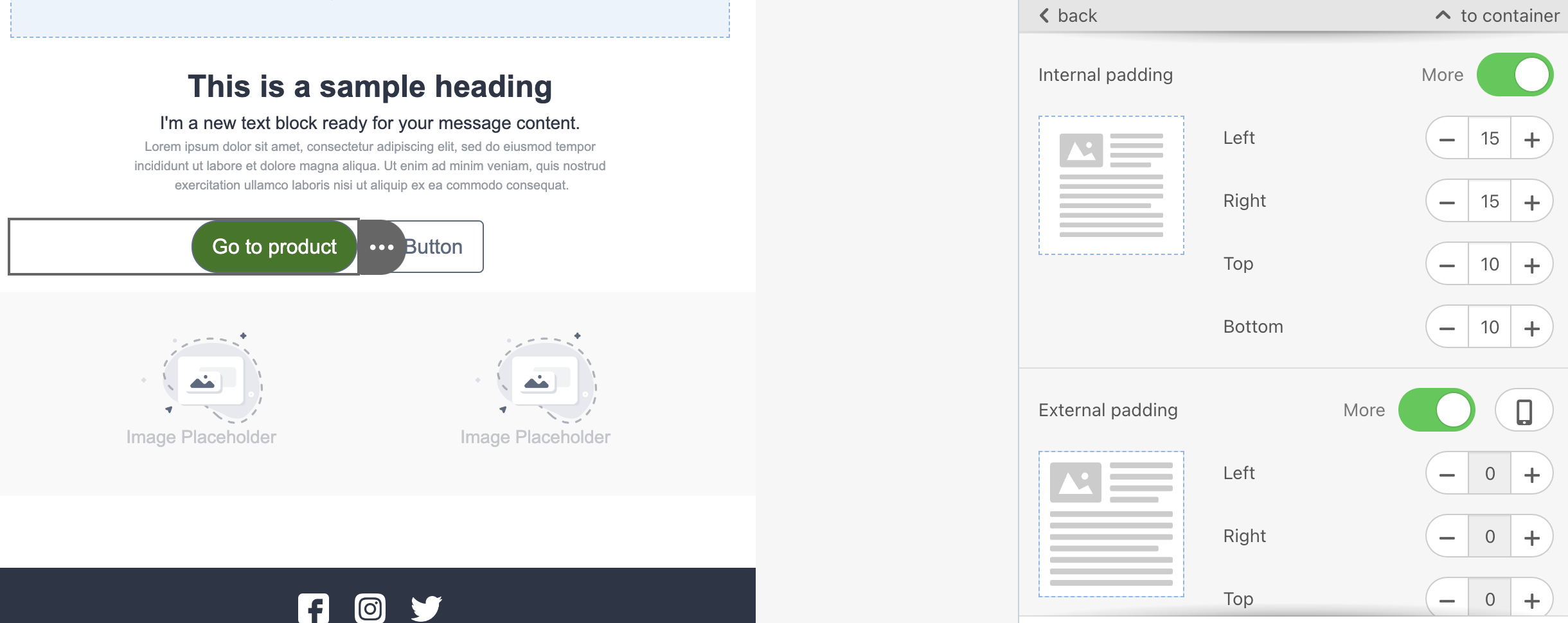
11. Set external paddings. They are responsible for the whitespace outside the button, but within the container it is located in.
Apply a hover effect to your buttons
After adding your button:
1. Go to the Appearance tab and enter the Button section.
2. Toggle the Highlight hovered buttons option.
3. Set parameters for the buttons and their fonts when highlighted.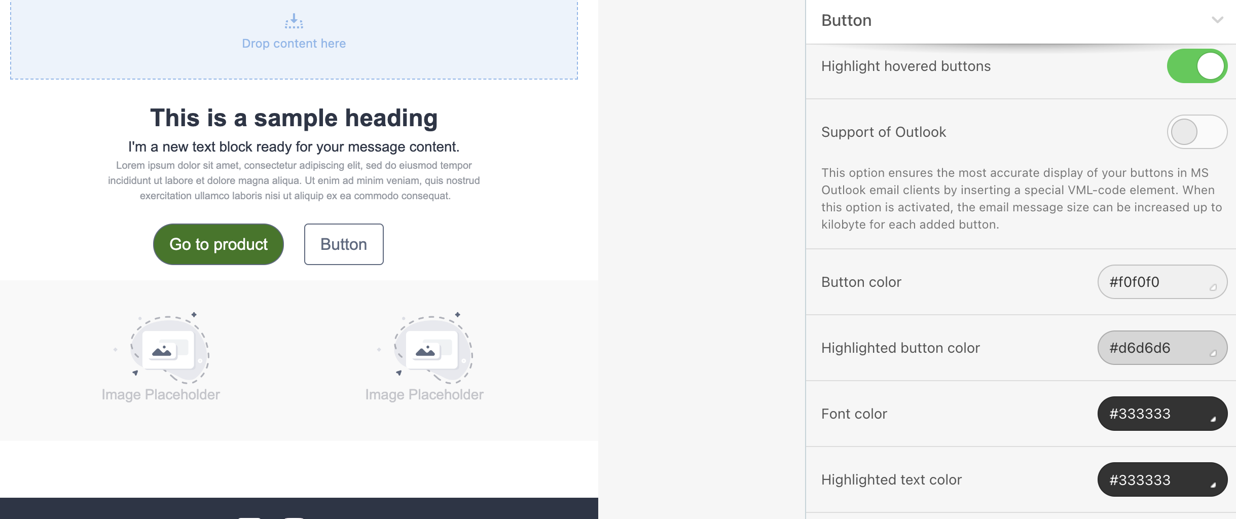
These settings will be applied to all buttons in your template. If you want to apply the hover effect to only some buttons, you should set the same color for the Button color and the Highlighted button color to the buttons you do not want to apply the hover effect to.
The hover effect works for most email clients on desktop devices. It does not break your email design on mobile devices or in email clients that do not support hoverable buttons.